ToolGUI

This Go package provides a framework for rapidly building interactive data dashboards and web applications. It aims to offer a similar development experience to Streamlit for Python users.
⚠️ Under Development:
The API for this package is still under development, and may be subject to changes in the future.
Live demo
Open the component demo in your browser — the demo app covering every component, compiled to WebAssembly, with no server behind it.
The same app runs locally with task run_demo, at http://localhost:3000.
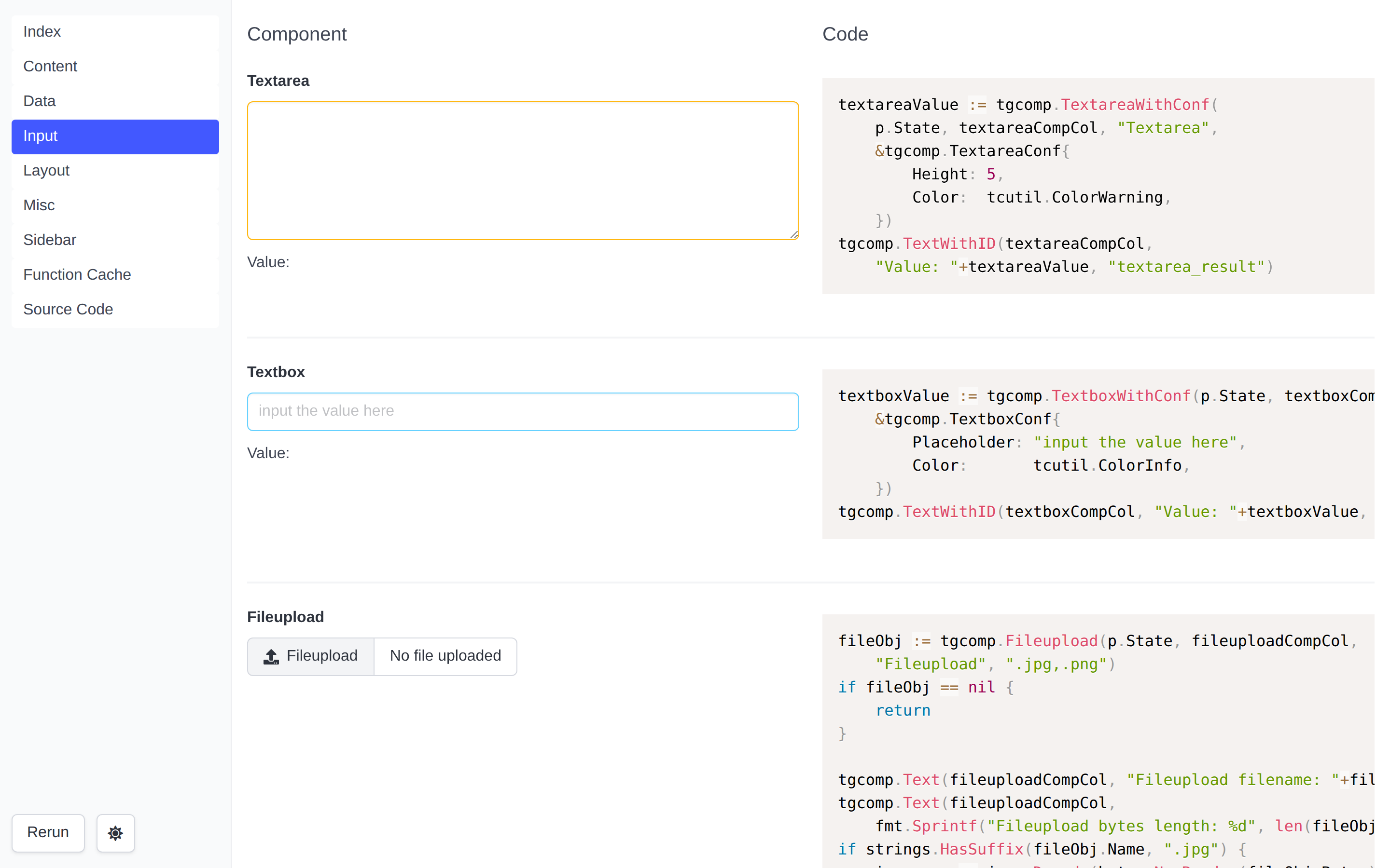
Server-Client
Step by step Hello World
- Create
main.go:
package main

import (
	"github.com/voilelab/toolgui/toolgui/tgcomp"
	"github.com/voilelab/toolgui/toolgui/tgexec"
	"github.com/voilelab/toolgui/toolgui/tgframe"
)

func main() {
	app := tgframe.NewApp()
	app.AddPage("index", "Index", func(p *tgframe.Params) error {
		tgcomp.Text(p.Main, "Hello world")
		return nil
	})

	tgexec.NewWebExecutor(app).StartService("127.0.0.1:3001")
}
- Create go.mod and download toolgui:
go mod init toolgui-helloworld
go mod tidy
- Run helloworld
go run main.go
Explain
- Create a ToolGUI App: The
Appinstance includes the info that app needs.
app := tgframe.NewApp()
- Register a page in App: Tell
Appinstance, we will have a page in the App.indexis the name.Indexis the title.
app.AddPage("index", "Index", ...)
- The Page Func: Draw a text component in the Main container.
func(p *tgframe.Params) error {
	tgcomp.Text(p.Main, "Hello world")
	return nil
}
- WebExecutor: The
Apponly includes the logic of app, but not the GUI. The web executor provides a web server GUI interface forApp.
tgexec.NewWebExecutor(app).StartService("127.0.0.1:3001")
Desktop App
The same App can run in a desktop window instead of a browser, through Wails v2. Only the executor changes: pages, components and state work exactly as they do on the web.
package main

import (
	"log"

	"github.com/voilelab/toolgui/toolgui/tgcomp"
	"github.com/voilelab/toolgui/toolgui/tgframe"

	tgwails "github.com/voilelab/toolgui/toolgui-wails"
)

func main() {
	app := tgframe.NewApp()
	app.AddPage("index", "Index", func(p *tgframe.Params) error {
		tgcomp.Text(p.Main, "Hello world")
		return nil
	})

	e := tgwails.NewExecutor(app, &tgwails.Conf{Title: "ToolGUI Hello"})
	if err := e.Run(); err != nil {
		log.Fatal(err)
	}
}
Run opens the window and blocks until the user closes it.
The example app
toolgui-wails/example/hello
is a runnable version of that program, with a sidebar textbox and a button to
show the state round trip working in a window:
func Main(p *tgframe.Params) error {
	name := tgcomp.Textbox(p.Sidebar, "What's your name?")
	if name != "" {
		tgcomp.Text(p.Sidebar, "Hi "+name+"~")
	}

	tgcomp.Text(p.Main, "hello ")
	if tgcomp.Button(p.Main, "keep going") {
		tgcomp.Text(p.Main, "world")
	}

	return nil
}

func main() {
	app := tgframe.NewApp()
	app.AddPage("index", "Index", Main)

	e := tgwails.NewExecutor(app, &tgwails.Conf{Title: "ToolGUI Hello"})
	err := e.Run()
	if err != nil {
		log.Fatal(err)
	}
}
The whole app is two files:
toolgui-wails/example/hello/
├── main.go      the app
└── wails.json   what the wails CLI builds
{
  "$schema": "https://wails.io/schemas/config.v2.json",
  "name": "hello",
  "outputfilename": "hello",

  "frontend:dir": "../../../toolgui-web/wails",
  "frontend:install": "yarn",
  "frontend:build": "yarn build",

  "assetdir": "../../frontend/dist",
  "wailsjsdir": "./build"
}
frontend:diris the desktop frontend workspace. The CLI runs yarn there, which builds intotoolgui-wails/frontend/dist.assetdiris that same directory, the oneassets.goembeds and Wails serves the window from.wailsjsdiris where the generated JavaScript bindings land. The example does not import them — the frontend calls the bound methods throughwindow.go— so they are build output, not source.
Running it
Building a desktop app needs Go, Node with yarn for the frontend build, and the webview development packages. On Debian and Ubuntu:
sudo apt-get install libgtk-3-dev libwebkit2gtk-4.1-dev
Then, from the repository root:
task run_wails_hello     # dev mode: frontend from disk, Go files watched
task build_wails_hello   # packaged binary, in example/hello/build/bin
The wails CLI itself is pinned as a tool dependency of the toolgui-wails
module, so there is nothing to install: both tasks run go tool wails in
example/hello. They also stub the embedded assets first, because the CLI
generates the bindings — which compiles the package holding the //go:embed —
before it builds the frontend the embed points at.
Build tags
webkit2_41asks for WebKit2GTK 4.1, on Linux only. The tasks add it there; passTAGS=to drop it on a distribution that still ships 4.0, which is what Wails asks for by default.productionpicks the real app over a stub that refuses to run. The CLI adds it, anddevin dev mode.
A plain go build works too, it just has to supply what the CLI would. See
toolgui-wails/README.md
for that and the other platform notes.
Conf
type Conf struct {
	// Title shows in the title bar.
	Title string

	// Width and Height are the window size in pixels.
	Width, Height int

	// WindowStartState sets the initial window state. The zero value is Normal.
	WindowStartState WindowStartState

	// FullscreenToggle adds View > Toggle Fullscreen to the native menu.
	// The shortcut is F11, or Ctrl+Cmd+F on macOS. Disabled by default.
	FullscreenToggle bool

	// Background is the window background colour.
	Background *RGBA

	// DisableResize stops the user resizing the window.
	DisableResize bool

	// Frameless drops the window decorations.
	Frameless bool
}
Empty fields fall back to DefaultConf: a 1024x768 white window titled
ToolGUI. An app title names the window ahead of that
default, so a Conf only sets Title to override it.
Set WindowStartState to tgwails.Maximised to open maximised, or
tgwails.Fullscreen to open fullscreen. tgwails.Normal is the zero value,
so omitting the field keeps the normal window size from Width and Height.
tgwails.Minimised is also exported. The type aliases Wails' window start state;
apps do not need to import Wails' options package.
With DisableResize: true, Wails v2.15.0 ignores Maximised on Windows and
uses the normal size; Fullscreen still takes the fullscreen path. macOS
passes both requests to AppKit. See the
desktop README
for the platform details and outstanding manual GUI checks.
Set FullscreenToggle: true to add View > Toggle Fullscreen, using F11 on
Windows/Linux and Ctrl+Cmd+F on macOS. It works without an app menu and does
not rerun the page or change session state. An existing View submenu is
reused. App shortcuts take precedence: if the fullscreen shortcut is already
assigned, the built-in command remains clickable without an accelerator.
The default is false. On macOS,
enabling it replaces the standard Window role (including its Minimize and
Zoom menu entries) to avoid a duplicate fullscreen command. See the
menu notes.
A separate module
github.com/voilelab/toolgui/toolgui-wails is its own Go module, because Wails
needs cgo, GTK and WebKit. Apps that only target the web never pull any of that
in.
Browser App (WebAssembly)
The same App can run inside the browser, compiled to WebAssembly, with no Go process behind it. Only the executor changes: pages, components and state work exactly as they do on the web.
//go:build js && wasm

package main

import (
	"github.com/voilelab/toolgui/toolgui/tgcomp"
	"github.com/voilelab/toolgui/toolgui/tgframe"
	"github.com/voilelab/toolgui/toolgui/tgwasm"
)

func main() {
	app := tgframe.NewApp()
	app.AddPage("index", "Index", func(p *tgframe.Params) error {
		tgcomp.Text(p.Main, "Hello world")
		return nil
	})

	// A static host cannot route paths, so pages live in the hash.
	app.SetHashPageNameMode(true)

	tgwasm.NewExecutor(app).Run()
}
Pages are then linked as /#/{name} — #/index here, not #index. See
Page name in the URL.
Run installs the bridge the page talks to and blocks forever, keeping the
wasm instance alive to answer it.
tgwasm is behind //go:build js && wasm, so an app that also ships a server
build splits its entry points:
page.go          the pages, no build tag
main_server.go   //go:build !(js && wasm)   tgexec.NewWebExecutor(app).StartService("127.0.0.1:3000")
main_wasm.go     //go:build js && wasm      tgwasm.NewExecutor(app).Run()
Building it
toolgui-wasm compiles the app and writes the site around it:
go get -tool github.com/voilelab/toolgui/cmd/toolgui-wasm

go tool toolgui-wasm build -o dist ./cmd/myapp   # the site, into dist/
go tool toolgui-wasm serve ./cmd/myapp           # the same, at :3000
-ldflags goes through to go build, e.g. -ldflags="-X main.version=1.0".
-s -w saves little here: wasm keeps most of its size in code, not symbols.
serve is there so the browser gets the binary as application/wasm and can
compile it while it downloads; deploying needs no server at all. Neither
command deletes anything it did not write, so -o can point at a web root.
The example app
toolgui/tgwasm/example/hello
is a runnable version, with three pages, a sidebar textbox, a button, a draft
kept across reloads and a file the page function reads without it leaving the
tab:
task build_wasm_hello   # static site, in toolgui/tgwasm/example/hello/build
task run_wasm_hello     # the same, served at http://localhost:3000
The component demo runs in the browser too — task run_wasm_demo, and it is
published beside this book.
What a build produces
build/
├── index.html      the page
├── manifest.json   the web app manifest
├── sw.js           the service worker, with -offline
├── static/         the frontend bundle and the worker
├── wasm_exec.js    the Go runtime shim
└── app.wasm        your app
A handful of static files. Any file server serves them; there is no backend.
It does have to be an https one, though, or localhost — see the hosting
notes.
The CLI does nothing a shell cannot:
GOOS=js GOARCH=wasm go build -o dist/app.wasm ./your/package
cp "$(go env GOROOT)/lib/wasm/wasm_exec.js" dist/
# plus the frontend, which the CLI carries as an embedded copy
wasm_exec.js is copied out of the toolchain that built the binary rather than
vendored: the two have to match. That is also why the CLI shells out to go build instead of asking you to run it — one toolchain, both halves.
Web manifest
The browser reads manifest.json before any Go runs, so the app cannot set it
from main. toolgui-wasm writes it instead:
go tool toolgui-wasm build -manifest manifest.json -assets assets ./cmd/myapp
-manifestis a json file, written asmanifest.json. It takes the same memberstgexec.Manifestdoes,"icons"and all.-assetsis a directory, copied toassets/.assets/icon.pngin it is"src": "assets/icon.png"in the manifest.- Without
-manifest, a build writestgexec.DefaultManifest(), unless the output already has amanifest.jsonof its own, which it keeps.
{
  "name": "My Tool",
  "short_name": "My Tool",
  "start_url": ".",
  "display": "standalone",
  "icons": [
    {"src": "assets/icon.png", "type": "image/png", "sizes": "512x512"}
  ]
}
Keep the urls relative, so the site still works under a project path.
iOS reads no manifest icons, so -manifest also writes the head tags it
reads instead:
apple-touch-icon: the png in"icons"closest to 180px. iOS takes no svg, so a manifest with no png gets none, and the build warns.apple-mobile-web-app-title:"short_name".theme-color:"theme_color", in place of the default.
A tag a -head file already has is left to it.
Icon
-icon points the favicon in index.html at a url, so the tab, bookmarks
and crawlers see it before any wasm loads. Ship the file with -assets:
go tool toolgui-wasm build -assets assets -icon assets/favicon.svg ./cmd/myapp
Once the app loads, the frontend sets the icon again from the app's config:
the page emoji, unless the app calls
app.SetIcon. Set both to the same url to keep one
icon throughout.
Head HTML
Crawlers run no wasm, so what they read has to be in index.html itself:
Open Graph or Twitter card meta, fonts, a CSP meta, analytics tags.
App.SetTitle runs too late for them. -head inserts a file at the
start of the head, right after the charset meta, so a CSP meta covers the links
after it:
go tool toolgui-wasm build -head head.html ./cmd/myapp
<meta property="og:title" content="My Tool" />
<meta property="og:image" content="https://example.com/assets/og.png" />
The server executor does the same with
SetHeadHTML.
Opening offline
-offline adds a service worker, so the app opens with no network once it has
been loaded once:
go tool toolgui-wasm build -offline -manifest manifest.json -o dist ./cmd/myapp
- The worker keeps a copy of the files the build wrote and serves it when the network fails. Online it gets out of the way: every load goes to the server and refreshes the copy, so a new build shows up on the next load, as it would without a worker.
- A build without
-offlineremoves the worker on its first load, along with its copy. - Only the site's own files are kept. What a page function fetches still needs the network, and the state is still the tab's: offline or not, a reload starts from an empty one.
- Service workers need a secure context too.
A large runtime the app loads on demand, such as Pyodide, would make every
install download it. Ship it with -lazy-assets instead:
go tool toolgui-wasm build -offline -lazy-assets runtime -o dist ./cmd/myapp
- It is copied to
assets/, like-assets; a path both write is an error. - The worker does not fetch it on install. A file is kept the first time the page fetches it, and works offline from then on; one never fetched still needs the network.
- A new build drops the kept files with the rest of the old copy.
- Without
-offlineit is a plain copy.
Where it runs
The Go program runs in a dedicated Web Worker, not on the page's thread, and it has to: the synchronous file handles the file store keeps uploads in exist in a worker and nowhere else. It also never touches the DOM — it sends the same packs the update websocket carries, and the React components on the main thread render them — so a page function that takes a while leaves the UI responsive.
Talking to the page
A worker's location is its script, not the page's URL, so what an app needs to know about the page is handed over at boot:
tgwasm.Query()is the page's query string, for an app that takes its own parameters such as?lang=en. Read once: it cannot change without a reload.tgwasm.Embedded()reports?embed, the frontend's display mode for a page shown in a frame, for an app laid out differently there.
The other way, tgwasm.Emit(name, detail) dispatches a toolgui:<name> DOM
event on the page's window, with detail sent as JSON. It reaches that tab
only, and is for a script of the page's own, such as analytics added with
-head:
tgwasm.Emit("download", map[string]any{"tool": "novel"})
addEventListener('toolgui:download', (e) => umami.track('download', e.detail))
Emit returns tgwasm.ErrNoEventCallback until the frontend has registered
for events, which it does at boot, before the first page runs.
Keeping data across reloads
A reload starts from an empty state. Data that must outlive it goes in a store, kept in the origin private file system:
var store = tgwasm.OpenStore("judge")

type Draft struct{ Lang, Code string }

func Index(p *tgframe.Params) error {
	draft, err := tgwasm.GetJSON[Draft](store, "draft/0004")
	if err != nil && !errors.Is(err, fs.ErrNotExist) {
		return err
	}
	...
	return tgwasm.SetJSON(store, "draft/0004", draft)
}
- Only the wasm build has it. A server build stores data under its own login, in its own database.
- A Go global is still fine for what only needs to last until a reload: in a tab it belongs to that tab alone. The store is for the rest.
OpenStorecan be called frommain, but read the store in a page run. Its methods returnErrBeforeRununtilRuninstalls the bridge.- The first tab owns the store. A second tab opens a read-only snapshot, where
SetJSONreturnsErrReadOnly. Checkstore.ReadOnly()to tell the user the app is already open in another tab. - The browser may clear the data under storage pressure. Call
navigator.storage.persist()from the page, for example in a-headscript, if the app needs it kept.
The example app's Echo page keeps its text this way. How it works is in Persistent Store.
What the browser takes away
- One session per tab, created on load. A reload starts from an empty state: there is no server to keep it. See Keeping data across reloads.
- No filesystem to open by path, and no listening socket.
net/httprequests becomefetch, so CORS applies to whatever your page function calls. GOMAXPROCSis 1. Goroutines interleave, nothing runs in parallel.- No timezone database unless the app imports
time/tzdata. - Uploaded files are kept in the origin private file system rather than the tab's memory, and go with the session. Storage there is per origin and bounded, so an upload can fail for want of room. Getting there is a stream: the worker copies the picked file straight into storage and hands Go a handle on it, so an upload is bounded by the origin's room for it and not by the tab's memory.
- The binary is public, like any other static asset. No secrets in it.
SetManifestandSetAssetsareWebExecutorsettings. The browser build takes the same things as build flags instead; see Web manifest.
Hosting notes
- Serve it over
https. Uploads go to the origin private file system, and that belongs to a secure context, so on plainhttpfrom anything butlocalhostthere is nowhere to put one and every upload fails. It says so rather than falling back to the tab's memory, which would put the files back where this build stopped keeping them without anyone noticing. GitHub Pages, Netlify and the like arehttpsalready. - Serve
.wasmasapplication/wasm, so the browser can compile it while it downloads. - Compress it. With Go 1.27 the example app is 8.2 MB, 2.2 MB gzipped; the component demo is 10.2 MB, 2.7 MB gzipped. It is cached after the first load, and the page shows how much of it has arrived until then.
- GitHub Pages gzips it for any browser that asks, which is all of them, so a
visitor downloads the gzipped size. DevTools' Network panel shows both: the
transferred size is what went over the wire, the resource size is the
binary after decompression.
Content-Encoding: gzipon the response is how to tell a host does it. A host that does not can serve a precompressedapp.wasm.gzor.brinstead, if it can set the header. - Keep
SetHashPageNameMode(true)unless the host can rewrite unknown paths toindex.html. - The build uses relative asset URLs, so it works at a site root and under a
project path like
/toolgui/without rebuilding.
Why not TinyGo
TinyGo makes much smaller binaries, but it cannot build a ToolGUI app. Checked with TinyGo 0.40.1:
- It supports Go up to 1.25, and this module needs 1.27.
- Past that, its standard library has no
encoding/json/v2and nouuid, whichtgjson,tgframeandtgutilimport.
Worth another look when TinyGo catches up with the Go release.
How it works?
Basic
---
config:
  look: handDrawn
---
graph LR
    UI -- "value update" --> State
    State -- "get value" --> PageFunc["Page Func"]
    UI -- "rerun" --> PageFunc
    PageFunc -- "notify update" --> UI
The key concept is that in the Page Function, the UI component interact immediately with the running logic.
For example:
if tgcomp.Button(p.Main, "Click me") {
    tgcomp.Text(p.Main, "Hi")
}
In the first call (For example: When the web page is entering.),
The Click me button will render, but the Hi will not render.
Since the button is not clicked in the first round.
When the user clicks the button, the Page Function will be called again.
In this round, tgcomp.Button will return true and Hi will render.
How?
Since we declare a button whose id is Click me, and when the button is clicked,
we store true with key Click me into p.State.
When entering tgcomp.Button, it will check if there is any data stored
in p.State with key Click me.
Server-Client Architecture
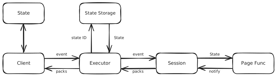
Server-Client need to handle a more complex part: multiple state for multiple users.
Hence we need a state_id for each state.
The executor owns the transport and the state pool — how long a state lives in it is on Session Cache. Everything from the event onwards is the Session's, and it is the same on the desktop.
packs is what travels back: a ready pack when a run starts, one notify pack
per component change, and a result pack when the run ends.
File upload is the one thing off this path. The client POSTs to /api/files
with its state_id and the percent-encoded component_id of the fileupload
(a header can't carry a non-ASCII label), and the handler
streams the body to a file of the state's own, so it touches neither the socket
nor the Session. The page reads that file back through
FileUpload, which means an upload only
has to fit on disk, not in memory.
Session
The piece that turns an event into a page run is tgframe.Session.
It holds a page name, a State, and one function to send packs to the client:
func NewSession(app *App, pageName string, state *State, send SendPackFunc) (*Session, error)
That is all it needs, so it does not know what the transport is. An executor only feeds it events:
session.HandleRawEvent(bs)
A Session is safe for concurrent use and serializes its runs: a new event
interrupts the page func still running from the previous one, so the client
never receives two runs interleaved. The interrupt travels as a cancelled
Params.Context: a page func watching it returns on its own, and one that
does not panics with ErrUpdateInterrupt at the next thing it draws, which
the session recovers.
This is why the web executor and the
desktop executor share the whole app logic. They
differ only in how packs and events travel: a websocket and a state_id pool on
the web, bound methods on a single window on the desktop.
Serving It Safely
ToolGUI has no login, no tokens and no permission model. Whoever reaches the app runs it, with everything the tool itself can reach: the files it opens, the databases it queries, the commands it shells out to. Treat "can open the page" as "can do anything the tool does", and decide who that should be.
Bind to loopback
StartService(":3000") listens on every interface, so the tool is on the
network the moment the machine is. The examples in these docs bind to
127.0.0.1 instead, which keeps it on the machine it runs on:
e := tgexec.NewWebExecutor(app)
e.StartService("127.0.0.1:3000")
That is the right default for a tool you run for yourself. It is also the
only thing standing between the tool and the rest of the network, so widen it
on purpose, not by copying a :3000 out of a README.
Origin check
The update websocket carries every event and every render of the app, and the
same-origin policy doesn't cover websockets: without a check, any page open in
the same browser could connect to ws://localhost:3000/api/update/..., press
the app's buttons and read back what they render.
So the handshake takes only an Origin whose host matches the one the request
asked for, and answers anything else with 403. Nothing has to be configured for
this; it is how the socket behaves.
Limits
Nothing authenticates a connection, so what one can ask for is capped. The
service holds 1024 states at most, one per open page, and a connection that
finds no room is refused rather than handed one anyway. One upload is 1 GiB at
most, and it is stored under a component the page actually drew, so a caller
cannot keep a file per name it invents. An event is held to the same rule: it
writes the state under an id the last finished run drew, so a client cannot
fill a session with keys no component owns and no run would ever read or
release. One message on the update socket is 1 MiB at most, and a form event
nests 32 levels at most: every level of a form has its subtree read again, so
the two together are what stop one message from buying far more work than it
took to send. StartService also puts deadlines on sending a request's
headers, on sitting idle between requests, and on naming a state once the
websocket handshake is done.
A download goes the other way and is capped by nothing, because there is
nothing to cap: DownloadFile serves a file one of the page's own runs offered,
named by a token that is unguessable, that is looked up in the state which
offered it and nowhere else, and that is only accepted alongside the state id of
the connection asking. A token is therefore a bearer of nothing on its own, and
neither it nor the state id is ever put in a URL, where a link, a log line or a
Referer would carry it further than the fetch that needs it.
The caps are worth lowering on anything reachable by more than the person running it:
e.SetMaxStateCount(64)
e.SetMaxUploadSize(16 * 1024 * 1024)
e.SetMaxMessageSize(64 * 1024)
Raise the message cap instead for an app whose iframe or plugin components send values of their own that are larger than 1 MiB. A message over the cap is refused by its header, without being read into memory, and the page keeps its connection.
These bound what one visitor costs. They are not a substitute for deciding who reaches the page.
Behind a reverse proxy
To serve the tool to more than the local machine, put it behind a proxy that authenticates — an identity-aware proxy, an SSO gateway, whatever the team already runs — and let the proxy reach ToolGUI over loopback.
A proxy that passes the browser's Host through needs nothing else. One that
rewrites it has to name the public origin, or the handshake will refuse the
browser it is proxying for:
e.SetAllowedOrigins([]string{"https://tools.example.com"})
Each entry is a full origin, scheme and all, the way a browser sends it. The app's own origin is always allowed on top of these.
Web FolderPicker decision
Decision, 2026-10-15: do not implement browser-folder RPC in the Web
executor at present. Keep its FolderPicker disabled. This completes the
design investigation in series 3/3 of TG-110, depending on TG-111; it does not
schedule an implementation or change the protocol. Desktop support shipped in
#257, and Wasm support in
#259.
Demand and alternatives
The likely first audience is a local tool whose Go server and browser run on the same machine: batch conversion, inspecting a source tree, or exporting results beside inputs. That is a hypothesis, not demonstrated demand. The maintainer confirmed during this investigation that there is currently no concrete app requiring a Web server to operate on a browser-granted folder. The repository's upload/download examples and Local folder demo demonstrate APIs, not an independent app that needs this transport.
Running on the same machine does not turn a browser directory handle into a server path. The handle can be cloned to another browser thread, not sent as a capability to Go over a WebSocket. Nor should the browser claim an absolute path that the server then opens. Even loopback would need a browser agent for each filesystem operation. On a shared remote server, the folder would still be on each visitor's machine; this is a different, more sensitive deployment.
| Need | Current choice | Limitation |
|---|---|---|
| Select inputs, run server processing, save outputs | MultiFileUpload plus DownloadFile; package multiple outputs into one archive | Copies inputs to the server; not directory traversal or in-place editing. Multi-file selection is currently capped at 1000 files per pick. |
| Read/write a local tree with Go-specific dependencies | Desktop FolderPicker | Requires installing a desktop app. |
| Offline browser processing of a tree | Wasm FolderPicker | Requires compatible browser APIs and an app that can run in Wasm. |
| Upload an entire directory while preserving relative names | A possible future webkitdirectory input | Read-only selection of file snapshots; still uploads bytes. It neither grants write access nor implements the existing live Folder interface. Not added here. |
Uploads/downloads cover the demonstrated import/process/export model. They do not cover every hypothetical tree-processing app, especially incremental random reads or writing results in place. That gap alone does not justify a new bidirectional filesystem protocol without a named consumer.
What implementing it would require
The following is a candidate design to expose the cost, not a protocol
specification to implement. A future implementation needs its own ticket
and review. No tgframe.Folder methods are added by this decision.
Grants and messages
Opening the picker must remain a main-thread user gesture. The server cannot
request a native dialog during an arbitrary page run. A successful selection
would create a browser-side grant registry entry, followed by a client-initiated
folder_granted control message. It would identify the connection epoch,
picker component, opaque grant ID and granted read/readwrite mode. The server
would validate the component and pending selection before applying the trusted
EventFolder and rerunning. Cancellation or denial would leave state unchanged.
The handle itself and an OS path would never be sent to the server.
Every successful WebSocket handshake would negotiate folder_fs_v1 and a
fresh unpredictable session epoch. Reusing an idle Web state ID on reconnect
must not reuse an epoch, outstanding requests or directory grants. Peers
without the capability keep the existing disabled behavior.
Illustrative server request and browser response:
{"fs_request":{"v":1,"session_epoch":"e7","run_id":"r9","request_id":"q12","grant_id":"g3","op":"read","file_id":"f2","offset":0,"length":65536}}
{"fs_response":{"v":1,"session_epoch":"e7","run_id":"r9","request_id":"q12","result":{"data_base64":"aGVsbG8=","eof":true}}}
An error response has an error instead of result, for example
{"code":"permission_denied"}. Stable codes would map to fs.ErrNotExist,
fs.ErrPermission, fs.ErrInvalid, fs.ErrClosed and
tgframe.ErrFolderReadOnly; browser error text is diagnostic, not the wire
contract. Offsets, lengths, decoded payload sizes and response metadata must
be checked before allocation or use.
The operation set needs open, read, stat, readdir, create, write,
mkdir_all, close and abort. open returns metadata and a browser-side
file ID for a File snapshot; create returns a writer ID, and writer close
commits its stream. IDs are scoped to the grant, epoch and run. Relative names
follow fs.ValidPath; Path() remains empty. Directory listings need bounded
pages and a listing ID, with a defined snapshot and sorting policy. Writers
need ordered chunks and per-writer sequence validation. A duplicate or late
response must not complete another request or repeat a write.
This JSON/base64 shape is enough for a prototype, not a good large-file data plane. A production design must compare binary frames or bounded HTTP streams associated with these request IDs. The existing update-message limit is 1 MiB; it should not be raised globally to accommodate file contents. Negotiated chunk limits, backpressure and per-session in-flight byte limits are required.
Dispatch, reruns and cancellation
The socket is already bidirectional, but SendPackFunc only delivers packs;
it has no response correlation or waiter lifecycle. It also carries query,
navigation and component-notification packs, beyond create/update/delete,
ready and result. Adding an FS request tag alone would not supply RPC.
The Web executor currently receives a frame and synchronously calls
Session.HandleRawEvent. A new user event cancels the previous run and waits
for it to finish. If that run is waiting for browser IO, and the FS response
is behind the user event on the socket, the receiver can deadlock. A future
receiver must keep reading, dispatch FS responses directly to a pending-request
registry, and queue normal UI events to a separate ordered handler. FS replies
must never go through ParseEvent, apply component state, or cause a rerun.
The frontend similarly needs an FS control dispatcher before render dispatch.
Each request would register a waiter before sending, then release all send, state and registry locks before waiting on its response, deadline or run context. The design needs these lifecycle rules:
| Trigger | Required behavior |
|---|---|
| User event interrupts a run | Params.Context cancellation wakes its IO waiters immediately with context.Canceled; late replies cannot change state. Best-effort fs_cancel asks the browser to abort pending work. |
| Normal run completion | Close readers and release run-owned IDs; abort any writer the app did not close. A committed writer must have completed before run success. |
| Same-session rerun | Keep the directory grant, allocate a new run ID and new run-bound proxies. ReadyPack is a rendering boundary, not grant revocation. |
App.RerunAll / RerunPage | Preserve existing behavior: coalesce and wait for the active run to finish, without interrupting it. They do not rescue a stuck FS call; IO deadlines are still necessary. |
| Session replacement or connection loss | Detach the epoch and grants, wake all waiters before waiting for the runner, and reject old-session operations with ErrSessionReplaced. Session replacement takes precedence over generic cancellation when both apply. Reconnect requires a fresh user selection. |
| Timeout or permission revocation | Complete the waiter with a defined timeout/permission error; stop further use of an invalid grant. Never retry writes automatically. |
The TG-111 Folder methods have no context parameter, and State.GetFolder
currently returns a session-owned object. A future implementation must work
out an internal run-scoped facade: each FolderPicker result, reader and
writer captures that run's Params.Context, while only the underlying grant
survives reruns. Mutating one cached proxy to point at the newest run would
let old work act under a new context and is unacceptable. How to expose that
run scope through the existing container/state path needs separate design;
waiting with context.Background() is not a solution. If the public interface
proves insufficient, revisit TG-111 and all executors together.
Cancellation is not a transaction rollback. Abort may discard an uncommitted
stream, but a completed mkdir_all, newly created file entry, or already
committed write cannot be undone reliably. If a commit succeeds and the reply
is lost, the outcome is unknown to the server. Automatic replay on reconnect
would be unsafe; the app must reconcile before retrying.
Security boundary
A directory grant would authorize the connected server application, not just the local page UI, to request reads under that root. Readwrite would also authorize creating and overwriting files without another dialog per operation. A compromised server or injected same-origin script could read the entire granted tree, send it elsewhere, or damage writable files. The grant must be explained that way; it must not look like selecting a harmless display path.
The browser agent, not the server alone, must enforce the root and mode for every operation. It must traverse from registered handles, reject invalid and escaping paths, disallow unsupported operations such as arbitrary remove or rename, reject unknown IDs and revoked grants, and bind requests to the exact connection/epoch and active run. The service cannot silently widen a read grant or reuse a browser's broader persisted permission. Origin checks do not replace these capability checks or protect against a compromised trusted origin.
ToolGUI currently has no built-in user authentication; a Web state ID is a bearer credential, not a verified user identity. On a shared server, a routing mistake, state-ID leak, global cache or app-level cross-session reference must not expose one visitor's grant or response to another. Keep capability maps per authenticated connection and session, never in app caches; require deployment authentication, exact origin checks and HTTPS/WSS for remote service. Disconnect revokes the protocol grant even when the browser still remembers OS permission. Loopback is a useful default for single-user tools, not a substitute for these checks. Any future multi-user support needs an explicit tenant-isolation review.
Apply request, byte, open-file and directory-entry quotas on both peers, plus timeouts and bounded queues. Do not log file contents, bearer/grant IDs or full local names by default. Browser responses are also untrusted server input: validate IDs, lengths, entry names and chunk sequences rather than trusting a visitor not to exhaust memory or forge another session's response.
Performance budget
These are analytical examples, not measurements. For sequential stop-and-wait
IO, latency alone is approximately request_count × RTT, in addition to disk,
serialization and byte-transfer time. Even loopback retains browser event-loop
and Promise scheduling costs. Each remote read must cross to Go; write output
must cross back, even when both endpoints are on the same machine.
| Workload | Round-trip latency floor at 1 ms | At 30 ms |
|---|---|---|
| Read 1 GiB in 64 KiB chunks: 16,384 reads | 16.4 s | 491.5 s (8.2 min) |
| 10,000 sequential metadata or small-file requests | 10 s | 300 s (5 min) |
At 100 Mbit/s, 1 GiB of bytes alone takes about 86 seconds one way, ignoring
overheads; base64 increases the payload by about one third. Go readers can ask
for just a few bytes at a time, so sending an RPC for every Read would be much
worse than the chunked example. Open/stat/close, listing and output writes add
further requests. Reruns could repeat the work unless the app explicitly caches
its results with a safe invalidation policy.
Read-ahead buffers, metadata batching, bounded concurrent requests and streamed writes could reduce that cost. They also require flow control, cancellation, snapshot consistency and commit semantics. They must not block small UI/control frames behind large transfers. Increasing a chunk size trades latency for memory and cancellation responsiveness; it does not remove the need to upload bytes. For import/process/export, uploading each input once and reading it on the server avoids repeated browser round trips using the existing protocol.
Outcome and reopening criteria
Do not open a Web FS implementation ticket under TG-110 now: the decision is not to implement it. Keep the existing disabled UI and document the reason on the FolderPicker page. Its current generic unavailable message is not a promise that support is scheduled; this documentation-only change intentionally does not alter component source.
Reopen the decision when there is a named app, an owner, and a workflow that cannot reasonably use uploads/downloads, desktop or Wasm. Require representative file counts/sizes, local versus remote deployment, an acceptable latency budget, permission UX, and measured results from an isolated transport prototype. Only then scope and attach an implementation ticket to TG-110, including the run-context, deadlock, multi-user isolation and uncertain-write-outcome requirements above.
Evidence checked
- Session and pack delivery: serialized sends, interrupt-and-wait, run cancellation.
- Server reruns and Params.Context: non-interrupting queued reruns.
- Web receiver and state acquisition: synchronous event handling, reconnect state and limits.
- Session replacement and TG-111 Folder.
- Frontend socket and render dispatch.
- Deployment trust model, uploads, downloads, and Local folder demo.
- Maintainer confirmation on 2026-10-15: no concrete app currently needs this Web filesystem bridge. This is not a claim that no outside user could need it.
App
The App includes the info of
- Side Nav: The left column of the app.
- Pages: The App holds an ordered map from page name to page's data.
- Menu: A menubar along the top, for an App that declares one.
Title
The App can name itself:
app.SetTitle("My Tool")
The browser tab then reads {page title} - {app title}, the title names the
app in the web manifest, and it titles the desktop window
unless Conf sets its own. An App with no
title leaves the tab to the page title alone.
Icon
By default the browser tab shows the current page's emoji. An App can set one icon for every page instead:
app.SetIcon("assets/favicon.svg")
The url is whatever the page can load: one under
SetAssets, or the -assets of a
browser build. It takes effect once the
frontend has the app's config; the icon an installed app shows comes from the
web manifest "icons" instead.
Side Nav
The side nav is the left column of the app.
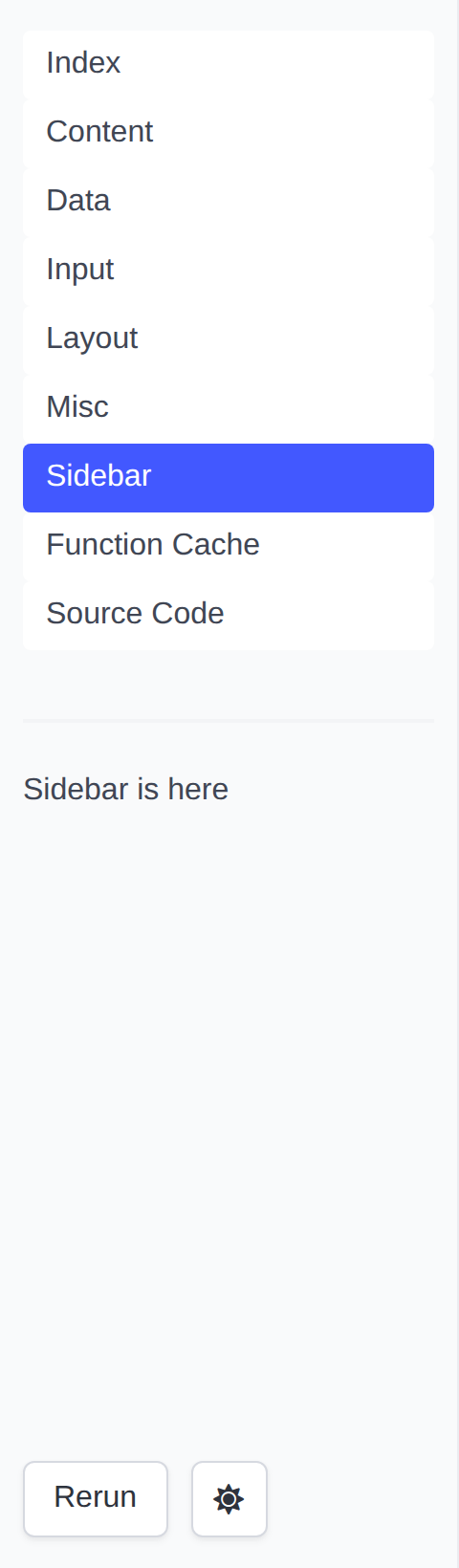
It holds four parts, top to bottom:
- The page list: one link per page in the App. The link of the current page is highlighted, and a page's emoji is shown in front of its title. A page the App declares Hidden is left off the list, except while it is the page being read. When the list would hold only the page being read -- a single-page app -- it is left out.
- The page's Sidebar container, when the page func puts anything in it.
- The app controls:
- Rerun: Rerun the Page Func without changing any state.
- Dark/Light Mode Switch: Switch the theme of the app. Until it is used,
the app follows the browser's
prefers-color-scheme; the choice is remembered afterwards. - A spinner, shown while the app is running the Page Func.
- The toolgui version the app was built against. Click it for the About dialog.
The page list is the part that scrolls: an app with more pages than the column is tall gets a scrollbar on the list, and the sidebar, the controls and the version line under it keep their place.
On a narrow screen the column collapses behind a Menu button. What the
button opens is a bar that fits the screen: the list is capped there too, so
the controls under it are where they can be reached rather than below every
link the app has.
Shared selection
A choice that belongs to every page -- a group picked in the sidebar -- can follow the user from page to page. Declare its query key sticky:
app.SetStickyQuery("group")
The page list then copies group from the current page query into the page
it opens, and so does a PageLink that
does not set group itself. Other keys are left behind. Each page keeps its
choice in the URL with p.ReplaceQuery, and reads it back from p.Query:
var groups = []string{"a", "b", "c"}

// groupSelect draws the shared Select. Both pages call it.
func groupSelect(p *tgframe.Params) *int {
	// Untrusted: only a known group seeds the input.
	conf := &tgcomp.SelectConf{}
	if def := slices.Index(groups, p.Query.Get("group")); def >= 0 {
		conf.SetDefault(def)
	}
	idx := tgcomp.Select(p.Sidebar, "Group", groups, conf)

	q := url.Values{}
	if idx != nil {
		q.Set("group", groups[*idx])
	}
	p.ReplaceQuery(q)
	return idx
}

func Summary(p *tgframe.Params) error {
	if idx := groupSelect(p); idx != nil {
		tgcomp.Text(p.Main, "Summary of "+groups[*idx])
	}
	return nil
}

func Detail(p *tgframe.Params) error {
	if idx := groupSelect(p); idx != nil {
		tgcomp.Text(p.Main, "Detail of "+groups[*idx])
	}
	return nil
}

func main() {
	app := tgframe.NewApp()
	app.AddPage("summary", "Summary", Summary)
	app.AddPage("detail", "Detail", Detail)
	app.SetStickyQuery("group")
	// ...
}
Pick b on Summary and the link to Detail reads /detail?group=b, so Detail
opens with b selected. The links are real URLs: a middle-click opens the
page in a new tab with the same group. It works the same in hash mode, wasm
and Wails; Wails just has no address bar to show it.
Width
Drag the column's right edge to resize it, between 180px and 480px. The handle
is also a keyboard control: focus it and the arrow keys move the edge in 16px
steps, Home and End go to the bounds, and Enter — or a double click —
puts it back to the default 240px.
The button at the top of the column collapses it to just that button, handing the whole width to the page; the page's Sidebar container keeps its state while hidden. Both the width and the collapsed state are remembered in the browser, so they survive moving between pages.
Neither applies on a narrow screen, where the column is a bar across the top
and the Menu button owns it.
Version
The version line reads the module version out of the binary's build info, so an
app that depends on a released toolgui shows that tag with nothing to configure.
A build off an untagged checkout shows the pseudo-version the toolchain derives
from the commit, v0.0.0-{date}-{revision}.
Only a build whose info names no commit at all falls back to a version recorded
in the source: go run, a tree with no VCS metadata, or -buildvcs=false,
which the wails CLI passes on every build. A release records its own tag there;
anything built off dev reports v0.0.0-unknown rather than claiming a release
it is not.
Hide it with:
app.SetShowVersion(false)
About
Clicking the version line opens an About dialog: the app's own introduction on top, then the toolgui version with a link to its repo and docs. ESC or the close button dismisses it.
Set the introduction, in markdown, with:
app.SetAbout("# My Tool\nConverts CSV to JSON.")
With SetShowVersion(false) the line reads About and the dialog shows only
the introduction; with neither, the line is gone.
Menu
An App can declare a menu. The web frontend draws it as a menubar along the top of the app, above the side nav and the page.
app.SetMenu(tgframe.NewMenu().
	Submenu("File", func(m *tgframe.Menu) {
		m.Text("Open", "file_open")
		m.Separator()
		m.Text("Quit", "file_quit")
	}).
	Submenu("Help", func(m *tgframe.Menu) {
		m.Text("About", "about")
	}))
A node is one of three things:
Text(label, id): an item that reports a click underid. It takes an optionalMenuTextConf.Separator(): a line between the items around it.Submenu(label, build): an item holding whateverbuildwrites into it. Submenus nest.
All three work at the top of the tree as well as inside a submenu: a top level
Text is a button in the menubar, and a top level Separator divides the row.
An App that calls no SetMenu has no menubar, and the row is not in the
document at all. The menubar is also dropped in embed mode, along with the
rest of the app's chrome.
The row is armed by a click: crossing the menubar opens nothing until an entry has been clicked, and from then on moving along the row moves the open dropdown with the pointer. Only one entry is open at a time.
The row scrolls away with the page rather than pinning to the top of the viewport, which would cover the first line of whatever is under it.
Reading a click
A click on a menu item runs the current page, the same as a Button does, and the run handling it reports the click:
app.AddPage("index", "Index", func(p *tgframe.Params) error {
	if tgframe.MenuClicked(p, "file_open") {
		open()
	}

	return nil
})
Only that one run sees it, so a page that wants a pick to outlive the run has to keep it — in the State, usually.
A click on an id the menu does not declare is not a click: the id comes from the client, and the menu is what says which ones exist.
Accelerators
An item can declare a key combination that fires it without the menu being opened:
m.Text("Open", "file_open", &tgframe.MenuTextConf{
	Accelerator: "CmdOrCtrl+O",
})
One declaration, written once, in a spelling that belongs to no platform:
- Modifiers are
CmdOrCtrl,OptionOrAlt,ShiftandCtrl, joined to the key by+.CmdOrCtrlis Command on macOS and Control everywhere else, andOptionOrAltis Option on macOS and Alt everywhere else — which is what saves the app from writing the combination twice.Ctrlis Control on every platform, soCmdOrCtrl+Ctrlis refused: off macOS the two are one key. - The key is a letter, a digit, one of
` - = [ ] \ ; ' , . /, or one ofbackspace,tab,enter,escape,left,right,up,down,space,delete,home,end,page up,page down,f1tof24. - Case does not matter, and neither does the order the modifiers are written in.
An accelerator names a key, not the character the key produces, so a
character that needs Shift is not one of them: CmdOrCtrl+? is refused, and
CmdOrCtrl+Shift+/ is how to say it. This is also the only spelling the two
carriers agree on — a browser reports ? for that keystroke while the desktop
menu is handed / — and it is why + is written Shift+= rather than being
the key that joins the parts.
The two carriers serve it differently, which is the whole of why it is worth declaring rather than wiring up:
- On the desktop the combination hangs off the native menu item and the OS dispatches it. Nothing in the app listens for a keystroke.
- In a browser nothing dispatches it, so the shell listens on the document itself, matches the keystroke against the tree, and sends the item's click. A menu that declares no accelerator at all has no listener: the row is drawn and nothing is bound.
Either way the item reports the same click id, and the run handling it reads
it back with MenuClicked without knowing which of the two fired.
SetMenu panics on a combination it cannot serve, and on two items landing on
one keystroke. What counts as one keystroke is what is actually held down, not
how it was written: CmdOrCtrl+O and cmdorctrl+o are one, and so are
CmdOrCtrl+O and Ctrl+O, because CmdOrCtrl is Control off macOS and the
second item would never fire there. CmdOrCtrl+O and CmdOrCtrl+Shift+O are
two, wherever they run.
Typing is not a shortcut
A combination carrying no modifier but Shift is ignored while the focus is
in a text field — an input, a textarea, a select, or anything
contenteditable. F2 on a menu item is a shortcut everywhere on the page
except inside the box being filled in, where it is a keystroke.
A real chord — anything carrying CmdOrCtrl, Ctrl or OptionOrAlt — still
reaches the menu from inside a text field, the way Cmd+S does in an editor.
One chord is not a chord: a keystroke carrying AltGr is left alone. On Windows,
and on some layouts elsewhere, AltGr is reported as Control and Alt held
together, so AltGr+E and a Ctrl+OptionOrAlt+E accelerator arrive as the
same event. There is no telling them apart, so the character wins — firing the
item would swallow a keystroke the visitor meant to type. A Ctrl+OptionOrAlt
accelerator is therefore not reachable by keyboard on such a layout, which is a
reason to prefer CmdOrCtrl and Shift for one.
What the browser has already taken
The browser sees a keystroke first. The shell calls preventDefault on every
combination it matched, which is as far as a page's say goes, and for some of
them it is not far enough: the browser takes the keystroke at a level no page
is asked about, and the item never hears it.
These are not reliably the app's, on at least one major browser:
| Combination | Who takes it |
|---|---|
CmdOrCtrl+T, CmdOrCtrl+N, CmdOrCtrl+Shift+N, CmdOrCtrl+Shift+T | New tab or window, and reopening a closed one. Not cancellable. |
CmdOrCtrl+W, CmdOrCtrl+Q | Closing the tab or quitting. Not cancellable. |
CmdOrCtrl+Tab, CmdOrCtrl+1 to CmdOrCtrl+9 | Switching tabs. |
f1 to f12 | The browser's own: F1 help, F3 find again, F5 reload, F6 address bar, F11 full screen, F12 devtools. F2 and F4 are usually free; the rest are not. |
escape | Stops a load, and closes whatever is open on the page first. |
CmdOrCtrl+P, CmdOrCtrl+S, CmdOrCtrl+O, CmdOrCtrl+F | Print, save, open, find. A page can cancel all four, but an extension or a user setting can take them back. |
The first three rows are the ones to stay off: nothing a page does reaches
them. The last two are a page's to take, and taking them means the browser's
own behaviour is gone for as long as the app is open — CmdOrCtrl+F on a menu
item costs the visitor the browser's find bar.
A combination is not rejected for being on this list. An app that only ever
runs on the desktop should say CmdOrCtrl+O and mean it; one that runs in
both places has to decide which behaviour it would rather have. Silently
dropping the declaration on the web would hide the choice rather than settle
it.
Why the menu belongs to the App
A menu is declared once on the App rather than drawn by a page func, unlike every component. A page func runs again on every event, and a native menu has no diff to apply: rebuilding the tree per run would rebuild the menu under the user's pointer while they type. The tree being static is what lets the same Go declaration stand for a menubar in the browser and for a real menu on the desktop.
The same reason is why a menu item has no checkbox or radio form yet. A text item only reports a click; a checkbox item would write state, under a key shared with the page's components, and which namespace that key belongs to is not settled.
Menu ids and component ids
A menu item's click id and a component's live in one space, and an item is in
no run, so nothing can catch a collision between the two the way a run catches
two components sharing an id. Menu ids are kept apart by a reserved prefix
instead: the id file_open reports as menu_item_file_open, which no
component id can be, because a component's is <component name>_<label> and
every component name ends in _component.
MenuClicked adds the prefix itself. A page comparing against
State.GetClickID
by hand wants tgframe.MenuID("file_open").
Within the menu, an item with no label, a text item with no id, two items
sharing one, an accelerator that cannot be parsed, and two items sharing one
of those are all reported: SetMenu panics on them, so the app says so at
startup rather than serving a menubar quietly missing an item.
Page
Parameters
We can config the page's:
-
Name: Or ID. The name of the page should be unique. In the web GUI provider, the name of a page will be used as the path of the page.
-
Title: In the web GUI provider, the title of a page will be used as the title of the page and the text of its link in the side nav.
-
Emoji: Optional. The emoji will be used as an icon in the side nav and browser favicon. An emoji shortcode works here too.
-
Hidden: Optional. A hidden page is kept off the side nav list. It is served like any other page: a link to its url still lands on it, and the nav shows it while it is the page being read. For a page something else links to — a detail page, a page an iframe embeds — rather than one a visitor picks off the list.
The config type in package is:
type PageConfig struct {
	Name   string `json:"name"`
	Title  string `json:"title"`
	Emoji  string `json:"emoji"`
	Hidden bool   `json:"hidden,omitzero"`
}
Page Function
The function signature of Page Function is defined as:
type RunFunc func(p *Params) error
Where Params contains these parameters to operate the page:
type Params struct {
	Context context.Context

	State   *State
	Main    *Container
	Sidebar *Container

	Query url.Values
}
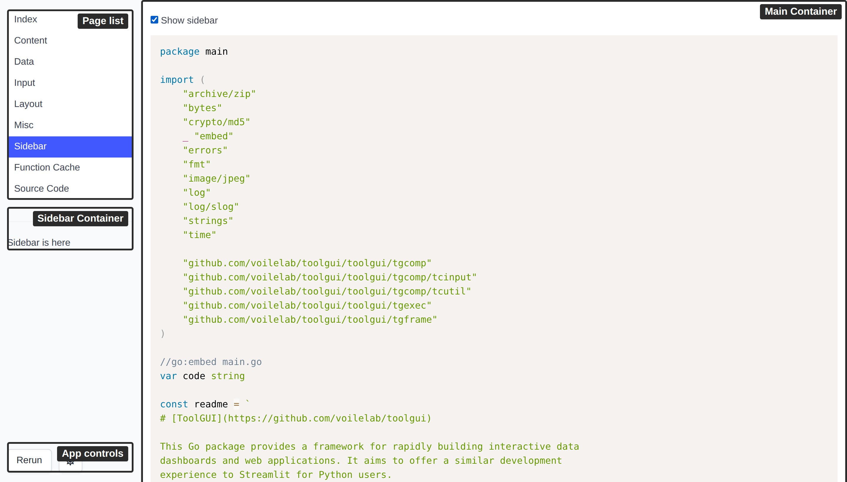
Main and Sidebar is the root container component of the main and sidebar part
shown in the layout image.
We can show a text in the Main container by:
tgcomp.Text(p.Main, "Hello")
The State in Params provided for
- The component that need to pass state. For example: the checked state of checkbox.
- The state that user need to store. For example: The todo items in the Todo App.
Page query
Query is the page query the page was opened with. It sits right after the
page name, wherever the name is:
| Mode | URL | Query |
|---|---|---|
| Web, path mode | /detail?group=a | group=a |
| Web, hash mode | /#/detail?group=a | group=a |
| Browser build | /?embed=1#/detail?group=a | group=a |
The real query string in hash mode (?embed=1) is the app's, not the page's.
On the desktop there is no address bar, and the query comes from a
Page Link.
Query is never nil: a page opened without a query gets an empty one. Each run
gets its own copy. It stays the same for every run until the page calls
ReplaceQuery.
It is untrusted input. Anyone can build a link and send it to a user.
Validate what you read: look a value up in a known set, and never use it as a
path, a command or SQL without checking it. The framework never writes it into
the State. To seed an input from it, set the input's default; once the user
picks something, the state wins:
func Detail(p *tgframe.Params) error {
	group := p.Query.Get("group")

	conf := &tgcomp.SelectConf{}
	if def := slices.Index(groups, group); def >= 0 {
		conf.SetDefault(def)
	}
	idx := tgcomp.Select(p.Sidebar, "Group", groups, conf)
	...
}
A query over 8 KiB encoded (tgframe.MaxQuerySize) is refused: the page does
not open, the same as a page name the app does not have.
To link to a page with a query, use Page Link.
Writing the query back
ReplaceQuery writes the user's choice back into the address bar, so a copied
URL opens the page as it is now:
q := url.Values{}
if idx != nil {
	q.Set("group", groups[*idx])
}
p.ReplaceQuery(q)
- No reload, no new session, and no history entry: Back still leaves the page.
- It replaces the whole page query. Pass every key you want to keep.
- It takes effect when the run ends. A run cut by a newer event changes nothing, and the last call of a run wins.
- Later runs read the new value as
Query, and so does a reconnect. - Over 8 KiB encoded, it fails the run (
run.err) and the address bar stays. - On the desktop there is no address bar; the query is only kept in memory.
Opening another page
Navigate opens another page from code, as a click on a
Page Link would. Use it when there is
nothing to click, such as a DataFrame row picked:
sel := tgcomp.DataFrame(p.Main, head, rows,
	&tgcomp.DataFrameConf{Selection: tgcomp.SelectionModeSingle})
if len(sel) == 1 {
	p.Navigate("detail", url.Values{"id": {ids[sel[0]]}})
}
- The new page gets a new session and a new state, and a history entry: Back returns here.
- It takes a page name of this app, never a URL. An unknown page or a query over 8 KiB fails the run, and the page stays.
- It takes effect when the run ends. A run cut by a newer event goes nowhere,
the last call of a run wins, and it wins over
ReplaceQuery.
Testing
In a test, open the page with tgtest.WithQuery, read what ReplaceQuery
left with Page.Query, and where Navigate went with Page.Navigated:
p := tgtest.Open(t, app, "detail", tgtest.WithQuery(url.Values{
	"group": {"a"},
}))
p.GetByLabel("Group").Select(2)
p.Query().Get("group") // "c"

page, q, ok := p.Navigated() // "detail", id=0004, true
Interrupting a run
A page function runs again on every event, and the run before it is cut short.
Context is how that reaches the work the page does: it is cancelled when a
new event arrives, or when the session closes.
Hand it to anything slow, and the user moving on stops the work instead of leaving it to finish into a screen nobody is looking at:
func Main(p *tgframe.Params) error {
	req, err := http.NewRequestWithContext(p.Context, "GET", url, nil)
	if err != nil {
		return err
	}

	resp, err := http.DefaultClient.Do(req)
	...
}
A page function that ignores Context is still interrupted, but only at the
next component it draws — a run that computes for a while without drawing
anything holds the next event until it gets there.
Returning the cancellation is fine: a cut run reports nothing to the client, since the run replacing it is about to paint the screen anyway, and it leaves the components of the last finished run in place — a click or an upload naming one of them still lands.
Example for adding a page
- No emoji icon
app.AddPage("index", "Index", Main)
- With a emoji icon
app.AddPageByConfig(&tgframe.PageConfig{
	Name:  "page2",
	Title: "Page2",
	Emoji: "🔄",
}, Page2)
- Reached by url, not off the nav
app.AddPageByConfig(&tgframe.PageConfig{
	Name:   "page3",
	Title:  "Page3",
	Hidden: true,
}, Page3)
Page name in the URL
By default the web executor serves each page at its own path, /{name}, and
redirects / to the first page added.
An app served from a static path — or opened from a file — cannot rely on the
server routing those paths. SetHashPageNameMode moves the page name into the
URL fragment, /#/{name}, so every page is served from /:
app.SetHashPageNameMode(true)
The fragment starts with #/, not a bare #. For a page named novel:
http://localhost:3000/#/novel   ✓ opens novel
http://localhost:3000/#novel    ✗ not a page link
With no fragment, the first page added is shown.
Web Manifest
A browser reads /manifest.json to name the app, pick its icons, and decide
how it looks when it is installed to a home screen. WebExecutor serves that
file, so an app configures it in Go:
e := tgexec.NewWebExecutor(app)
e.SetManifest(&tgexec.Manifest{
	Name:      "My Tool",
	ShortName: "My Tool",
	Icons: []tgexec.ManifestIcon{
		{Src: "/assets/icon.png", Type: "image/png", Sizes: "512x512"},
	},
	Display:         "standalone",
	ThemeColor:      "#000000",
	BackgroundColor: "#ffffff",
})
e.StartService("127.0.0.1:3001")
toolgui ships no icon of its own, so an app that wants one serves the file itself: see Serving your own files below. Empty fields are left out of the served json, so the manifest holds only what the app sets.
SetManifest(nil) goes back to the default, which an app that never calls it
serves too: tgexec.DefaultManifest(), named after the
app title when it has one.
Serving your own files
SetAssets puts an fs.FS under /assets/, which is where a manifest icon,
or any other file the app hands the browser, comes from:
//go:embed assets
var assets embed.FS

func main() {
	// ...

	e := tgexec.NewWebExecutor(app)

	// assets/icon.png is served at /assets/icon.png.
	sub, _ := fs.Sub(assets, "assets")
	e.SetAssets(sub)

	e.SetManifest(&tgexec.Manifest{
		Name: "My Tool",
		Icons: []tgexec.ManifestIcon{
			{Src: "/assets/icon.png", Type: "image/png", Sizes: "512x512"},
		},
	})

	e.StartService("127.0.0.1:3001")
}
The files at the root of the fs are what /assets/ shows, so os.DirFS works
the same way. Without a SetAssets call, /assets/ holds nothing.
Both setters read their value per request, and both are safe to call while the server is already serving, so an app can swap its manifest or its files at any point in its own run.
Head HTML
Crawlers run no script, so meta tags they read, such as Open Graph, Twitter
card or CSP, have to be in the page itself, as do font links and analytics
tags. SetHeadHTML inserts html at the start of the page head, right after the
charset meta, so a CSP meta covers the links after it:
e.SetHeadHTML(`<meta property="og:title" content="My Tool" />
<meta property="og:image" content="https://example.com/assets/og.png" />`)
Like the other setters, it is read per request and safe to call at any time.
The browser app takes it as -head.
Other members
Extra carries the manifest members the struct doesn't name, and a key there
wins over the field of the same name:
e.SetManifest(&tgexec.Manifest{
	Name: "My Tool",
	Extra: map[string]any{
		"categories": []string{"utilities"},
	},
})
The browser app has no server to serve it from, so its manifest is a build flag instead. Only the desktop executor has no manifest: the desktop app is not installed through a browser.
State Storage
ToolGUI stores data at three levels, longest lived first:
- App Cache: for the whole process, shared by every user. Not provided by ToolGUI — the developer implements it.
- Session Cache: for one user's connection to the app.
- State Cache: for the page currently shown, through
p.State.
In a wasm build, the Persistent Store also keeps data across reloads.
Why cache at all:
-
Faster access: Frequently used data can be retrieved from the cache much faster than recalculating it or fetching it from an external source every time. This improves the application's overall performance.
-
Reduced resource usage: By avoiding redundant calculations and external data fetching, the app can conserve resources like CPU and network bandwidth.
Two paths to the same state: p.State and c.State
A page function gets the state as p.State; a container carries the same
*State as c.State. They are the same object — App.Run hands one state to
the page function and to every container of that run — so neither sees
anything the other does not, and both are kept.
Which one to use follows from what is in hand:
- Page code takes a
*tgframe.Params, so it readsp.State. - A custom component takes a
*tgframe.Containerand nothing else, soc.Stateis how it reaches the state at all. That is the reason the field exists: a component has to be callable anywhere a container is — inside a layout, inside a slot — without the page function handing it anything.
A component that reaches for p.State has taken a dependency on the page it
was first written in, and stops working in the next one.
A container built directly with NewContainer carries whatever state its
caller passed, which may be nil. A component that has to work there checks
for it, the way Dialog does.
Reading a value out of the state
p.State holds any, so every getter has to answer what happens when the
value is not the type asked for. None of them panic. There are three, and
they differ in what they mean by "the right type":
| Getter | Reads | Misses as |
|---|---|---|
Get[T] | a value stored as a T, and nothing else | zero value, false |
GetNumber[T] | any number, as a T | zero value, false |
GetObject | anything, through a JSON round trip | leaves out alone |
Get[T] is a plain type assertion, and the one to reach for by default:
name, ok := p.State.Get[string]("name")
State.Default[T] is the same idea for a value the page mutates. It stores
the default the first time round and hands back a pointer, so what the page
writes through it is what the next run reads:
todoList := p.State.Default("todoList", TODOList{})
todoList.Add("buy milk")
Numbers are the one place a type is not taken literally, and GetNumber[T] is
why. The frontend sends every number as JSON, so an event lands a float64
whatever the component's own type is, while a default written from Go code
carries whichever integer type was at hand. GetNumber reads either, so
Set(key, 30), Set(key, int64(30)) and Set(key, 30.0) are the same value:
age, ok := p.State.GetNumber[int]("number_component_Age")
An integer is read exactly, so an id past 2^53 comes back as it went in. A
float read as an integral T truncates, and a number T cannot hold is
absent rather than whatever the conversion produced. A page's own numeric
type — a type Count int — counts as a number on both sides. A string does
not: Set(key, "30") reads back as false.
GetObject is the third one, and it is not a getter for a type so much as a
decoder. It marshals what the key holds and unmarshals it into out, so a
value the client sent as a JSON array reads back into the []int or the
struct it stands for — which Get[[]int] would miss, because what the state
is holding is a []any:
var idxes []int
err := p.State.GetObject("multiselect_component_Fruit", &idxes)
So: Get[T] for a value the page itself wrote, GetNumber[T] for a number
from either side, and GetObject for a composite value the client sent. A
missing key is not an error for GetObject: out is left as it was.
Setting an input's initial value
An input reads its value from the state under its own id, so writing that key before the component runs is what the page reads back from it:
func Main(p *tgframe.Params) error {
	if _, ok := p.State.GetNumber[float64]("number_component_Age"); !ok {
		p.State.Set("number_component_Age", 30)
	}

	age, _ := tgcomp.Number[int64](p.Main, "Age") // 30, before anyone types
	...
}
The guard matters: Set on every run overwrites what the user just typed. Use
the getter that matches the stored value — GetNumber for a numeric key,
since Get[float64] would miss a default the page itself wrote as an int.
What Set does not do is fill in the field on screen. The state lives on the
server and is never sent to the client; the widget starts from the component's
own Conf.Default, and the browser only learns a value once someone enters
one. So a page that only writes the key reads 30 while showing an empty box.
To have both, write the key and set the conf:
p.State.Set("number_component_Age", 30)
age, _ := tgcomp.Number(p.Main, "Age", &tgcomp.NumberConf[int64]{Default: 30})
Every input that has a value to start on takes a Default in its conf, so
writing the key directly is a thing to reach for only when the value is not
known where the component is written. FileUpload is the exception, for the
reason its page gives.
The key is <component name>_<label>, unless the component was given an
explicit ID in its conf, in which case the key is that id verbatim.
| Component | Key | Stored value |
|---|---|---|
Textbox | textbox_component_<label> | string |
Textarea | textarea_component_<label> | string |
CodeInput | code_input_component_<label> | string |
Number | number_component_<label> | any number |
Checkbox | checkbox_component_<label> | bool |
Select | select_component_<label> | item index, 1-based; 0 is "nothing selected" |
Radio | radio_component_<label> | item index, 0-based |
MultiSelect | multiselect_component_<label> | item indices, 0-based, as a list; [] is "nothing selected" |
DatePicker | datepicker_component_<label> | string, 2006-01-02 |
TimePicker | datepicker_component_<label> | string, 15:04 |
DateTimePicker | datepicker_component_<label> | string, 2006-01-02T15:04 |
Select and Radio disagree on the base, which is the one asymmetry to watch
for. The frontend's select has a placeholder as its first option, so Go
numbers the real items from 1 and keeps 0 for "nothing selected"; radio has no
placeholder and numbers from 0, using an unset key for "nothing selected".
Neither shows through the API — both return a 0-based index, take a 0-based
Conf.Default, and give nil when nothing is selected — so it only bites
when writing the key directly. To preselect the second item:
p.State.Set("select_component_Fruit", 2) // 1-based
p.State.Set("radio_component_Fruit", 1)  // 0-based
Both drop an index that points outside items — a selection left over from a
run of a longer list reads as nothing selected, rather than as an index the
page would go on to use. Which is what Conf.Default is for, and it is
0-based for both:
tgcomp.Select(p.Main, "Fruit", fruits, (&tgcomp.SelectConf{}).SetDefault(1))
tgcomp.Radio(p.Main, "Fruit", fruits, (&tgcomp.RadioConf{}).SetDefault(1))
MultiSelect numbers from 0 like Radio, and holds a list rather than one
index, so an empty list is a selection of nothing and an absent key is what
falls back to the conf's Default:
p.State.Set("multiselect_component_Fruit", []int{0, 2})
The pickers parse the string they read, and a value in the wrong format fails
the run rather than being ignored, so write the format in the table exactly.
An empty string is the one they do read: it is the app user having cleared the
picker, and reads back as nil rather than as a default to fall back to.
App Cache
An app-level cache stores data for the entire duration of the application's execution, from launch to termination.
This cache is not provided by ToolGUI and needs to be implemented by the developer.
For example:
type App struct {
	data sync.Map
}

func (app *App) QueryData(key string) any {
	if v, ok := app.data.Load(key); ok {
		return v
	}

	// calculate the value, then keep the first one stored
	calVal := calculate(key)
	v, _ := app.data.LoadOrStore(key, calVal)
	return v
}

func (app *App) Page1(p *tgframe.Params) error {
	tgcomp.Text(p.Main, app.QueryData("key").(string))
	return nil
}
Loading in the background
A cache that takes long to fill should not hold up the service. Start the
service right away, fill the cache in a goroutine, and let the page draw a
loading screen until it is ready. When the load finishes, RerunAll reruns
the pages already open, so they show the data without the user doing
anything:
type App struct {
	tgApp *tgframe.App

	mu   sync.RWMutex
	data *Data // nil until loaded
	err  error
}

func (app *App) load() {
	data, err := loadData() // slow

	app.mu.Lock()
	app.data, app.err = data, err
	app.mu.Unlock()

	// Pages opened during the load still show the loading screen.
	app.tgApp.RerunAll()
}

// snapshot returns what is loaded so far; data is nil while loading.
func (app *App) snapshot() (*Data, error) {
	app.mu.RLock()
	defer app.mu.RUnlock()
	return app.data, app.err
}

func (app *App) Page1(p *tgframe.Params) error {
	data, err := app.snapshot()
	if err != nil {
		return err
	}

	if data == nil {
		tgcomp.Spinner(p.Main, "Loading data...")
		return nil
	}

	tgcomp.Text(p.Main, data.Summary())
	return nil
}

func main() {
	tgApp := tgframe.NewApp()
	app := &App{tgApp: tgApp}
	tgApp.AddPage("page1", "Page1", app.Page1)

	go app.load()

	// Serves at once; load() keeps running in the background.
	tgexec.NewWebExecutor(tgApp).StartService("127.0.0.1:3000")
}
The page func must not wait for the load: draw the loading screen and return.
A page blocked on the load keeps its session busy, and the user gets no answer
until it finishes. Store the loaded data with one assignment, as load()
does, so a run sees either nothing or all of it.
RerunAll returns at once. It never cuts a run in flight, since that would
drop the button click the run is handling: a page in the middle of a run is
rerun once that run ends, and calls made meanwhile fold into that one rerun.
RerunPage("page1") reruns only the pages named.
A reload button
The same call makes a "reload data" button that updates every open page, not only the one it was pressed on:
func (app *App) Page1(p *tgframe.Params) error {
	if tgcomp.Button(p.Main, "Reload data") {
		go app.load()
	}

	// ...draw from app.snapshot() as above
	return nil
}
Load in a goroutine rather than in the page func, so the run that handled the
click ends at once. Pages, the one with the button included, rerun with the new
data when load() calls RerunAll. To show the loading screen while it runs,
clear app.data before starting the load.
In wasm
In a wasm build the process is one browser tab, so a Go global is the app state for that tab and for one user. That is a valid place for data the page needs across page switches, for example the submissions made so far. It lasts until the tab reloads or closes.
For data that has to survive a reload, such as drafts and records, use the persistent store.
Additional Considerations:
-
Cache Invalidation: As the application runs, the underlying data sources might change. It's crucial to have a strategy to invalidate cached data when necessary to ensure consistency. This could involve periodically refreshing the cache or implementing mechanisms to detect changes in the source data.
-
Memory Usage: App-level caches can consume memory. It's essential to choose appropriate data structures and cache eviction policies to balance performance gains with memory constraints.
Session Cache
Session-level cache stores data for one user's connection to the app.
ToolGUI has no separate API for it: the State is the session cache.
A session holds exactly one State, so everything on
State Cache applies here too. What is worth knowing is how
long a session lives, which is up to the executor.
Web executor
The executor keeps a pool of states, each with a state_id:
- The client opens the update websocket and sends the
state_idit has, or an empty one on the first connection. - The server hands back a new
state_idwhen the client has none, or when the one it sent is gone. The client drops the components it drew and starts over on the fresh state. - The state is marked alive while the socket is open. On disconnect it stays in the pool, so a reconnect resumes on the same state.
A state that is no longer alive expires 5 minutes after its last use. The pool is swept when a new state is created, at most once per timeout, so an expired state may outlive the timeout on an idle server.
The pool holds 1024 states at most. A connection that asks for one when the
pool is full, and nothing in it can be reclaimed, is refused with an error and
left to retry — another page closing frees a state. SetMaxStateCount changes
the limit:
e.SetMaxStateCount(64)
The state_id lives only in the page's JavaScript. A reload, or navigating to
another page, always starts a new session with an empty state.
Desktop executor
One window is one session. Start(pageName) closes the previous session and
runs the new page on an empty state, the same as loading another page in the
browser.
What does not belong here
Data that should outlive a session — anything shared by all users, or expensive enough to compute once per process — belongs in an App Cache.
State Cache
State-level cache stores data specific to the current view or "page" displayed to the user. This data is lost when the user navigates away from the page or refreshes it.
Example of variable
Here we provide a state-level TODO App example. It stores the list of todos in the state, so it survives a rerun:
type TODOItem struct {
	ID   int    `json:"id"`
	Text string `json:"text"`
	Done bool   `json:"done"`
}

type TODOList struct {
	Items  []TODOItem `json:"items"`
	LastID int        `json:"last_id"`
}

func (t *TODOList) Add(text string) {
	t.LastID++
	t.Items = append(t.Items, TODOItem{ID: t.LastID, Text: text})
}

func Main(p *tgframe.Params) error {
	tgcomp.Title(p.Main, "Example for Todo App")

	todoList := p.State.Default("todoList", TODOList{})

	inp := tgcomp.Textbox(p.Main, "Add todo")
	if tgcomp.Button(p.Main, "Add") && inp != "" {
		todoList.Add(inp)
	}

	for i, item := range todoList.Items {
		// The ID ties the checkbox to the item instead of to its position,
		// so its value follows the item when the list changes.
		todoList.Items[i].Done = tgcomp.Checkbox(p.Main, item.Text,
			&tgcomp.CheckboxConf{
				ID: fmt.Sprintf("todo_%d", item.ID),
			})
	}

	return nil
}
Two things the state makes easy to get wrong:
- A component is sent to the client as soon as it's created, so anything that changes the list has to run before the list renders. Removing an item after the loop leaves it on screen until the next run.
- A component's value is only known once it's rendered. Writing it back to the
state, as
Doneabove, is what lets the next run act on it before rendering.
cmd/toolgui-todo
is the runnable version of this example, with removal on top of it:
task run_todo
Example of function
SetFuncCache and GetFuncCache are a state-level cache for what a run
computed and the next run would rather not compute again. The value is typed:
GetFuncCache[T] reads back a T, and a key holding something else reads as
a miss rather than panicking the page.
The key is the whole of the namespace. Two calls naming the same key read and write the same entry, wherever in the page they are written, so moving a pair of calls into a helper function keeps them hitting the same entry. That also means a key has to say what the value was computed from — the inputs, or a hash of them — or a later run reads back a result for inputs it no longer has. Naming the function in the key, as below, keeps two functions that cache on the same inputs apart.
SetFuncCache only adds: every new key is another entry, kept until the
state goes away. DeleteFuncCache removes one, and Memo keeps the cache
bounded for the common case, a value recomputed whenever its input changes.
Memo(slot, key, fn) returns what fn computed for key, calling fn only
when slot does not already hold key. A slot holds only its latest key, so
a new input replaces the old result instead of piling up beside it. An error
from fn is returned and not kept.
// getFiles unarchive cbz file and return list of file names,
// since unarchive is time-consuming, we memo the result
func getFiles(p *tgframe.Params, f *tcinput.FileObject) ([]string, error) {
	// The upload stays on disk, so both the key and the archive are read
	// through a stream instead of a copy of the file.
	fp, err := f.Open()
	if err != nil {
		return nil, err
	}
	defer fp.Close()

	hash := md5.New()
	if _, err := io.Copy(hash, fp); err != nil {
		return nil, err
	}

	// The slot keeps only the latest file's list.
	key := fmt.Sprintf("%s_%s_%x", f.Name, f.Type, hash.Sum(nil))

	return p.State.Memo("getFiles", key, func() ([]string, error) {
		cbzFp, err := zip.NewReader(fp, int64(f.Size))
		if err != nil {
			return nil, err
		}

		ret := []string{}
		for _, f := range cbzFp.File {
			ret = append(ret, f.Name)
		}
		return ret, nil
	})
}

func FuncCachePage(p *tgframe.Params) error {
	cbzfile := tgcomp.FileUpload(p.Sidebar, "CBZ File", "application/x-cbz")

	if cbzfile == nil {
		return nil
	}

	files, err := getFiles(p, cbzfile)
	if err != nil {
		return err
	}

	for i, f := range files {
		tgcomp.Text(p.Main, fmt.Sprintf("%d: %s", i, f))
	}

	return nil
}
Persistent Store (wasm)
How tgwasm.Store (toolgui/tgwasm/store.go) works. For usage, see
Keeping data across reloads.
A Go function on the JavaScript callback stack cannot block, and every browser
storage API except a sync access handle answers with a promise. So the store
uses OPFS with a sync access handle, the same approach as
tgframe/file_opfs.go. Only opening the handle is async, once per store.
IndexedDB is ruled out: it has no synchronous API.
The log
- In memory. The whole store is a
map[string][]byte.GetandKeysnever touch the file. It is meant for KB to MB of data, not for a database. - Write-through.
SetandDeleteappend one record andflush()before they return. The map is updated only after the write succeeds, so a write over quota keeps the old value. - A failed append is undone. The file is truncated back to its length before the append, so a later record is not lost behind a partial one. If that fails too, the store is broken and every later write returns the error.
- Records have a length and a CRC. On open, a record cut short at the tail is dropped. A corrupt record in the middle fails the load.
- Compaction on open. When the log is more than twice the compacted size plus 64 KiB, the live data is written to the other of two files under a higher generation, ended with a commit record. The old file is left until the next compaction, so a crash loses nothing. On open, the newest committed generation wins. A failed compaction empties the other file and keeps the old one. Read-only tabs never compact.
toolgui-kv/            separate from toolgui-state, so the upload sweep skips it
  <name>/              [a-z0-9-]+
    .lock              its sync access handle is held while the store is open
    a, b               generations of the log
Opening without blocking boot
worker.ts expects the bridge to exist when the Go program first blocks, so
OpenStore returns at once and loads on its own goroutine, like
opfsStateRoot.
- Before
Runinstalls the bridge, methods returnErrBeforeRun. - After
Run, the first call waits for the load. Page functions run on the bridge's run goroutine, not the callback stack, so that is safe.
Multiple tabs
A sync access handle is exclusive. The tab that gets the .lock handle owns
the store. A tab refused it (NoModificationAllowedError) reads the newest
committed generation with getFile() and opens read-only, retrying a few times
if the owner changes the file mid-read. Keeping the previous generation means
at least one file is complete even during a compaction.
A read-only tab answers from its snapshot, returns ErrReadOnly on writes, and
stays read-only until reload. BroadcastChannel coordination and
readwrite-unsafe handles were rejected as too complex and Chrome-only.
Failures
Never a silent fallback to memory. No dedicated worker or no secure context
fails the load, and every method returns that error. persist() is not called,
since some browsers prompt for it.
Other executors
- Web: none. A server-side store would be shared by every user.
- Wails: none yet. It can write under
os.UserConfigDir()directly. The method set fits a file-backed version, so atgframeinterface can come with a second implementation.
Out of scope
- Upgrading a read-only tab in place, or live updates across tabs.
- Large data and blobs: use the file store.
- Transactions across keys: keep related data under one key.
Components
Component Tree / Forest
When every component created, we need to assign where it should generate. The root will be Main Container or Sidebar Container. Hence the relation between components is trees.
For example, if a page function implements as:
tgcomp.Text(p.Main, "Text")
tgcomp.Button(p.Main, "Button")
box := tgcomp.Box(p.Main)
tgcomp.Text(box, "Text1")
tgcomp.Text(box, "Text2")
Then the Component Tree will be:
---
config:
  look: handDrawn
---
graph TD
    Main --> Text1[Text]
    Main --> Button
    Main --> Box
    Box --> Text2[Text]
    Box --> Text3[Text]
One shape for every component
Every component reads the same way: the container first, then whatever the component is for, then an optional conf.
func Text(c *tgframe.Container, text string, conf ...*TextConf)
func Button(c *tgframe.Container, label string, conf ...*ButtonConf) bool
func Select(c *tgframe.Container, label string, items []string, conf ...*SelectConf) *int
The conf is variadic so that the common call carries nothing:
tgcomp.Button(p.Main, "Save")
tgcomp.Button(p.Main, "Save", &tgcomp.ButtonConf{ID: "save_all", Disabled: true})
Zero or one conf; two is a mistake rather than something to merge, and panics
with the component's name in the message. An explicit nil means the same as
none.
Every conf embeds tgframe.Base,
which is where its ID comes from — the field is not declared per component,
and the framework reads it through the embed rather than through a getter per
conf.
type Base struct{ ID string }

type ButtonConf struct {
	tgframe.Base
	Color    tcutil.Color
	Disabled bool
}
Go version
Writing &ButtonConf{ID: "save_all"} — a promoted field as a key in a
composite literal — needs the calling file to be at language version Go
1.27 or above. That is the only version-dependent thing a user of toolgui
touches, and toolgui's own go.mod says go 1.27.1, so a module that
depends on it is already above that line.
What a component hands back
Most components hand back what the user did — Button a bool, Textbox a
*string — or nothing at all. The few that hand back something the page
function operates later follow one rule, so that a caller wrapping toolgui
in an abstraction of its own knows what to expect and can name the type:
- A place the page can write and write over is a slot,
*XxxSlot, and is written throughWithand emptied throughClear. - Something whose only follow-up is one teardown is a
func(): call it, and the component is gone. - Anything else is a handle,
*XxxHandle, with named methods for what it can do. The one that takes it off the page, where there is one, isRemove.
Every one of these types is exported, so a handle can be declared as a variable, kept in a struct field, passed to a function, and named in an interface.
| Component | Hands back | Finished with |
|---|---|---|
Empty | *EmptySlot | With / Clear |
Spinner | func() | call it |
Status | *StatusHandle | Complete / Fail |
ProgressBar | *ProgressBarHandle | Remove |
Container is not one of these words. Box, Column, Form and Expand
hand out a *tgframe.Container, which is a place components are added to, as
many as the page function likes. A slot is written whole and rewritten whole,
and a handle is neither — which is why the slot is EmptySlot and the handle is
StatusHandle.
Status.Error is likewise now Status.Fail, with Error kept and deprecated:
the old name reads like the error interface, which a status does not
implement. Both take at most one closing label — two or more is a mistake
rather than something to join, and panics, the way passing two confs does.
Identity: position and id
A page function runs again from the top on every interaction and writes every component again. Two questions follow from that, and they have different answers.
Which component is this, across runs? Its position. A container counts the
components written into it, so the second component in the main container is
container_component_container_main/1 on every run, whatever it contains.
Nothing compares content, so writing the same thing twice is fine:
tgcomp.Text(p.Main, "same")
tgcomp.Text(p.Main, "same")
Both render. A component that keeps its position keeps its identity, so its props are updated in place instead of it being torn down and rebuilt.
Where is this component's state stored? Its id, derived from the
component's type and its label: Button(c, "Save") is button_component_Save.
A component claims one when it holds state, whether that state lives in Go —
every input component — or only in the browser: Tab remembers which tab is
open, Expand whether it is open, JSON which nodes are collapsed, and
Iframe sends events back.
Components that only display something — Text, Markdown, Divider,
Title, Table and the rest — have no id at all unless you give them one.
An id is a name, so two components cannot share one. Two identical buttons
have the same id and the page fails with duplicated component id:
tgcomp.Button(p.Main, "Save")
tgcomp.Button(p.Main, "Save")   // error
Give one of them its own id to tell them apart. There is one way to do that,
and every component takes it: Conf.ID.
tgcomp.Button(p.Main, "Save")
tgcomp.Button(p.Main, "Save", &tgcomp.ButtonConf{ID: "save_all"})

tgcomp.Expand(p.Main, "Details", false)
tgcomp.Expand(p.Main, "Details", false, &tgcomp.ExpandConf{ID: "second_details"})

tgcomp.Text(p.Main, "Value: 3", &tgcomp.TextConf{ID: "count_result"})
The display components take it the same way, which is what to reach for when a
test or a stylesheet needs to name one in particular. So do the layout
components: Box, Column, Form and the rest are configured through their
conf like everything else, and the containers they hand out derive their ids
from theirs.
An id given this way is also the element's id in the DOM.
The name in front of the id
A component does not take the conf id as-is: it prefixes it with its own name,
so &tgcomp.ButtonConf{ID: "save"} is the component button_component_save.
That is what keeps a Button and an Expand given the same "save" apart.
It matters as soon as Go code asks about a component by id, because the
prefixed value — not the one written in the conf — is what the state is keyed
by and what State.GetClickID() returns:
// Never true: GetClickID returns "button_component_save".
if p.State.GetClickID() == "save" {
Each component package hands out the getter that adds the prefix for you:
if tgcomp.ButtonClicked(p.Main, "Save") {
These getters read the run's state rather than the component, so they can be asked before the component is drawn. That is what a page needs when the button sits below the content it changes: handle the click first, then write the new content once, instead of sending the old content out and rewriting the whole slot.
They all name the component the same way: the container, plus the same arguments and conf the draw call gets. The getter derives the id from those, exactly as the draw call does, so the id is never written twice:
| Getter | Names the component by |
|---|---|
ButtonClicked | the container, plus the same label and conf the Button call got |
DownloadButtonClicked | the container, plus the same text and conf the DownloadButton call got |
DownloadFileClicked | the container, plus the same text and conf the DownloadFile call got |
IframeValue | the container, plus the same html and conf the Iframe call got |
PluginValue | the container, plus the same src and conf the Plugin call got |
The two download getters leave out the body the draw call takes: those ids
come from the text, not from the file. IframeValue keeps its html, whose
hash is the iframe's default id.
None of them draw anything — a getter reads, only the draw call adds a component — so it is fine to ask and then draw, in that order, in the same run.
The click id comes from the client, and a getter asked before the page has
written anything has nothing of this run to check it against. So the Clicked
getters check it against the ids the last run drew: a click naming a button
that was not on the screen is not a click. Button needs no such check — it
reports a click only where the button is actually written — which is why
asking by hand, with GetClickID() and a prefix of your own, is not the same
thing.
Scoping ids in a helper
A helper that draws inputs — say addressForm(c) —
claims the same ids every time it is called, so calling it twice on one page
fails with duplicated component id. Container.Scope fixes that without
threading a prefix through the helper:
func addressForm(c *tgframe.Container, kind string) {
	c = c.Scope(kind)

	// "@billing/textbox_component_City"
	tgcomp.Textbox(c, "City")

	// "@billing/button_component_save"
	tgcomp.Button(c, "Save", &tgcomp.ButtonConf{ID: "save"})
}

addressForm(p.Main, "billing")
addressForm(p.Main, "shipping")
The scoped container writes into the same place as c; only ids change.
Derived ids and Conf.ID alike get the prefix, and so does everything in the
containers opened from it — Box, Column, Form, Dialog, slots. Scopes
nest: c.Scope("a").Scope("b") gives @a/b/<id>. The getters above take the
container, so ButtonClicked(c, "Save") on the scoped c asks about the
scoped button.
A scoped id is @, the scopes and the id joined by /, with % and / in
each part escaped, so neither a label nor a scope name can make two different
scopings read the same, and no unscoped id starts with @. Without Scope,
ids are exactly as before.
To name a scoped component outside the page — in a tgtest test, or when
reading state by hand — use tgframe.ScopedID, or c.ScopedID from the
container:
p.Get(tgframe.ScopedID("button_component_save", "billing")).Click()
Scoping is opt-in: nothing scopes by container position on its own, since that would change the state key of every existing app.
Writing one place more than once
A page function normally writes each place once per run. A slot — what
Empty hands out, and what Spinner and
Status are built on — is the exception: it can be written, cleared and
written again while the run is still going, so the page can show "querying…"
and then replace it with the result.
A slot keeps one key across every write. Clearing it sends a delete for that key, and the client drops the node and the subtree under it; the next write creates a node there again. The alternative — a fresh key per write — would save the delete, but it would leave the client holding a node per write until the run ended, and it would move the slot's contents in the tree every time, so nothing inside could keep anything across a redraw.
Keeping the key means an id written into the slot is claimed again on the next write, and an id is a name that only one component may hold. So clearing a slot gives its ids back: what was in it is off the screen, and the id is free for the next write to claim.
slot := tgcomp.Empty(p.Main)
for range names {
	// The same id every time, and no `duplicated component id`: each
	// textbox is gone before the next one is written.
	slot.With(func(c *tgframe.Container) {
		tgcomp.Textbox(c, "Name")
	})
}
An id that is given back and never claimed again names nothing on the page by the end of the run, so the state under it is dropped. That is the point: a widget cleared out of a slot should not hand its old value to whatever lands on its id next run. An id that is claimed again — the common case, where the slot is rewritten with the same widget — keeps its state, because the claim takes it back off the released list.
Two things follow for a page function. The container a slot's With hands
over is only good until the next With or Clear, so take it in the callback
rather than keeping it. And a slot starts empty on every run, whatever the
last run left in it, so the first write of a run is not stacked on the last
write of the one before.
Where tgcomp comes from
Each built-in component lives in a tgcomp/tc* package. tgcomp itself is
generated: a declaration marked with a //tgcomp:export directive at the end
of its doc comment is forwarded, a func by a wrapper, a type by an alias and a
const group by a group of the same names, with the doc comment copied.
// Box create a box container.
//
//tgcomp:export
func Box(c *tgframe.Container, conf ...*BoxConf) *tgframe.Container {
After adding or changing a marked declaration, run go generate in
toolgui/tgcomp. A test fails while the generated files are stale.
Custom Components
ToolGUI ships a fixed set of components, but a page function is ordinary Go, so the set is not the limit. There are three ways to add something of your own, and they cost very different amounts of work. Start at the top.
A function over the built-ins
Most of what people call a custom component is a fixed arrangement of components that already exist. That is a function taking a container:
// MetricConf is the configuration for Metric.
type MetricConf struct {
	tgframe.Base
}

// Metric shows a label with the value under it.
func Metric(c *tgframe.Container, label string, value float64, conf ...*MetricConf) {
	cf := tgframe.OneConf("Metric", conf)

	box := tgcomp.Box(c, &tgcomp.BoxConf{ID: cf.ID})
	tgcomp.Text(box, label)
	tgcomp.Title(box, strconv.FormatFloat(value, 'f', 2, 64))
}
Nothing registers it and nothing knows it exists: by the time the run reaches the frontend it is a box with two components in it.
Write it in the shape the built-ins have. Container first, then the data,
then a variadic conf embedding tgframe.Base. That is not decoration: the
embed is what gives your conf an ID, tgframe.OneConf is the shared helper
that turns "none, or one" into a conf you can read without a nil check, and
tgframe.SetConfIDIn is what puts the conf's id on a component, under the
container's scope (a component that
does not embed tgframe.BaseComponent implements tgframe.ScopedIDSetter
to take it). A third-party component that does this is configured exactly
like a built-in one, and the caller does not have to learn which is which.
tgcomp.Text(p.Main, "Revenue")
Metric(p.Main, "Revenue", 12.5, &MetricConf{ID: "revenue"})
Two things to watch for.
Ids have to stay unique. Everything stateful inside your function claims
an id, and two calls on one page claim it twice, which fails the run with
duplicated component id. Pass the conf's id down to whatever inside needs
one, as Metric passes cf.ID to the box, or write the inside through
c.Scope(...) so every id under it gets a prefix of its own. Components that
hold no state — Text, Title, Markdown — have no id unless you give them
one, so a display-only function may never need to.
Reading a value back works the way input components work: the state is
keyed by id, so read it and return it. c.State is the same state the page
function has as p.State, and is how a component reaches it without the page
handing it anything. The shape does not change for a
component that returns something:
// CounterConf is the configuration for Counter.
type CounterConf struct {
	tgframe.Base
}

// Counter shows a number and a button that adds one to it.
func Counter(c *tgframe.Container, conf ...*CounterConf) int {
	cf := tgframe.OneConf("Counter", conf)

	id := cf.ID
	if id == "" {
		id = "counter"
	}

	count, _ := c.State.GetNumber[int](id)

	if tgcomp.Button(c, "+1", &tgcomp.ButtonConf{ID: id + "_button"}) {
		count++
		c.State.Set(id, count)
	}

	tgcomp.Text(c, strconv.Itoa(count))
	return count
}
A conf must not declare a field named ID of its own: the flat literal would
bind to that one, leave Base.ID empty, and nothing would report it.
&MetricConf{ID: "revenue"} needs the calling file at Go 1.27; see
Components for the fallback below that.
A component struct
A component is anything that can tell you its id:
type Component interface {
	GetID() string
}
Embed tgframe.BaseComponent
to get that for free, and every exported field becomes a prop: the component
is marshalled to JSON as it is and sent to the frontend.
type sparklineComponent struct {
	*tgframe.BaseComponent
	Points []float64 `json:"points"`
}

func Sparkline(c *tgframe.Container, points []float64) {
	c.AddComponent(&sparklineComponent{
		BaseComponent: &tgframe.BaseComponent{
			Name: "sparkline_component",
		},
		Points: points,
	})
}
Name is the type the frontend renders by. ID is the key its state is
stored under, and is only needed by a component that has state — see
Components for how the two differ from the position key the
container assigns.
When the data a component is handed will not do, report it through
Container.Fail rather than adding the component:
func Sparkline(c *tgframe.Container, points []float64) {
	if len(points) < 2 {
		c.Fail(tgutil.NewError("a sparkline needs at least two points"))
		return
	}
	...
}
The run records the error and carries on, so the rest of the page still renders and the user sees an error placeholder where the sparkline would have been. Panic only for a call no data could make right. See Error Handling for the split.
The catch is the other half. Name is looked up in a map that is fixed when
the web assets are built, and those assets are embedded into the Go binary,
so a name nothing renders does not draw a blank — it fails the page. Adding
a renderer means building your own frontend, which is a real fork of the
project, not an extension of it.
Riding on a component that already renders
The way to ship a component with its own rendering, without forking the frontend, is to build it out of one that the frontend already knows.
Iframe is the one meant for it. It takes
HTML, runs it sandboxed on an opaque origin, and gives the guest a
window.toolgui bridge: onRender for props and theme, update to write a
value back into the state, upload for files, autoHeight for sizing.
Wrap it, and the iframe becomes an implementation detail your callers never see:
// GaugeConf is the configuration for Gauge.
type GaugeConf struct {
	tgframe.Base
}

// gaugeValue is what the gauge's guest sends back.
type gaugeValue struct {
	Value float64 `json:"value"`
}

// Gauge draws a dial, and reports the value the user leaves it on.
func Gauge(c *tgframe.Container, value float64, conf ...*GaugeConf) float64 {
	cf := tgframe.OneConf("Gauge", conf)

	iframeConf := &tgcomp.IframeConf{
		ID:     cf.ID,
		Script: true,
		Height: "auto",
	}

	tgcomp.Iframe(c, gaugeHTML, iframeConf)

	// Until the guest sends one, the value the caller passed in stands.
	if v := tgcomp.IframeValue[gaugeValue](c, gaugeHTML, iframeConf); v != nil {
		return v.Value
	}

	return value
}
An interactive iframe needs an explicit ID: without one its id is a hash of
the HTML, which is not something a caller can name. IframeValue reads the
value rather than drawing a second iframe, so it takes the same html and
conf the Iframe call got.
Plugin is the same frame with the guest
shipped as files instead of a string. Register the files on the app and name
them by url:
//go:embed plugins/gauge
var gaugeAssets embed.FS

assets, _ := fs.Sub(gaugeAssets, "plugins/gauge")
app.AddPluginAssets("gauge", assets)
tgcomp.Plugin(c, tgframe.PluginAssetURL("gauge", "gauge.js"),
	&tgcomp.PluginConf{ID: id, Props: props})
The props are whatever you hand it, marshalled to json and delivered to
onRender; the value the plugin sends back is read with PluginValue. Reach
for it over Iframe as soon as the guest is more than a few lines: it is a
javascript file with an editor and a linter around it, rather than a string
in a Go file.
The tradeoffs are the frame's, either way. The guest cannot reach the app's
DOM, cookies or storage, which is the point, but it also gets none of the
app's CSS or theme beyond what onRender hands it, it cannot contain other
toolgui components, and each instance is a document of its own.
Error Handling
A page function has three ways a failure reaches the user:
func Page(p *tgframe.Params) error {
    // 1. return it
    if err := doSomething(); err != nil {
        return err
    }

    // 2. a component records it and carries on
    tgcomp.Table(p.Main, head, table) // rows that don't match the head

    // 3. panic
    tgcomp.Column(p.Main, 0) // no such thing as zero columns

    return nil
}
All three end up in the same red message box under the page, and none of them takes the server down. What differs is how much of the page survives.
Which one to use
return err is for a failure of the job the page is doing: a file that
does not parse, a request that timed out, a form value the app rejects. The
page function decides when the run is over and hands the reason back. Nothing
after the return renders.
Container.Fail is for a failure the run's data decides — the same call
would be right on other data. A table whose rows do not match its head, an
image that will not encode, a date in the state that no longer parses. The run
records the error and keeps going: the component leaves a visible error
placeholder where it would have been, everything after it still renders, and
App.Run returns the failure once the page function is done.
// Table create a table by heading(head) and values(table).
func Table(c *tgframe.Container, head []string, table [][]string, conf ...*TableConf) {
    // ...
    if len(table[0]) != len(head) {
        c.Fail(tgutil.NewError("len of head should equal to len of table[0]"))
        return
    }
    // ...
}
Fail is public, so a third-party component reports a bad value the same way
the built-in ones do. A nil error is nothing to report and does nothing.
panic(err) is for a misuse of the API: a call that no data could make
right. Column(c, 0) asks for zero columns, OneConf was handed two confs,
Echo cannot see its caller. These are programming errors the caller cannot
recover from, so the components panic instead of returning an error and keep
their signature small:
// Column create N columns.
func Column(c *tgframe.Container, n uint, conf ...*ColumnConf) []*tgframe.Container {
    if n == 0 {
        panic("number of columns should > 0")
    }
    ...
}
The same rule applies to App.AddPage and App.AddPageByConfig: they panic
on a bad page config, because an app that cannot register its own pages has
nothing to run.
Application code is free to panic too — it just gets reported as a run error rather than crashing the process.
Where each component sits
The split is between what the call says and what the data says. A wrong argument type or an out-of-range constant is the call; a length that only this run's rows have is the data.
Reports through Fail | Why |
|---|---|
Table, head and row lengths | the rows are data |
DataFrame, head, row, column conf and page size checks | same |
Chart and friends, series against labels and points against kind | same |
JSON, a value that will not marshal or a string that is not JSON | same |
Image, a PNG or JPEG that will not encode | same |
DatePicker, TimePicker, DateTimePicker, a stored value that will not parse | the state is data, and the browser or an old session may have written it |
FileUpload, a stored pick that will not unmarshal | same |
| Still panics | Why |
|---|---|
Column(c, 0), EqColumn with an unsupported count | no data makes zero columns valid |
OneConf handed two confs | the call passed two, not the data |
Echo that cannot find its caller | the code is not shaped the way Echo needs |
Slider, SelectSlider, ColorPicker bad bounds and defaults | the conf is the call |
Status with more than one closing label | the call again |
Image with an unsupported format constant or an unsupported argument type | the call again |
ChartKind, ColumnType, ColumnAlign String() on an unknown constant | the call again |
App.AddPage on a bad page config | an app that cannot register a page has nothing to run |
session.go panics with ErrUpdateInterrupt for neither reason: it is
control flow, the only way to unwind a run the next event has already made
stale, from wherever in the page function it happens to be. See
Sentinel errors below.
What happens to a returned error
App.Run calls the page function and wraps whatever comes back:
err := pageFunc(&Params{...})
if err != nil {
    return tgutil.Errorf("%w", err)
}
A page function that returns nothing still fails the run when a component did:
App.Run returns what Fail recorded. The first failure of a run is the one
kept — a later one does not overwrite it — but every one of them leaves its own
placeholder, so the page shows all of them even though the caller reads one.
An error the page function returns itself wins over both: the page said the run
was over, and that reason is the one that comes back.
tgutil.Errorf and tgutil.NewError prefix the message with the name of the
function that created the error, so the log line says where it came from.
They wrap with %w, so errors.Is still works on the original error.
The Session turns the error into a result pack:
err := s.app.runContextWithHandlingPanic(runCtx, s.pageName, s.query, s.state,
    sendNotifyPack, onEnd)
// ...
if err != nil {
    s.sendResult(ReportError("run err", err))
    return
}

s.sendSuccess()
The client renders ResultPack.Error in AppError, a is-danger message
below the page body. Components the run already created stay on screen: the
error is appended to a half-drawn page, not a replacement for it. The next
run clears it.
What happens to a panic
The session runs the page through runContextWithHandlingPanic, which
recovers it and turns it into an error wrapping ErrPanic (keeping the chain
when the recovered value is an error):
defer func() {
    r := recover()
    if r == nil {
        return
    }
    // ...
    err = tgutil.Errorf("%w: %v", ErrPanic, r)
}()
App.Run, which runs a page once outside a session for tests, does not
recover: a panic reaches the test.
From there it follows the path above, so the user sees the same red box, its
message being panic: followed by the recovered value. A panic in one run does not affect the
session, the state, or the other users of a web executor.
Note that only panics inside the page function are covered. A panic in a goroutine the page function started has no recover on its stack and kills the process, as it does in any Go program.
Sentinel errors
| Error | Meaning |
|---|---|
tgframe.ErrPageNotFound | App.Run or NewSession got a name no page is registered under. |
tgframe.ErrPanic | The page function panicked. Wraps the recovered value, keeping its chain when it is an error. |
tgframe.ErrUpdateInterrupt | The run was cut short by a new event. Not an application error. |
tgframe.ErrDuplicatedID | Two components of one run claimed the same id. Recorded through the same slot as Fail, so the first of the two comes back. |
ErrUpdateInterrupt is how an interrupted run unwinds. When an event arrives
while a page function is still running, the session cancels that run's context,
and the next component the page func creates panics with ErrUpdateInterrupt
instead of sending its notify pack:
sendNotifyPack := func(pack NotifyPack) {
    if runCtx.Err() != nil {
        panic(ErrUpdateInterrupt)
    }
    ...
}
A page function that watches Params.Context
does not have to wait for that: it returns as soon as the context is done.
Either way the run is cut, and a cut run is silent — no result pack, no
run err line. The session tells the two apart by the context, not by the
error: a context.Canceled an application produced from a context of its own
still reaches the client as an error.
An error a page function panicked with keeps its chain under ErrPanic, so
errors.Is(err, ErrUpdateInterrupt) holds for an interrupt.
Outside the page function
The rest of the framework does not panic on the request path; it returns errors and lets the executor decide.
Session.HandleRawEventreports a malformed event to the client and returns the error, so the executor can log it. A closed session ignores events instead of erroring.Sessionnever fails a run because the client is gone. A send that fails is logged and dropped — there is nowhere left to report it to.- The web executor answers with an HTTP status on the upload and page handlers,
and sends a
ResultPackover the socket when a session cannot be created. - The desktop (Wails) backend returns the error to the frontend from its bound
methods,
ErrNoSessionamong them.
Package-level initialization is the one place the library panics on something
that is not a caller mistake: toolguiweb.GetRootAssets panics if the embedded
frontend assets cannot be read, since a build without them cannot serve
anything.
Testing
tgtest runs a page inside a Go test, with no server and no browser. It
renders the page, sends the events a browser would, and lets the test read
back what the page drew.
import "github.com/voilelab/toolgui/toolgui/tgtest"

func TestGreet(t *testing.T) {
    p := tgtest.Open(t, newApp(), "index")

    p.GetByLabel("Name").Input("Alice")
    p.GetByLabel("Greet").Click()

    if err := p.Err(); err != nil {
        t.Fatal(err)
    }

    if !p.HasText("Hello, Alice") {
        t.Error("no greeting")
    }
}
Each action waits for the run it starts, so what the test reads next is what that run drew.
Finding a component
| Method | Returns |
|---|---|
p.GetByLabel(label) | The one component with that label; fails the test otherwise |
p.Get(id) | The component of that id; fails the test without one |
p.FindByName(name) | Every component of a type, e.g. "form_component" |
p.Find(match) | Every component match accepts |
p.Main(), p.Sidebar() | The root containers, to walk Children |
A Node carries the component's Name, ID and Props as sent to the
client. p.HasText(s) reports whether any text the page draws contains s;
props that never reach the screen as text, such as a fileupload's accept or
a link's url, don't count. A textbox or textarea counts with the value it
shows: what was typed, else its default.
Props keys are the json names, not the Go field names, e.g. row_keys for
DataFrameConf.RowKeys. n.RowKeys() reads that one as a []string.
Acting on it
| Method | Does |
|---|---|
n.Click() | Click a button |
n.Input(v) | Set a textbox, checkbox, number, ... to v |
n.Select(i) | Pick item i (0-based) of a select, radio, select slider or menu, or row i of a single-select DataFrame; -1 clears a select, and any other index outside the items fails the test |
n.SelectMany(i...) | Pick items of a multiselect, or rows of a multi-select DataFrame |
n.SelectKeys(k...) | Pick rows of a DataFrame with row keys, by key |
n.Upload(name, body) | Pick a file in a fileupload |
n.UploadFiles(files...) | Pick files in a multi-file upload |
n.Submit() | Submit a form |
p.Rerun() | Run the page again, like the rerun button |
p.Send(event) | Send any tgframe.Event |
p.Wait() | Wait for a run the page didn't start, e.g. one app.RerunAll() triggered |
A DataFrame row is picked by the index it was written at, keyed or not:
with RowKeys set, tgtest sends that row's key, as the browser does.
Actions on a disabled component fail the test, since a user cannot reach
them. Inside a form, inputs are held until the form is submitted, as in the
browser: by Submit on the form, or by clicking a button inside it.
Errors
p.Err() is the error of the last run, nil when it succeeded. A failed run
leaves the components of the run before it in place, as the browser does.
Content Components
The content components show basic content. It doesn't return any value to user.
import "github.com/voilelab/toolgui/toolgui/tgcomp"
These components are shown on the content page of the demo app: run it in
your browser, or task run_demo and open
http://localhost:3000/content.
Title
Title component display a title.
The text supports emoji shortcodes: :tada: renders as 🎉.
API
func Title(c *tgframe.Container, text string, conf ...*TitleConf)
cis Parent container.textis the title text.confis an optional configuration, at most one.
// TitleConf is the configuration for the Title component.
type TitleConf struct {
	tgframe.Base // ID
}
Example
tgcomp.Title(p.Main, "Title")

Subtitle
Subtitle component display a subtitle.
The text supports emoji shortcodes: :tada: renders as 🎉.
API
func Subtitle(c *tgframe.Container, text string, conf ...*SubtitleConf)
cis Parent container.textis the subtitle text.confis an optional configuration, at most one.
// SubtitleConf is the configuration for the Subtitle component.
type SubtitleConf struct {
	tgframe.Base // ID
}
Example
tgcomp.Subtitle(p.Main, "Subtitle")

Text
Text component display a text.
The text supports emoji shortcodes: :tada: renders as 🎉.
API
func Text(c *tgframe.Container, text string, conf ...*TextConf)
cis Parent container.textis the text.confis an optional configuration, at most one.
// TextConf is the configuration for the Text component.
type TextConf struct {
	tgframe.Base // ID
}
Example
tgcomp.Text(p.Main, "Text")
tgcomp.Text(p.Main, "Text", &tgcomp.TextConf{ID: "greeting"})
Components are placed by position rather than by identity, so the same text written twice shows twice:
	tgcomp.Text(p.Main, "written twice")
	tgcomp.Text(p.Main, "written twice")
Caption
Caption component displays a small dimmed text, for a note next to what it explains.
The text supports emoji shortcodes.
API
func Caption(c *tgframe.Container, text string, conf ...*CaptionConf)
cis Parent container.textis the caption text.confis an optional configuration, at most one.
// CaptionConf is the configuration for the Caption component.
type CaptionConf struct {
	tgframe.Base // ID
}
Example
tgcomp.Caption(p.Main, "Caption")

Metric
Metric component displays a labelled value, with an optional delta under it: the number card of a dashboard.
The label and the value support emoji shortcodes.
API
func Metric(c *tgframe.Container, label, value string, conf ...*MetricConf)
cis Parent container.labelis the name of the metric.valueis the value, already formatted the way it should be shown.confis an optional configuration, at most one.
// MetricConf is the configuration for the Metric component.
type MetricConf struct {
	tgframe.Base // ID

	// Delta is the change shown under the value, e.g. "+12%" or "-3.2k".
	// Hidden when empty.
	Delta string

	// DeltaColorInverse paints an increase red and a decrease green.
	DeltaColorInverse bool
}
A delta that starts with - is a decrease, and is drawn in red with a down
arrow; anything else is an increase, drawn in green with an up arrow. Set
DeltaColorInverse for a metric where growing is the bad news — cost,
latency, churn — and the two colors swap. The arrow follows the sign either
way, so the direction still reads without the color.
Example
	// The second metric is a cost, where growing is the bad news, so its
	// delta is colored the other way round.
	tgcomp.Metric(p.Main, "Revenue", "12.4M",
		&tgcomp.MetricConf{Delta: "+12%"})
	tgcomp.Metric(p.Main, "Cloud spend", "$3.1k",
		&tgcomp.MetricConf{Delta: "+8%", DeltaColorInverse: true})
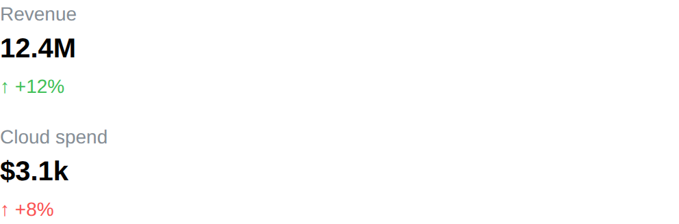
Badge
Badge component displays a short label, for a status or a tag next to other content.
The text supports emoji shortcodes.
API
func Badge(c *tgframe.Container, text string, conf ...*BadgeConf)
cis Parent container.textis the badge text.confis an optional configuration, at most one.
// BadgeConf is the configuration for the Badge component.
type BadgeConf struct {
	tgframe.Base // ID

	// Color is the color of the badge. Default is tcutil.ColorNull, which
	// leaves it neutral.
	Color tcutil.Color
}
Color is one of tcutil.ColorInfo, ColorSuccess, ColorWarning or
ColorDanger.
Example
	tgcomp.Badge(p.Main, "Badge")
	tgcomp.Badge(p.Main, "Shipped",
		&tgcomp.BadgeConf{Color: tcutil.ColorSuccess})

Image
Image component display an image.
API
Interface
func Image(c *tgframe.Container, img any, conf ...*ImageConf)
Parameters
-
cis Parent container. -
imgis the image.image.Image: an image.Image[]byte: a byte array, MIME is detected from magic bytes (png, jpeg, gif, webp, bmp, ico, svg); falls back toFormatif unknownstring: a url or base64 encoded image- example:
- url:
https://http.cat/100 - base64 uri:
data:image/png;base64,...
- url:
- example:
An
image.Imagethat will not encode draws an error placeholder instead of the image and fails the run, without stopping the rest of the page. -
confis an optional configuration, at most one.
// ImageConf is the configuration for the Image component
type ImageConf struct {
	tgframe.Base // ID

	// Width is the width of the image (e.g. "100px", "50%")
	Width string

	// Format is the format of the image, default is "png".
	// For []byte, the MIME is detected from magic bytes; Format is the fallback.
	Format ImageFormat
}
Example
	tgcomp.Image(p.Main, "https://http.cat/100",
		&tgcomp.ImageConf{
			Width: "200px",
		})
tgcomp.Image(p.Main, "https://http.cat/100", &tgcomp.ImageConf{Width: "200px"})
Code
API
Interface
func Code(c *tgframe.Container, code string, conf ...*CodeConf)
Parameters
c: Parent container.code: Code to display.conf: Optional configuration, at most one.
// CodeConf provide extra config for Code Component.
type CodeConf struct {
	tgframe.Base // ID

	// Language is language of code block, leave empty to use `go`
	Language string
}
Example
tgcomp.Code(c, "package main\n\nfunc main() {\n\tprintln(\"Hello, World!\")")
tgcomp.Code(c, "print('Hello, World!')",
    &tgcomp.CodeConf{
        Language: "python",
        ID:       "mycode",
    })
Markdown
Prose supports emoji shortcodes. A shortcode in a code span or a fenced block stays as written.
Formulas are written in LaTeX and drawn by KaTeX, as in the
Latex component: $...$ inline, $$...$$ as a block. An inline
formula can't start or end with a space, so $5 and $10 stays text.
API
Interface
func Markdown(c *tgframe.Container, markdown string, conf ...*MarkdownConf)
Parameters
c: Parent container.markdown: Markdown content to display.conf: Optional configuration, at most one.
// MarkdownConf is the configuration for the Markdown component.
type MarkdownConf struct {
	tgframe.Base // ID
}
Example
tgcomp.Markdown(c, "* Hello, World!")
tgcomp.Markdown(c, "Euler: $e^{i\\pi} + 1 = 0$")
tgcomp.Markdown(c, "* Hello, World!", &tgcomp.MarkdownConf{ID: "my_markdown"})
Write Stream
WriteStream writes a stream of text, such as a model's reply, into one Markdown as it arrives, and returns the whole text once the stream ends.
API
Interface
func WriteStream(c *tgframe.Container, seq iter.Seq2[string, error],
	conf ...*WriteStreamConf) (string, error)
Parameters
c: Parent container.seq: The chunks to write. The first error stops the stream; it is returned with the text before it.conf: Optional configuration, at most one.
// WriteStreamConf is the configuration for the WriteStream component.
type WriteStreamConf struct {
	tgframe.Base // ID

	// Interval is the least time between two sends of the text. Default is
	// 50ms.
	Interval time.Duration
}
The growing text is sent at most once per Interval, so a stream of one token
per chunk does not resend the whole text once per token.
The stream
seq runs on a goroutine of its own, and must not draw components.
WriteStream waits for it to return before it does, so build it on
Params.Context: a run cut by the next event then ends
the request too, instead of holding up the run after it.
Keeping the text
Like everything else on the page, the streamed text is drawn again only if the
next run writes it again. Keep what WriteStream returns in the
state and draw it with Markdown from
then on, as a chat keeps its history.
Example
	if tgcomp.Button(p.Main, "Stream a reply") {
		text, err := tgcomp.WriteStream(p.Main, fakeReply(p.Context))
		if err != nil {
			return err
		}

		tgcomp.Caption(p.Main, fmt.Sprintf("%d words", len(strings.Fields(text))))
	}
// fakeReply stands in for a model's reply: a word at a time.
func fakeReply(ctx context.Context) iter.Seq2[string, error] {
	const reply = "**WriteStream** writes the chunks into one Markdown " +
		"as they arrive, and returns the whole text once the stream ends."

	return func(yield func(string, error) bool) {
		for _, word := range strings.SplitAfter(reply, " ") {
			select {
			case <-ctx.Done():
				return
			case <-time.After(80 * time.Millisecond):
			}

			if !yield(word, nil) {
				return
			}
		}
	}
}
Divider
Divider component display a horizontal line.
API
func Divider(c *tgframe.Container, conf ...*DividerConf)
cis Parent container.confis an optional configuration, at most one.
// DividerConf is the configuration for the Divider component.
type DividerConf struct {
	tgframe.Base // ID
}
Example
tgcomp.Divider(p.Main)

Link
Link component display a link.
The link text supports emoji shortcodes, the url does not.
API
func Link(c *tgframe.Container, text, url string, conf ...*LinkConf)
cis Parent container.textis the link text.urlis the link url.confis an optional configuration, at most one.
// LinkConf is the configuration for the Link component.
type LinkConf struct {
	tgframe.Base // ID
}
Example
tgcomp.Link(p.Main, "Link", "https://www.example.com/")

Link Button
Link Button component displays a link drawn as a button.
It navigates rather than reporting a click, so unlike Button it returns nothing and keeps no state. It is a link in the page too: it opens in a new tab on a middle click, and its url can be copied.
The text supports emoji shortcodes, the url does not.
API
func LinkButton(c *tgframe.Container, text, url string, conf ...*LinkButtonConf)
cis Parent container.textis the button text.urlis the url to navigate to.confis an optional configuration, at most one.
// LinkButtonConf is the configuration for the LinkButton component.
type LinkButtonConf struct {
	tgframe.Base // ID

	// Color is the color of the button. Default is tcutil.ColorNull, which
	// leaves it neutral.
	Color tcutil.Color
}
Color is one of tcutil.ColorInfo, ColorSuccess, ColorWarning or
ColorDanger.
Example
	tgcomp.LinkButton(p.Main, "Link Button",
		"https://www.example.com/")

Page Link
Page Link component displays a link to another page of the app, opened with
a page query. The page it opens reads the query as
Params.Query.
It is a real link: it opens in a new tab on a middle click, and its url can be
copied. It takes a page name and values, never a url, so it cannot point off
the app. The url follows the app's page mode: /detail?group=a, or
#/detail?group=a in hash mode and in the browser build. On the desktop it
switches page the way the side nav does.
The text supports emoji shortcodes.
API
func PageLink(c *tgframe.Container, text, page string,
	query url.Values, conf ...*PageLinkConf)
cis Parent container.textis the link text.pageis the name of the page to open. A page the app does not have fails the component: the run reports the error and the link is not drawn.queryis the page query.nilopens the page without one.confis an optional configuration, at most one.
// PageLinkConf is the configuration for the PageLink component.
type PageLinkConf struct {
	tgframe.Base // ID
}
Example
	// The query is untrusted: anything that is not a number is 0.
	n, err := strconv.Atoi(p.Query.Get("n"))
	if err != nil || n < 0 {
		n = 0
	}

	tgcomp.Text(p.Main, "n = "+strconv.Itoa(n))
	tgcomp.PageLink(p.Main, "Next", "page_link", url.Values{
		"n": {strconv.Itoa(n + 1)},
	})
Latex
Latex component is used to display LaTeX content.
API
func Latex(c *tgframe.Container, text string, conf ...*LatexConf)
cis the container to add the LaTeX component to.textis the LaTeX content to display.confis an optional configuration, at most one.
// LatexConf is the configuration for the Latex component.
type LatexConf struct {
	tgframe.Base // ID
}
Example
tgcomp.Latex(p.Main, "E = mc^2")
Emoji Shortcodes
Anywhere text is decoration rather than data, a :name: shortcode expands to
the emoji it stands for, the same names GitHub and Slack use.
tgcomp.Text(p.Main, "Shipped it :tada:")
Renders as Shipped it 🎉.
Where it applies
| Expands | Stays literal |
|---|---|
Title, Subtitle, Text | Code |
Link text, but not its url | code spans and fenced blocks in Markdown |
prose in Markdown | HTML, JSON, Table |
PageConfig.Emoji | anything a user typed and the app reads back |
A shortcode inside code is the thing being shown, not decoration, so it is left as written:
tgcomp.Markdown(p.Main, "A `:tada:` in code stays as written.")
That is also the way to show a shortcode literally — there is no escape character.
Names
A name the table does not know stays as it was written, so :notanemoji:
renders as typed rather than disappearing. The names come from
emojibase's github preset, 1913 of
them; :tada:, :+1:, :100: and the rest of what you would type in a
pull request.
Only whole shortcodes are replaced, so ordinary text that happens to hold
colons is safe: a timestamp like 15:04:05 comes through untouched, because
04 is not a name.
Data Components
The data components display data in some special form.
import "github.com/voilelab/toolgui/toolgui/tgcomp"
These components are shown on the data page of the demo app: run it in
your browser, or task run_demo and open
http://localhost:3000/data.
JSON
JSON component display the JSON representation of an object.
API
func JSON(c *tgframe.Container, v any, conf ...*JSONConf)
-
cis Parent container. -
vis the object.- string: assume to be a serialized JSON string.
- other: assume to be a struct and will be converted to a JSON string.
A string that is not JSON, or a value that will not marshal, draws an error placeholder instead of the viewer and fails the run, without stopping the rest of the page.
-
confis an optional configuration, at most one.
// JSONConf is the configuration for the JSON component.
type JSONConf struct {
	tgframe.Base // ID
}
The viewer keeps which nodes are collapsed, so the component claims an id of
its own: a hash of the value, unless Conf.ID gives it one. Two viewers over
the same value therefore need one of them to be named.
Example
	type DemoJSONHeader struct {
		Type int
	}

	type DemoJSON struct {
		Header   DemoJSONHeader
		IntValue int
		URL      string
		IsOk     bool
	}

	tgcomp.JSON(p.Main, &DemoJSON{})
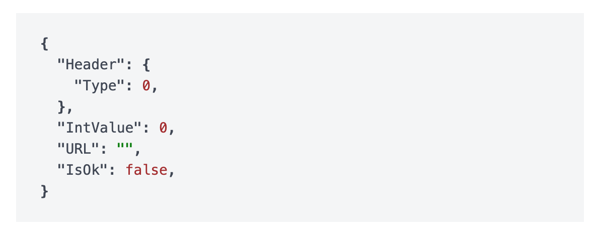
Table
Table component display a table. It is static: the rows are drawn in the order they are given, and there is nothing for the reader to click.
Reach for it when the rows are few and already in the order they should be read in. When the rows are many, or when the reader — not the page function — should decide the order, use DataFrame, which sorts, searches and pages in the browser.
API
func Table(c *tgframe.Container, head []string, table [][]string, conf ...*TableConf)
cis Parent container.headis the head of table.tableis the body of table. Every row needs one cell per head entry; rows of any other length draw an error placeholder instead of the table and fail the run, without stopping the rest of the page.confis an optional configuration, at most one.
// TableConf is the configuration for the Table component.
type TableConf struct {
	tgframe.Base // ID
}
Example
	tgcomp.Table(p.Main, []string{"a", "b"},
		[][]string{{"1", "2"}, {"3", "4"}})
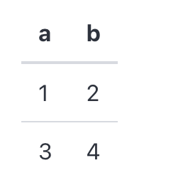
DataFrame
DataFrame component displays a table the user can sort, search and page through, and optionally pick rows from.
Sorting, searching and paging all happen in the browser, so none of them
reruns the page function. Table is the static counterpart: reach for it when
the rows are few and already in the order they should be read in, and for
DataFrame when the rows are many, or when the reader — not the page
function — should decide the order.
API
func DataFrame(c *tgframe.Container, head []string, rows [][]string, conf ...*DataFrameConf) []int
cis Parent container.headis the head of table. It cannot be empty.rowsis the body of table. Every row needs one cell per head entry; a row of any other length draws an error placeholder instead of the table and fails the run, the way a chart does on a series that does not line up with its labels.confis an optional configuration, at most one.
The return is the rows the user has picked, as indices into rows. It is
empty unless Selection says the rows can be picked, and empty
rather than nil when nothing is picked.
// DataFrameConf is the configuration for the DataFrame component.
type DataFrameConf struct {
	tgframe.Base // ID

	// Sortable lets the user sort by clicking a column head, default on.
	// Set it with SetSortable.
	Sortable *bool

	// Searchable puts a search box above the table, default on.
	// Set it with SetSearchable.
	Searchable *bool

	// PageSize is how many rows one page holds, default 25.
	PageSize int

	// Height is the CSS height the table scrolls past (e.g. "400px").
	Height string

	// ColumnConf configures the columns, one entry per head entry.
	ColumnConf []DataFrameColumnConf

	// Selection is how many rows the user may pick, default
	// SelectionModeNone.
	Selection SelectionMode

	// RowKeys names the rows, one key per row, so that what is picked is
	// remembered by row and not by position.
	RowKeys []string

	// DefaultSelection is what is picked before the user first touches the
	// table, as indices into rows.
	DefaultSelection []int
}
Sortable and Searchable are pointers so that leaving them out means on,
which is what a DataFrame is for. Turn one off through its setter:
conf := (&tgcomp.DataFrameConf{}).SetSearchable(false)
Set PageSize above the row count to keep every row on one page. A negative
PageSize fails the run and draws an error placeholder.
Height caps the table rather than fixing it: the page grows the table until
it reaches Height, and the rows scroll under a pinned head from there. Left
empty, the table is as tall as its page needs.
Columns
// DataFrameColumnConf is the configuration of one DataFrame column.
type DataFrameColumnConf struct {
	// Type is how the cells are read and sorted, default ColumnTypeText.
	Type ColumnType

	// Align is which edge the cells sit against, default ColumnAlignAuto.
	Align ColumnAlign

	// Width is the CSS width of the column (e.g. "8rem", "20%").
	Width string

	// Hidden drops the column from the table.
	Hidden bool

	// Format is how a NumberCell without its own display is shown.
	// Only a ColumnTypeNumber column takes one.
	Format *NumberFormat
}
It is named after the component because ColumnConf is the layout
Column's.
ColumnConf is either empty, leaving every column on its defaults, or exactly
as long as head. Any other length fails the run and draws an error
placeholder.
The rows stay a plain string matrix; Type is what tells the client how to
read them:
Type | Sorted by |
|---|---|
ColumnTypeText | the string |
ColumnTypeNumber | the numeric value, so "10" sorts after "9" |
ColumnTypeDatetime | the instant named, RFC 3339 most reliably |
A cell that does not parse as its column's type sorts last, whichever direction the column is sorted in.
ColumnAlignAuto aligns a ColumnTypeNumber column right and every other one
left. ColumnAlignLeft, ColumnAlignCenter and ColumnAlignRight say so
outright.
A Hidden column is still searched, so a row can be found by a value it does
not show.
Typed cells
A string column can only sort what it shows. 0.21% does not parse as a
number, so a percentage column falls back to sorting text, and 9.5% lands
after 29.41%. DataFrameCells takes cells that carry the value to sort by
apart from the string to show:
func DataFrameCells(c *tgframe.Container, head []string, rows [][]Cell, conf ...*DataFrameConf) []int
| Cell | Sorted by | Shown as | Column |
|---|---|---|---|
TextCell(s) | s, read by the column type | s | any |
NumberCell(v) | v | v through the column's Format | ColumnTypeNumber |
TimeCell(t) | the instant t | t as RFC 3339 | ColumnTypeDatetime |
MissingCell() | always last, either direction | empty | any |
.WithDisplay(s) replaces what any cell shows without touching how it sorts.
NumberCell(math.NaN()) is a MissingCell(). A NumberCell or TimeCell
in a column of any other type, or an infinite NumberCell, fails the run and
draws an error placeholder.
DataFrame is DataFrameCells with every string a TextCell, so a string
table behaves, and is sent, exactly as before.
Format is a NumberFormat:
type NumberFormat struct {
	// Decimals is how many digits follow the point.
	Decimals int

	// Percent shows the value times 100 followed by "%".
	Percent bool
}
With no Format a number is shown as its shortest exact decimal. Formatting
happens in Go, not in the browser, so the string the page function can
predict is the string shown — and the string searched: search always matches
what the user sees, never the sort value. A Format on a column that is not
ColumnTypeNumber, or negative Decimals, fails the run.
	type run struct {
		name string
		rate float64 // NaN when the run has no result
	}
	runs := []run{
		{"baseline", 0.2941},
		{"tuned", 0.095},
		{"pruned", 0.0021},
		{"crashed", math.NaN()},
	}

	rows := make([][]tgcomp.Cell, 0, len(runs))
	for _, r := range runs {
		// NaN is a missing cell: shown as "-", always sorted last.
		rate := tgcomp.NumberCell(r.rate)
		if math.IsNaN(r.rate) {
			rate = tgcomp.MissingCell().WithDisplay("-")
		}

		rows = append(rows, []tgcomp.Cell{tgcomp.TextCell(r.name), rate})
	}

	tgcomp.DataFrameCells(p.Main, []string{"Run", "Hit rate"}, rows,
		&tgcomp.DataFrameConf{
			ID: "demo_runs",
			ColumnConf: []tgcomp.DataFrameColumnConf{
				{},
				{
					Type:   tgcomp.ColumnTypeNumber,
					Format: &tgcomp.NumberFormat{Decimals: 2, Percent: true},
				},
			},
		})
Selection
Selection decides how many rows the user may pick, and so whether
DataFrame's return means anything:
SelectionMode | What the user gets |
|---|---|
SelectionModeNone | nothing; the rows are not pickable, and the return is empty |
SelectionModeSingle | one row at a time, picked by clicking it |
SelectionModeMulti | any number of rows, through a checkbox column on the left |
selected := tgcomp.DataFrame(p.Main, head, hosts, &tgcomp.DataFrameConf{
	ID:        "hosts",
	Selection: tgcomp.SelectionModeSingle,
})

if len(selected) != 0 {
	tgcomp.Text(p.Main, "picked "+hosts[selected[0]][0])
}
The indices are into rows, in the order the page function wrote them — not
the order the table happens to show them in. Sorting and searching only change
what is on screen, so a row picked out of a sorted table still names the row
the page function wrote. They come back sorted and without duplicates, so
selected reads the same whatever order the rows were picked in.
In SelectionModeSingle, clicking the picked row again clears the selection.
In SelectionModeMulti, the checkbox in the head takes every row the search
kept, on whatever page it sits — and gives back only what it took, so a row
picked by hand before the search survives it.
Neither mode needs a mouse. In SelectionModeSingle the row is the control,
so each row is a tab stop that Enter and Space pick and
clear. In SelectionModeMulti the checkbox is already one, so the row is left
out of the tab order rather than made a second stop per row.
DefaultSelection is what is picked before the user first touches the table,
and is only read until then: clearing the selection is an answer, and beats
the default from that point on. Indices pointing outside rows are dropped,
and SelectionModeSingle keeps only the lowest one.
Name the rows with RowKeys
Without RowKeys a selection is a position, not a row. If rows changes
between runs, an index picked against the old data is read against the new
one. Pick rows[1] out of [A, B, C], drop B, and the selection is still
1 — which is now C, a row the user never picked. Only an index past the
end of rows is dropped. This is the positional contract
Select and MultiSelect
already have with their items, and the id being derived from head keeps
the selection across a rerun rather than making it safe across a change of
data.
RowKeys is how to get out of it, and is what to reach for before acting on a
selection destructively — deleting, submitting, sending. Give one key per row,
whatever the app already calls that row by — a primary key, an id, a path:
keys := make([]string, 0, len(hosts))
for _, host := range hosts {
	keys = append(keys, host[0])
}

selected := tgcomp.DataFrame(p.Main, head, hosts, &tgcomp.DataFrameConf{
	ID:        "hosts",
	Selection: tgcomp.SelectionModeMulti,
	RowKeys:   keys,
})
What is picked is then remembered by key. The return is still indices into
rows — the same slice the page function just wrote, so hosts[idx] reads
the same as ever — but they are resolved from the keys against this run's
rows: a row that moved keeps its pick at its new position, and a key whose row
is gone is dropped instead of standing for whatever moved into its place. Drop
B out of [A, B, C] with B picked, and the selection comes back empty.
RowKeys is either empty, leaving the selection positional, or exactly as
long as rows. Any other length fails the run and draws an error placeholder,
and so does a key used by two rows: two rows answering to one name is the
mistake RowKeys exists to rule out. The keys are the app's to give —
DataFrame will not guess one out of a column, because no column is
guaranteed unique.
DefaultSelection stays positional either way: it is read before the user has
touched anything, when the page function has rows in hand.
The other way out is to give the table a fresh ID when the data is replaced,
which drops the selection with the old id. That clears the selection rather
than carrying it over, so reach for it when a reload means "start again" and
for RowKeys when it does not.
Identity
A pickable DataFrame holds state, so it needs an id. It derives one from
head when the conf names none — from the head rather than the rows, so a
selection survives the data being refreshed underneath it. Two pickable tables
sharing a head on one page would collide, which is what ID is for.
An unpickable DataFrame holds no state and carries no id at all, so any
number of them can sit on a page.
Cost
Picking a row is the one DataFrame interaction that reruns the page
function, and the rerun sends rows again in full. That is nothing for the
tables selection is usually for, but it is worth knowing before turning it on
for a table of the size Large tables measures: there, page
the rows on the server side instead.
Behaviour
Clicking a column head sorts ascending, clicking it again sorts descending, and a third click drops the sort and gives the rows back in the order the page function wrote them.
The search box keeps the rows holding what is typed, matched case-insensitively against what every cell of the row shows, hidden columns included.
Sorting, searching and paging are all client state. Nothing is sent to the server, so the page function does not rerun and no other component on the page is touched. Picking a row is the exception: that is an answer the page has to be given, so it reruns the page function like any other input component.
With no rows the head is still drawn, over a No rows message — which is also
what a search that matches nothing leaves behind.
Large tables
Paging, not virtual scrolling, is how a large DataFrame stays usable.
Only PageSize rows are ever in the DOM, so what a sort or a keystroke has to
re-render is the page size and not the row count.
Measured on the demo grown to 10,000 rows, each configuration alone on the page, taking the median of ten samples from click to painted frame:
PageSize 10 | every row on one page | |
|---|---|---|
| rows in the DOM | 10 | 10,000 |
| page load, first row painted | 660 ms | 2,922 ms |
| sort | 31 ms | 1,534 ms |
| search keystroke | 31 ms | 596 ms |
| page jump | 31 ms | — |
Scrolling is not what paging rescues: scrolling 4,800 px through all 10,000 rows dropped no frames either way (80 frames, median 16.7 ms, none over 25 ms), because the rows are laid out once and the browser scrolls them on the compositor. What degrades without paging is re-rendering — a sort costs 1.5 s and every search keystroke close to 0.6 s, which is what makes an unpaged table of this size unusable.
So take the advice above to set PageSize above the row count only for tables
of a few hundred rows at most.
Neither number is a server-side bound. The rows are sent whole — 10,000 rows of this demo's five columns is a 573 KiB pack, the same either way — and are filtered and sorted in full on every interaction. A table far past 10,000 rows is worth paging on the server side instead.
Example
	tgcomp.DataFrame(p.Main,
		[]string{"Order", "Ordered", "Region", "Item", "Amount"},
		demoOrders(),
		&tgcomp.DataFrameConf{
			ID:       "demo_orders",
			PageSize: 10,
			ColumnConf: []tgcomp.DataFrameColumnConf{
				{Width: "9rem"},
				{Type: tgcomp.ColumnTypeDatetime},
				{},
				{},
				{Type: tgcomp.ColumnTypeNumber},
			},
		})
Picking rows out of one, by key so the pick follows the host:
	hosts := [][]string{
		{"web-1", "APAC", "healthy"},
		{"web-2", "EMEA", "degraded"},
		{"db-1", "NA", "healthy"},
		{"db-2", "LATAM", "down"},
	}

	// The host name is what a row is, so the pick follows the host rather
	// than the position it happens to sit at this run.
	keys := make([]string, 0, len(hosts))
	for _, host := range hosts {
		keys = append(keys, host[0])
	}

	selected := tgcomp.DataFrame(p.Main,
		[]string{"Host", "Region", "Status"}, hosts,
		&tgcomp.DataFrameConf{
			ID:        "demo_hosts",
			Selection: tgcomp.SelectionModeMulti,
			RowKeys:   keys,
		})

	names := []string{}
	for _, idx := range selected {
		names = append(names, hosts[idx][0])
	}

	picked := "none"
	if len(names) != 0 {
		picked = strings.Join(names, ", ")
	}

	tgcomp.Text(p.Main, "Selected: "+picked,
		&tgcomp.TextConf{ID: "dataframe_multi_result"})
Or one row at a time, starting on the first:
	builds := [][]string{
		{"#41", "Go", "passed"},
		{"#42", "Rust", "failed"},
		{"#43", "Python", "passed"},
	}

	selected := tgcomp.DataFrame(p.Main,
		[]string{"Build", "Language", "Result"}, builds,
		&tgcomp.DataFrameConf{
			ID:               "demo_builds",
			Selection:        tgcomp.SelectionModeSingle,
			DefaultSelection: []int{0},
		})

	detail := "none"
	if len(selected) != 0 {
		detail = strings.Join(builds[selected[0]], " / ")
	}

	tgcomp.Text(p.Main, "Build: "+detail,
		&tgcomp.TextConf{ID: "dataframe_single_result"})
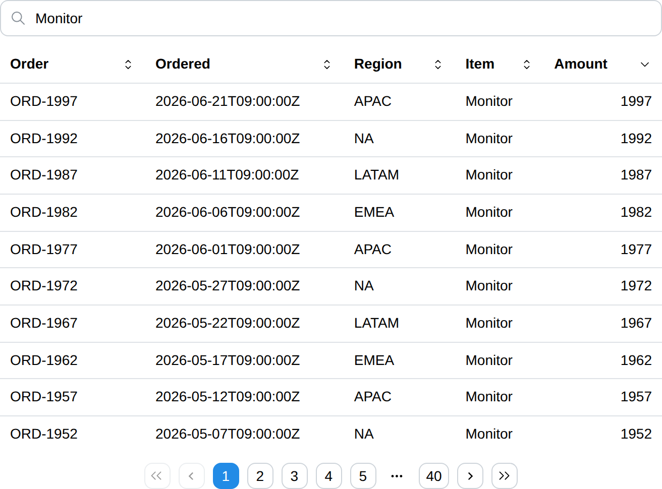
Chart
Chart component draws a line, bar or area chart. A scatter chart is drawn from points rather than labels, and has its own page: Scatter Chart.
API
func Chart(c *tgframe.Container, labels []string, series []ChartSeries, conf ...*ChartConf)
func LineChart(c *tgframe.Container, labels []string, series []ChartSeries, conf ...*ChartConf)
func BarChart(c *tgframe.Container, labels []string, series []ChartSeries, conf ...*ChartConf)
func AreaChart(c *tgframe.Container, labels []string, series []ChartSeries, conf ...*ChartConf)
cis the parent container.labelsare the x axis categories.seriesare the series to draw. Every series needs one value per label; a series of any other length draws an error placeholder instead of the chart and fails the run, without stopping the rest of the page.confis an optional configuration, at most one.
LineChart, BarChart and AreaChart set Kind themselves and ignore what
the conf says; Chart follows the conf.
ChartSeries:
| Field | Description |
|---|---|
Name | Shown in the legend and the tooltip. |
Values | One value per label, in the same order. |
Points | The {X, Y} points of a scatter series, instead of Values. |
Color | Any CSS color, overriding the theme palette. |
ChartConf:
| Field | Description | Default |
|---|---|---|
ID | The user specific id, from the embedded tgframe.Base. | none |
Kind | ChartKindLine, ChartKindBar, ChartKindArea or ChartKindScatter. | ChartKindLine |
Stacked | Stack the series instead of drawing them side by side. | false |
Height | CSS height of the chart. | 300px |
XLabel | Title of the x axis, hidden when empty. | none |
YLabel | Title of the y axis, hidden when empty. | none |
YLogScale | Draw the y axis on a log scale. See Log scale. | false |
XLogScale | Draw the x axis on a log scale, scatter only. See Log scale. | false |
A chart is placed by position like everything else, so it does not need an id to be updated in place across runs. Give it one when a test or a stylesheet has to name it, or when the page draws two charts you want to tell apart.
Examples
Line
	tgcomp.LineChart(p.Main,
		[]string{"Mon", "Tue", "Wed", "Thu", "Fri"},
		[]tgcomp.ChartSeries{
			{Name: "visits", Values: []float64{12, 19, 9, 24, 17}},
			{Name: "signups", Values: []float64{3, 7, 4, 9, 6}},
		},
		&tgcomp.ChartConf{ID: "demo_line"})
Bar
	tgcomp.BarChart(p.Main,
		[]string{"Go", "Rust", "Python"},
		[]tgcomp.ChartSeries{
			{Name: "stars", Values: []float64{31, 24, 47}},
		},
		&tgcomp.ChartConf{ID: "demo_bar"})
Stacked area
	tgcomp.AreaChart(p.Main,
		[]string{"Q1", "Q2", "Q3", "Q4"},
		[]tgcomp.ChartSeries{
			{Name: "cloud", Values: []float64{4, 6, 5, 9}},
			{Name: "desktop", Values: []float64{2, 3, 4, 4}},
		},
		&tgcomp.ChartConf{
			ID:      "demo_area",
			Stacked: true,
			YLabel:  "revenue",
		})
Log scale
	tgcomp.LineChart(p.Main,
		[]string{"v1", "v2", "v3", "v4", "v5"},
		[]tgcomp.ChartSeries{
			{Name: "downloads", Values: []float64{3, 40, 520, 6800, 91000}},
		},
		&tgcomp.ChartConf{
			ID:        "demo_log",
			YLogScale: true,
			YLabel:    "downloads",
		})
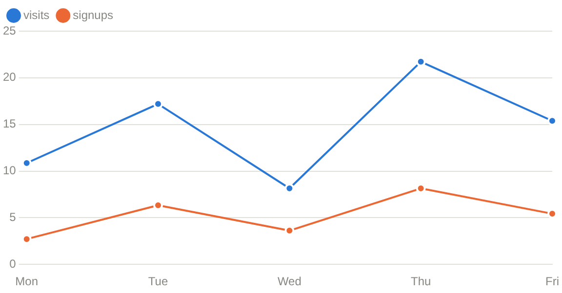
Log scale
YLogScale draws the y axis on a log scale, so data spanning several orders
of magnitude does not crowd the small values onto the baseline. XLogScale
does the same for the x axis of a Scatter Chart, the only
kind whose x axis carries values.
A log axis has no 0, so these draw an error placeholder instead of the chart and fail the run:
XLogScaleon a line, bar or area chart: their x axis is categories.YLogScaletogether withStacked: stacked segments add up linearly.- Any value ≤ 0 on a log axis.
Bars and area fills, which start from 0 on a linear axis, start from the bottom of a log axis instead, one decade below the smallest value.
Notes
- Values are
float64, labels are strings. A time axis is formatted into labels by the page function; there is no time scale. - Colors follow the theme. Series get their color from a palette that is
stepped for the light and the dark theme, in a fixed order. The palette has
eight slots and is never cycled, so a chart with more than eight series has
to set
ChartSeries.Coloron the rest. - Every point travels over the websocket on every run of the page function. A few thousand points per chart is the practical ceiling; downsample before drawing more than that.
Scatter Chart
Scatter Chart component draws one marker per point, on two value axes.
It is the one chart that takes points rather than labels and values: both of its axes are value axes, so a point carries its own x. The rest of Chart applies unchanged — the conf, the palette, the notes.
API
func ScatterChart(c *tgframe.Container, series []ChartSeries, conf ...*ChartConf)
cis the parent container.seriesare the series to draw. Every series needs itsPoints, and noValues; anything else draws an error placeholder instead of the chart and fails the run, without stopping the rest of the page.confis an optional configuration, at most one.ScatterChartsetsKinditself and ignores what the conf says.
ChartPoint:
| Field | Description |
|---|---|
X | Position on x axis. |
Y | Position on y axis. |
Example
	tgcomp.ScatterChart(p.Main,
		[]tgcomp.ChartSeries{
			{Name: "runs", Points: []tgcomp.ChartPoint{
				{X: 1, Y: 3}, {X: 2, Y: 5}, {X: 3, Y: 4},
				{X: 4, Y: 8}, {X: 5, Y: 6},
			}},
		},
		&tgcomp.ChartConf{ID: "demo_scatter"})
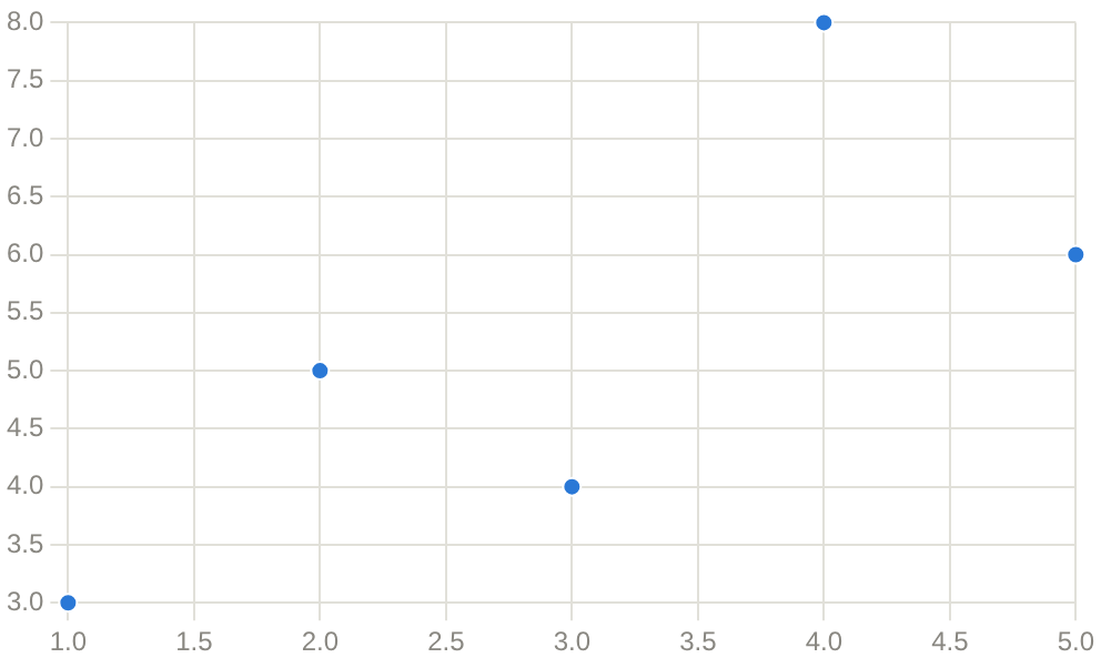
Axis titles and a height come from the conf, the same as the other kinds:
tgcomp.ScatterChart(p.Main,
	[]tgcomp.ChartSeries{{Name: "p95", Points: points}},
	&tgcomp.ChartConf{
		XLabel: "concurrency",
		YLabel: "ms",
	})
XLogScale and YLogScale put either axis on a log scale; every point's x or
y on that axis must be > 0. See Chart.
Input Components
The input components provide UI for app-user to input their data.
import "github.com/voilelab/toolgui/toolgui/tgcomp"
These components are shown on the input page of the demo app: run it in
your browser, or task run_demo and open
http://localhost:3000/input.
Default and what you get back
Every input that takes a Conf.Default reads it the same way: it is what Go
gets back before the app user has touched the component, and it is what the
frontend renders on the first draw. One field, one meaning, everywhere.
The return type follows from one question — can this component have no value at
all? An input that always has one hands back a value; one that can genuinely be
empty hands back a pointer, and nil is that emptiness. There is no third case.
| Component | Conf.Default | Returns | Before any input |
|---|---|---|---|
Textbox | string | string | Default |
Textarea | string | string | Default |
CodeInput | string | string | Default |
Checkbox | bool | bool | Default |
Toggle | bool | bool | Default |
ColorPicker | string | string | Default, else #000000 |
Number | T | T | Default |
Slider | *T | T | Default, else Min |
SelectSlider | int | int | Default |
MultiSelect | []int | []int | Default, nil for none |
Select | *int | *int | Default, nil for none |
Radio | *int | *int | Default, nil for none |
DatePicker | *time.Time | *time.Time | Default, nil for none |
TimePicker | *time.Time | *time.Time | Default, nil for none |
DateTimePicker | *time.Time | *time.Time | Default, nil for none |
FileUpload | — | *FileObject | nil |
MultiFileUpload | — | []*FileObject | nil |
FolderPicker | — | FolderObject | nil |
Two things follow from the table that are worth saying out loud:
- "Nothing selected" is
nilforSelect,RadioandMultiSelectalike, so the same check reads a single pick and a multiple one. - The three pickers all hand back a
time.Time, so a date and a time of day add up without a conversion in between.DatePickerkeeps only the day, at midnight UTC;TimePickerkeeps only the clock.
FileUpload and MultiFileUpload are the inputs with no Default: a browser refuses to have a
file input's value set from script, so a default would read back in Go while the
box on screen stayed empty.
Menu is outside the table altogether. It reports a click rather
than holding a value — the index it hands back is there for one run and nil
after — so there is nothing for a default to stand in for.
Textarea
Textarea create a textarea and return its value.
API
Interface
func Textarea(c *tgframe.Container, label string, conf ...*TextareaConf) string
Parameters
cis Parent container.labelis the label for textarea.confis an optional configuration, at most one.
// TextareaConf is the configuration for a textarea.
type TextareaConf struct {
	tgframe.Base // ID

	// Height is the height of the textarea. default value is 3.
	Height int

	// Default is the default value of the textarea.
	Default string

	// ResetKey drops the app user's input and restores Default whenever it
	// changes, e.g. a hash of the file the text was filled from.
	ResetKey string

	// Color defines the color of the textarea
	Color tcutil.Color
}
Example
	textareaValue := tgcomp.Textarea(p.Main, "Textarea",
		&tgcomp.TextareaConf{
			Height: 5,
			Color:  tcutil.ColorWarning,
		})
	tgcomp.Text(p.Main, "Value: "+textareaValue,
		&tgcomp.TextConf{ID: "textarea_result"})
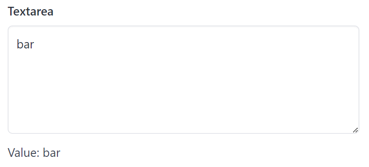
Code Input
CodeInput create a code editor with syntax highlight and return its value.
It is built on CodeMirror 6: line numbers, bracket
matching, undo history and search (Ctrl/Cmd+F) come with it.
API
Interface
func CodeInput(c *tgframe.Container, label string, conf ...*CodeInputConf) string
Parameters
cis Parent container.labelis the label for the code input.confis an optional configuration, at most one.
// CodeInputConf is the configuration for a code input.
type CodeInputConf struct {
	tgframe.Base // ID

	// Language is the language to highlight, leave empty to use `go`.
	// Supported: go, python, javascript, typescript, jsx, tsx, json, cpp,
	// sql, html, css, markdown, yaml, shell. "text" or any other value
	// leaves the code unhighlighted.
	Language string

	// Height is the fewest lines shown; the editor grows with the code from
	// there. default value is 5.
	Height int

	// MaxHeight is the most lines shown before the editor scrolls. 0 lets it
	// grow without limit.
	MaxHeight int

	// Default is the default value of the code input.
	Default string

	// ResetKey drops the app user's input and restores Default whenever it
	// changes, e.g. a hash of the file the code was filled from.
	ResetKey string
}
Example
	code := tgcomp.CodeInput(p.Main, "Code",
		&tgcomp.CodeInputConf{
			Language:  "python",
			Height:    4,
			MaxHeight: 15,
			Default:   "def hello(name):\n    return f\"Hello, {name}!\"\n",
		})
	tgcomp.Code(p.Main, code,
		&tgcomp.CodeConf{ID: "code_input_result", Language: "python"})
Height
The editor starts at Height lines and grows as the code gets longer, so the
whole code shows without scrolling. Set MaxHeight to stop growing at that
many lines; past it the editor scrolls.
When the code is sent
Like Textarea, typing does not rerun the page. The code is
sent when the editor loses focus, or at once on Ctrl+Enter (Cmd+Enter on
macOS). Leaving the editor without a change sends nothing.
Keyboard
Tab indents rather than moving focus: a tab for go, two spaces otherwise. To leave the editor by keyboard, press
Esc and then Tab.
Textbox
Textbox create a textbox and return its value.
API
Interface
func Textbox(c *tgframe.Container, label string, conf ...*TextboxConf) string
Parameters
cis Parent container.labelis the label for textbox.confis an optional configuration, at most one.
// TextboxConf is the configuration for the Textbox component
type TextboxConf struct {
	tgframe.Base // ID

	// Placeholder text to display in the textbox.
	Placeholder string

	// Maximum number of characters allowed in the textbox.
	// If 0, there is no character limit.
	MaxLength int

	// Indicates whether the textbox should mask input as asterisks.
	Password bool

	// Indicates whether the textbox should be disabled.
	Disabled bool

	// Default value of the textbox.
	Default string

	// ResetKey drops the app user's input and restores Default whenever it
	// changes, e.g. a hash of the file the text was filled from.
	ResetKey string

	// Color defines the color of the textbox
	Color tcutil.Color
}
Example
	textboxValue := tgcomp.Textbox(p.Main, "Textbox", &tgcomp.TextboxConf{
		Placeholder: "input the value here",
		Color:       tcutil.ColorInfo,
	})
	tgcomp.Text(p.Main, "Value: "+textboxValue,
		&tgcomp.TextConf{ID: "textbox_result"})
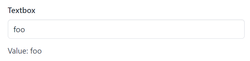
FileUpload
FileUpload create a fileupload and return its selected file.
API
type FileObject struct {
	Name string `json:"name"`
	Type string `json:"type"`
	Size int    `json:"size"`
}

func (f *FileObject) Open() (tgframe.FileReader, error)
func (f *FileObject) Bytes() ([]byte, error)

func FileUpload(c *tgframe.Container, label, accept string, conf ...*FileUploadConf) *FileObject
cis Parent container.labelis the label for options group.acceptis the file type to accept.confis an optional configuration, at most one.- Return the selected file object. nil if no file is selected.
// FileUploadConf is the configuration for the FileUpload component.
type FileUploadConf struct {
	tgframe.Base // ID

	// Disabled is true if the fileupload is disabled.
	Disabled bool
}
There is no Default here, unlike the other inputs. A file input is the one
control a page cannot fill in on the app user's behalf: the browser refuses to
have its value set from script, so a default would read back in Go while the
box on screen stayed empty. A page that wants to start from a file it already
has should read that file itself rather than ask for one.
On a server the upload is streamed to disk rather than kept in memory, so a
file only has to fit on disk. In the browser it is kept in the origin private
file system, which is what a tab has instead of one, so a stored file is not a
second copy sitting in the tab's memory for as long as the session lasts. It
does still cross in one piece on the way in, so an upload has to fit in the tab
to arrive. Size is the size of what was stored.
Openreturns a reader over the content, which the caller closes. It reads at an offset too, soarchive/zipand the image decoders can work straight off it.Bytesreads the whole file into memory. PreferOpenfor anything that can work on a stream.
Example
	fileObj := tgcomp.FileUpload(p.Main, "FileUpload", ".jpg,.png")
	if fileObj == nil {
		return nil
	}

	tgcomp.Text(p.Main, "FileUpload filename: "+fileObj.Name)
	tgcomp.Text(p.Main, fmt.Sprintf("FileUpload bytes length: %d", fileObj.Size))
	if strings.HasSuffix(fileObj.Name, ".jpg") {
		// Decoding reads the upload off disk, so the image never has to
		// be held twice.
		fp, err := fileObj.Open()
		if err != nil {
			return nil
		}
		defer fp.Close()

		img, err := jpeg.Decode(fp)
		if err == nil {
			tgcomp.Image(p.Main, img)
		}
	}
Reading the content through a stream:
fp, err := fileObj.Open()
if err != nil {
    return err
}
defer fp.Close()

img, err := jpeg.Decode(fp)
MultiFileUpload
MultiFileUpload takes more than one file at once, and returns them in the
order they were picked. It shares FileUploadConf with FileUpload.
func MultiFileUpload(c *tgframe.Container, label, accept string, conf ...*FileUploadConf) []*FileObject
- Return the selected file objects. nil if no file is selected, or while any of them is still uploading.
- A pick holds at most
tgframe.MaxFileKeyIndexfiles.
	fileObjs := tgcomp.MultiFileUpload(p.Main, "MultiFileUpload", ".jpg,.png")
	for _, fileObj := range fileObjs {
		tgcomp.Text(p.Main, fmt.Sprintf("MultiFileUpload: %s (%d bytes)",
			fileObj.Name, fileObj.Size))
	}
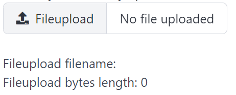
FolderPicker
FolderPicker draws a button that opens a directory dialog on desktop or in
Chromium's Wasm executor.
It returns nil before a selection. Selecting a directory reruns the page, and
that run receives the new folder. Cancelling keeps the previous selection and
does not rerun.
API
type FolderObject = tgframe.Folder

type FolderPickerConf struct {
    tgframe.Base // ID
    Write bool
    DefaultDir string
    Disabled bool
}

func FolderPicker(c *tgframe.Container, label string, conf ...*FolderPickerConf) FolderObject
conf is optional, with at most one configuration. Write requests write
access; desktop grants it unconditionally. DefaultDir sets the desktop
dialog's initial directory. Disabled disables the button.
The shared interface lives in tgframe:
type Folder interface {
    fs.ReadDirFS // Open and ReadDir
    fs.StatFS
    Create(name string) (io.WriteCloser, error)
    MkdirAll(name string) error
    Writable() bool
    Path() string
}

var ErrFolderReadOnly = tgutil.NewError("folder is read-only")
Names follow fs.ValidPath: slash-separated paths relative to the selected
root, with no .. components. Desktop uses os.OpenRoot, which also prevents
symlinks from escaping the root. Create creates or truncates a file and
requires an existing parent. MkdirAll creates missing parents. Read-only
implementations return tgframe.ErrFolderReadOnly for either write operation.
Close files and writers returned by Open and Create when finished.
Writable reports granted write access. Path returns an absolute OS path on
desktop; other executors return an empty string. The session owns the folder
and closes it when replaced or the session ends; use it within the current
page run rather than keeping it across selections or sessions.
In Wasm, the dialog uses showDirectoryPicker in a secure context (HTTPS or
localhost). Write: true requests readwrite; otherwise it requests read
and Writable() is false even if the browser already has broader permission.
Cancelling or denying permission keeps the previous selection without rerunning.
DefaultDir is ignored in Wasm, and Path() is always empty.
The browser directory handle is passed directly to the Go worker. Reads use
File snapshots in chunks and writes use writable streams, committed on Close.
No network upload or download is involved. Handles are kept only for the session;
reloads require a new selection. Firefox, Safari, and the server Web executor
show a disabled button with an explanation and return nil.
Why FolderPicker is disabled in Web
Web executor support is intentionally not scheduled. Go runs on the server, while the browser owns the directory handle; even when both run on the same machine, a handle is not a server path. Implementing the same Folder interface would require browser filesystem requests and replies, run cancellation, session-bound permissions and a new transfer protocol. There is currently no concrete app requiring that added complexity.
For server processing, use MultiFileUpload and DownloadFile, optionally packaging output files into an archive. For reading and writing a local tree in place, use the desktop or Wasm executor. Upload/download does not provide in-place folder access, but it covers the current import/process/export examples without granting a server ongoing access to local files.
The existing disabled-control explanation, "Folder selection is not available in this executor yet.", does not promise future Web support. See the Web FolderPicker decision for the protocol sketch, security and performance assessment, and criteria for reconsidering support. The disabled behavior and message are unchanged by this documentation-only decision.
Example
folder := tgcomp.FolderPicker(p.Main, "Output folder", &tgcomp.FolderPickerConf{
    Write: true,
})
if folder != nil && tgcomp.Button(p.Main, "Export") {
    if err := folder.MkdirAll("results"); err != nil {
        return err
    }
    file, err := folder.Create("results/report.txt")
    if err != nil {
        return err
    }
    if _, err := io.WriteString(file, "Export complete\n"); err != nil {
        _ = file.Close()
        return err
    }
    return file.Close()
}
Download Button
DownloadButton create a download button component.
API
Interface
func DownloadButton(c *tgframe.Container, text string, body []byte, conf ...*DownloadButtonConf) bool
Parameters
cis Parent container.textis the text on button.bodyis the bytes of file.confis an optional configuration, at most one. The file name is set byconf.Filename.
type DownloadButtonConf struct {
	tgframe.Base // ID

	// MIME specifies the Multipurpose Internet Mail Extension (MIME) type of the downloaded content.
	// Defaults to "application/octet-stream" if not provided.
	MIME string

	// Color defines the color of the download button.
	Color tcutil.Color

	// Disabled indicates whether the download button should be initially disabled.
	Disabled bool

	// Filename sets the suggested filename for the downloaded content when clicked.
	Filename string
}
Size
The content travels in the component, as a data: URI: base64, so a third
larger again than the bytes, and it is sent on every run that draws the button
and held in the tab as a string for as long as it is on screen. That is the
right trade below a few hundred kilobytes, where the round trip it saves is
worth more than the transport it costs.
Above that, use DownloadFile, which keeps the bytes in the
state's file storage and puts a token in the component instead. Its page has the
comparison in full.
Example
	if tgcomp.DownloadButton(
		p.Main, "Download", []byte("123"),
		&tgcomp.DownloadButtonConf{
			Filename: "123.txt",
			Color:    tcutil.ColorInfo,
		}) {
		tgcomp.Text(p.Main, "Downloaded!")
	}

Asking before the button is drawn
func DownloadButtonClicked(c *tgframe.Container, text string,
    conf ...*DownloadButtonConf) bool
ButtonClicked for a download
button: it reports the same click, read off the run's state rather than the
component, so a page can ask before the button is written. Give it the same
text and conf the DownloadButton call gets.
It takes no body: the button's id comes from text (or the conf id), not
from what it hands over, so a page can ask about the click before it has the
bytes to offer.
Download File
DownloadFile create a button that hands the app user a file to download, fetched by token rather than carried in the page.
API
Interface
func DownloadFile(c *tgframe.Container, text string, body []byte, conf ...*DownloadFileConf) bool
Parameters
cis Parent container.textis the text on button.bodyis the bytes of file.confis an optional configuration, at most one. The file name is set byconf.Filename.
type DownloadFileConf struct {
	tgframe.Base // ID

	// MIME specifies the Multipurpose Internet Mail Extension (MIME) type of the downloaded content.
	// Defaults to "application/octet-stream" if not provided.
	MIME string

	// Color defines the color of the download button.
	Color tcutil.Color

	// Disabled indicates whether the download button should be initially disabled.
	Disabled bool

	// Filename sets the suggested filename for the downloaded content when clicked.
	// Defaults to the content's MD5 in hex.
	Filename string
}
It returns whether this run is handling a click on it, the same as
DownloadButton.
Example
	// A megabyte, which is past what belongs in a data: URI, and a pattern
	// rather than noise so a byte anywhere in the file is known from its
	// offset alone.
	body := make([]byte, 1<<20)
	for i := range body {
		body[i] = byte(i % 251)
	}

	if tgcomp.DownloadFile(
		p.Main, "Save a megabyte", body,
		&tgcomp.DownloadFileConf{
			Filename: "pattern.bin",
			Color:    tcutil.ColorInfo,
		}) {
		tgcomp.Text(p.Main, "Megabyte saved!")
	}
Making the file on click
func DownloadFileFunc(c *tgframe.Container, text string, gen func() ([]byte, error), conf ...*DownloadFileConf) bool
DownloadFileFunc draws the same button, but calls gen only on the run a
click on it starts, and the client saves the file when that run's pack
arrives. A page no longer needs a "Prepare" button that builds the file into
the state ahead of time, and a run that is not about the file never builds it.
conf.Filenamedefaults to the file's MD5 in hex, as withDownloadFile.- An error from
genis shown under the button, which stays for a retry. - It returns whether this run is handling a click on it, which is also
whether
genran.
	// Made on click, so a run that is not about the file never builds it.
	if tgcomp.DownloadFileFunc(
		p.Main, "Export a timestamp", func() ([]byte, error) {
			return []byte(time.Now().Format(time.RFC3339)), nil
		},
		&tgcomp.DownloadFileConf{
			Filename: "now.txt",
			MIME:     "text/plain",
		}) {
		tgcomp.Text(p.Main, "Timestamp exported!")
	}
DownloadFile or DownloadButton
Both draw the same button. What differs is where the bytes travel.
DownloadButton puts the content in the component itself, as a
data: URI. The content is base64, which is a third larger again than the
bytes, and it travels in the render tree: over the update socket on a server,
through the worker's message in the browser, and it sits in the tab as a string
for as long as the button is on screen. A rerun that draws the same button
sends it all again.
DownloadFile stores the bytes where the build keeps files — on disk on a
server, in the origin private file system in a browser build — and puts only an
unguessable token in the component. A click fetches the file through the state's
own transport, straight from that file into a blob the browser keeps wherever it
keeps blobs, and saves it. Nothing about the content is in the render tree and
nothing of it is held in the tab's heap, so the file costs what it weighs
whether it is a megabyte or a gigabyte.
Roughly:
DownloadButton | DownloadFile | |
|---|---|---|
| Where the content is | in the component, as base64 | in the state's file storage |
| What the pack carries | the whole file, ×1.33 | a token |
| Fetch on click | none, the URI is already there | one, through the state's transport |
| Sensible up to | a few hundred kilobytes | whatever the disk or the origin's quota holds |
So: below a few hundred kilobytes, DownloadButton — the round trip saved is
worth more than the transport it costs. Above that, DownloadFile. A megabyte
is where it starts to matter; anything the page builds from a query, an export
or an archive belongs here from the start.
Which builds it works in
| Executor | DownloadButton | DownloadFile |
|---|---|---|
Web (tgexec.WebExecutor) | yes | yes |
Browser (tgwasm) | yes | yes |
Desktop (tgwails) | yes | no |
The desktop build has neither an HTTP endpoint nor an origin private file
system, and how a Wails binding should hand a file of any size to the webview
is not settled. Until it is, a DownloadFile in a desktop app draws its button
and fails to save, with the reason on the console: use DownloadButton there,
or keep the component out of a page a desktop build serves.
The token
The token names one file and grants nothing by itself. It is unguessable, it is looked up in the state that offered it and nowhere else, and the fetch carries it with whatever already identifies the connection — the state id on a server, the session the bridge holds in a browser build. So a token taken from one page fetches nothing on another, and a token alone fetches nothing at all.
It is also the run's, not the component's. A rerun that offers the same file again keeps the token, so the pack does not change and a client holding one goes on using it; a rerun that offers different bytes writes a new file under a new token. What a token names is the output of the run that handed it out.
The token from the run before stays fetchable, because that is the button the app user still has on screen until the replacement reaches them: a click in that window saves what it was offering rather than failing. One run back and no further, so a page that offers a new file on every run holds two of them per button and not a history.
A download lives as long as the component offering it: clear it off the screen and its bytes and its token go with it, and a state that goes away takes whatever is left.
Checkbox
Checkbox create a checkbox and return true if it's checked.
API
Interface
func Checkbox(c *tgframe.Container, label string, conf ...*CheckboxConf) bool
Parameters
cis Parent container.labelis the text on checkbox.confis an optional configuration, at most one.
// CheckboxConf is the configuration for a checkbox.
type CheckboxConf struct {
	tgframe.Base // ID

	// Default is true if the checkbox is default checked.
	Default bool

	// Disabled is true if the checkbox is disabled.
	Disabled bool
}
Example
	checkboxValue := tgcomp.Checkbox(p.Main, "Checkbox")
	tgcomp.Text(p.Main, fmt.Sprint("Value: ", checkboxValue),
		&tgcomp.TextConf{ID: "checkbox_result"})

	onValue := tgcomp.Checkbox(p.Main, "Checkbox default on",
		&tgcomp.CheckboxConf{Default: true})
	tgcomp.Text(p.Main, fmt.Sprint("Default: ", onValue),
		&tgcomp.TextConf{ID: "checkbox_default_result"})
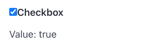
Toggle
Toggle create a switch and return true if it's on.
It is Checkbox drawn as a switch: same signature, same value, different affordance. Reach for it where the setting takes effect immediately ("dark mode on"), and for a checkbox where it is one of several things being filled in before a submit.
API
Interface
func Toggle(c *tgframe.Container, label string, conf ...*ToggleConf) bool
Parameters
cis Parent container.labelis the text beside the switch.confis an optional configuration, at most one.
// ToggleConf is the configuration for a toggle.
type ToggleConf struct {
	tgframe.Base // ID

	// Default is true if the toggle is default on.
	Default bool

	// Disabled is true if the toggle is disabled.
	Disabled bool
}
Example
	toggleValue := tgcomp.Toggle(p.Main, "Toggle")
	tgcomp.Text(p.Main, fmt.Sprint("Value: ", toggleValue),
		&tgcomp.TextConf{ID: "toggle_result"})

	onValue := tgcomp.Toggle(p.Main, "Toggle default on",
		&tgcomp.ToggleConf{Default: true})
	tgcomp.Text(p.Main, fmt.Sprint("Default: ", onValue),
		&tgcomp.TextConf{ID: "toggle_default_result"})

Button
Button create a button and return true if it's clicked.
API
func Button(c *tgframe.Container, label string, conf ...*ButtonConf) bool
cis Parent container.labelis the text on button.confis an optional configuration, at most one.
// ButtonConf is the configuration for the Button component
type ButtonConf struct {
	tgframe.Base // ID

	// Color defines the color of the button
	Color tcutil.Color

	// Disabled indicates whether the button should be initially disabled
	Disabled bool
}
Example
	btnClicked := tgcomp.Button(p.Main, "button")
	tgcomp.Text(p.Main, fmt.Sprint("Value: ", btnClicked),
		&tgcomp.TextConf{ID: "button_result"})
Two buttons with the same label claim the same id, so one of them needs its own:
tgcomp.Button(p.Main, "Save")
tgcomp.Button(p.Main, "Save", &tgcomp.ButtonConf{ID: "save_all"})
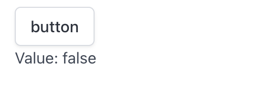
Asking before the button is drawn
func ButtonClicked(c *tgframe.Container, label string, conf ...*ButtonConf) bool
Button reports the click where it is written, which is a problem when the
button belongs below the content it changes — a "Load details" at the bottom
of a card. ButtonClicked reads the click off the run's state instead, so the
page can handle it first and write the content once:
if tgcomp.ButtonClicked(p.Main, "Load details") {
	details = fetchDetails()
}

tgcomp.Text(p.Main, details)
tgcomp.Button(p.Main, "Load details")
It reads the click, it does not draw the button: give it the same label and
conf the Button call gets, and it derives the same id. Where the button
carries a ButtonConf.ID, pass that conf to both — sharing one variable is the
way to keep them from drifting apart:
conf := &tgcomp.ButtonConf{ID: "load_details"}

if tgcomp.ButtonClicked(p.Main, "Load details", conf) {
	details = fetchDetails()
}

tgcomp.Text(p.Main, details)
tgcomp.Button(p.Main, "Load details", conf)
It is true for exactly the run that handles the click on a button the page has
on the screen — the same as what Button returns there — and false again on
the next run. A click id naming a button the last run never drew is not one:
the click comes from the client, and ButtonClicked is asked before the page
has written anything to check it against, so it checks that itself.
Don't compare State.GetClickID() with the conf id yourself: the click id
carries the component name in front of it
(Identity),
and comparing it by hand skips that check.
Menu
Menu puts a button on the page and hangs a list of actions behind it, and
returns the index of the item clicked. 0-indexed, nil if no item is clicked.
It is a button that carries several presses rather than one, so a row of related actions — rename, duplicate, delete — takes a single button's worth of space.
API
func Menu(c *tgframe.Container, label string, items []string, conf ...*MenuConf) *int
cis the container to add the menu to.labelis the text on the button that opens it.itemsare the actions in the dropdown, in the order they are shown.confis an optional configuration, at most one.
// MenuConf is the configuration for the Menu component.
type MenuConf struct {
	tgframe.Base // ID

	// Color defines the color of the button that opens the menu.
	Color tcutil.Color

	// Disabled is true if the button that opens the menu is disabled.
	Disabled bool
}
Example
	items := []string{"Rename", "Duplicate", "Delete"}
	picked := tgcomp.Menu(p.Main, "Actions", items)

	action := "none"
	if picked != nil {
		action = items[*picked]
	}

	tgcomp.Text(p.Main, "Action: "+action,
		&tgcomp.TextConf{ID: "menu_result"})
The click lasts one run
A menu reports a pick the way Button reports a press: the index
is there for exactly the run that handles the click, and nil again on the
next one. Act on it where you get it, or keep it yourself:
if picked := tgcomp.Menu(p.Main, "Actions", items); picked != nil {
	applyAction(items[*picked])
}
There is no "currently selected item" to read back later. A menu is a list of
things to do; a list of things to be is Select or
Radio, which keep what was chosen.
Identity
Each item claims a click id of its own, the menu's id with the item's index
behind it — menu_component_Actions_0 for the first item of a menu labelled
Actions. Two menus with the same label therefore collide, and the run reports
duplicated component id; give one of them a Conf.ID, and its items follow:
tgcomp.Menu(p.Main, "Actions", items)
tgcomp.Menu(p.Main, "Actions", items, &tgcomp.MenuConf{ID: "row_actions"})
Because the ids carry the index, a click naming an index the menu no longer has
— items dropped between the draw and the press — is not a pick, and the run
reads it as nil rather than as the last item.
Rendering
Whether the dropdown is open lives on the client, which the server never sees and never sets. The items are written every run, open or not.
Clicking an item closes the dropdown, as does clicking outside it or pressing
Escape. Escape goes to whichever overlay was opened last, so a menu opened
inside a dialog closes on the first press and leaves the
dialog for the second.
Disabled is on the button, not the items: a disabled menu cannot be opened at
all.
Inside a form
Picking an item sends the form it is written in, the way pressing a
Button does. A menu item is an action to take now, so it does not sit in the
form's queue waiting for something else to send it: the run that reports the
pick is the one that reads the values queued before it.
Select
Select create a select dropdown list and return its selected value.
API
func Select(c *tgframe.Container, label string, items []string, conf ...*SelectConf) *int
cis Parent container.labelis the label for select.itemsis the list of options.confis an optional configuration, at most one.- Return the index of the selected item, 0-indexed. nil if no item is selected.
// SelectConf is the configuration for the Select component.
type SelectConf struct {
	tgframe.Base // ID

	// Default is the item the select starts on, as an index into items,
	// 0-based like the return. It is only read until the app user first
	// touches the component, and one that points outside items is ignored.
	Default *int

	// Disabled is true if the select is disabled.
	Disabled bool
}

func (c *SelectConf) SetDefault(v int) *SelectConf
Default is 0-based like the return, so a Default of 0 starts on
items[0]. The state behind a select is 1-based — the frontend keeps its first
option for the placeholder — but that offset stays inside the component; see
State Storage for the one place it
shows.
Example
	selIdx := tgcomp.Select(p.Main, "Select", []string{"Value1", "Value2"})

	selItem := ""
	if selIdx != nil {
		selItem = fmt.Sprintf("Value%d", (*selIdx)+1)
	}

	tgcomp.Text(p.Main, "Value: "+selItem,
		&tgcomp.TextConf{ID: "select_result"})
Starting on the second item, until the app user picks another:
tgcomp.Select(p.Main, "Select", values,
	(&tgcomp.SelectConf{}).SetDefault(1))
A select derives its id from its label, so two with the same label collide. Naming either of them is the way out:
tgcomp.Select(p.Main, "Pick", items)
tgcomp.Select(p.Main, "Pick", items, &tgcomp.SelectConf{ID: "second_pick"})
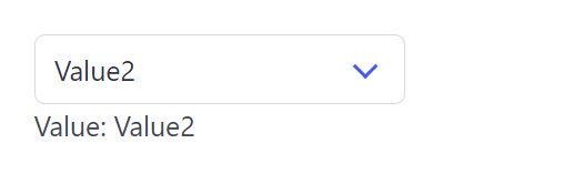
MultiSelect
MultiSelect create a dropdown list that takes more than one item and return the indices of the selected ones.
API
func MultiSelect(c *tgframe.Container, label string, items []string, conf ...*MultiSelectConf) []int
cis Parent container.labelis the label for multiselect.itemsis the list of options.confis an optional configuration, at most one.- Return the indices of the selected items, 0-indexed. nil when nothing is selected.
The result is ordered by items rather than by the order the app user picked
them in, so the same selection always reads the same way.
Nothing selected is nil, the same "nothing" Select hands back, so one check reads a single pick and a multiple one. Ranging over it is safe either way — a nil slice has no elements — so the check is only needed where the absence itself matters.
// MultiSelectConf is the configuration for the MultiSelect component.
type MultiSelectConf struct {
	tgframe.Base // ID

	// Default is the selection the component starts with, as indices into
	// items. It is only read until the app user first touches the component.
	Default []int

	// MaxSelections is how many items may be selected at once. Zero, the
	// default, is no limit. At the limit the frontend disables the items that
	// are not selected, so the limit is never reached by a refusal.
	MaxSelections int

	// Placeholder is the text shown while nothing is selected.
	Placeholder string

	// Disabled is true if the multiselect is disabled.
	Disabled bool
}
Example
	items := []string{"Alpha", "Beta", "Gamma"}
	selIdxes := tgcomp.MultiSelect(p.Main, "MultiSelect", items,
		&tgcomp.MultiSelectConf{
			Placeholder:   "pick up to two",
			MaxSelections: 2,
		})

	selItems := []string{}
	for _, idx := range selIdxes {
		selItems = append(selItems, items[idx])
	}

	tgcomp.Text(p.Main, "Values: "+strings.Join(selItems, ", "),
		&tgcomp.TextConf{ID: "multiselect_result"})
Like a Select, a multiselect derives its id from its label, so two with the same label collide. Naming either of them is the way out:
tgcomp.MultiSelect(p.Main, "Pick", items)
tgcomp.MultiSelect(p.Main, "Pick", items, &tgcomp.MultiSelectConf{ID: "second_pick"})

Radio
Radio create a group of radio items and return its selected value.
API
func Radio(c *tgframe.Container, label string, items []string, conf ...*RadioConf) *int
cis Parent container.labelis the label for options group.itemsis the list of options.confis an optional configuration, at most one.- Return the index of the selected item, 0-indexed. nil if no item is selected.
// RadioConf is the configuration for the Radio component.
type RadioConf struct {
	tgframe.Base // ID

	// Default is the item the group starts on, as an index into items,
	// 0-based like the return. It is only read until the app user first
	// touches the component, and one that points outside items is ignored.
	Default *int

	// Disabled is true if the radio group is disabled.
	Disabled bool
}

func (c *RadioConf) SetDefault(v int) *RadioConf
Example
	selIdx := tgcomp.Radio(p.Main,
		"Radio", []string{"Value3", "Value4"})

	selItem := ""
	if selIdx != nil {
		selItem = fmt.Sprintf("Value%d", (*selIdx)+3)
	}

	tgcomp.Text(p.Main, "Value: "+selItem,
		&tgcomp.TextConf{ID: "radio_result"})
Starting on the second item, until the app user picks another:
tgcomp.Radio(p.Main, "Radio", []string{"Value3", "Value4"},
	(&tgcomp.RadioConf{}).SetDefault(1))
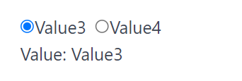
Select Slider
SelectSlider create a slider over a list of discrete items and return the index of the one it sits on.
API
Interface
func SelectSlider(c *tgframe.Container, label string, items []string,
	conf ...*SelectSliderConf) int
Parameters
cis Parent container.labelis the label of the slider.itemsis the list of options, drawn as marks along the track.confis an optional configuration, at most one.- Return the index of the item the slider sits on, 0-indexed as Select's is.
The handle is always on an item, so unlike Select there is no "nothing
selected" state and nothing to check: the index is the one the app user left it
at, else Default.
// SelectSliderConf is the configuration for the SelectSlider component.
type SelectSliderConf struct {
	tgframe.Base // ID

	// Default is the index of the item the slider starts on. Defaults to 0.
	Default int
}
An empty items, or a Default outside it, is a mistake in the call rather
than a value to correct, and panics.
Like Slider, the index is sent to Go when the handle is released rather than while it is being dragged.
Example
	sizes := []string{"S", "M", "L"}
	selIdx := tgcomp.SelectSlider(p.Main, "SelectSlider", sizes)

	tgcomp.Text(p.Main, "Value: "+sizes[selIdx],
		&tgcomp.TextConf{ID: "select_slider_result"})
Use this over Select when the options are ordered — sizes, tiers, buckets — so that their order is part of what the control shows. For an unordered list, a dropdown reads better.

DatePicker
DatePicker create a datepicker and return its selected date.
API
func DatePicker(c *tgframe.Container, label string, conf ...*DatePickerConf) *time.Time
cis Parent container.labelis the label for datepicker.confis an optional configuration, at most one.- Return the selected date, as midnight UTC on the day picked. nil if no date is selected.
// DatePickerConf is the configuration for the DatePicker component.
type DatePickerConf struct {
	tgframe.Base // ID

	// Default is the date the picker starts on, read to the day. It is only
	// read until the app user first picks one.
	Default *time.Time

	// Disabled is true if the datepicker is disabled.
	Disabled bool
}

func (c *DatePickerConf) SetDefault(v time.Time) *DatePickerConf
Only the day is kept: a clock on the Default is dropped, the way
TimePicker drops the date. That is what lets the three pickers
be compared and added without a conversion in between.
Example
	dateValue := tgcomp.DatePicker(p.Main, "DatePicker")
	val := ""
	if dateValue != nil {
		val = dateValue.Format("2006-01-02")
	}

	tgcomp.Text(p.Main, "Value: "+val,
		&tgcomp.TextConf{ID: "datepicker_result"})
Starting on a date, until the app user picks another:
tgcomp.DatePicker(p.Main, "DatePicker",
	(&tgcomp.DatePickerConf{}).SetDefault(
		time.Date(2026, 9, 8, 0, 0, 0, 0, time.UTC)))
Clearing the picker is an answer of "no date": the return goes back to nil and
stays there, rather than falling back to Default.
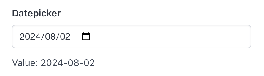
TimePicker
TimePicker create a timepicker and return its selected time of day.
API
func TimePicker(c *tgframe.Container, label string, conf ...*TimePickerConf) *time.Time
cis Parent container.labelis the label for timepicker.confis an optional configuration, at most one.- Return the selected time of day, as that clock on 1 January year 0 in UTC — only the clock is meaningful. nil if no time is selected.
// TimePickerConf is the configuration for the TimePicker component.
type TimePickerConf struct {
	tgframe.Base // ID

	// Default is the time of day the picker starts on, read to the minute. It
	// is only read until the app user first picks one.
	Default *time.Time

	// Disabled is true if the timepicker is disabled.
	Disabled bool
}

func (c *TimePickerConf) SetDefault(v time.Time) *TimePickerConf
Only the clock is kept: a date on the Default is dropped, the way
DatePicker drops the clock. Read the hour and minute off it
rather than the date:
day := tgcomp.DatePicker(p.Main, "Day")
at := tgcomp.TimePicker(p.Main, "At")
if day != nil && at != nil {
	when := day.Add(time.Duration(at.Hour())*time.Hour +
		time.Duration(at.Minute())*time.Minute)
	tgcomp.Text(p.Main, "Value: "+when.Format("2006-01-02 15:04"))
}
Example
	timeValue := tgcomp.TimePicker(p.Main, "TimePicker")
	val := ""
	if timeValue != nil {
		val = timeValue.Format("15:04")
	}

	tgcomp.Text(p.Main, "Value: "+val,
		&tgcomp.TextConf{ID: "timepicker_result"})
Starting on a time, until the app user picks another:
tgcomp.TimePicker(p.Main, "TimePicker",
	(&tgcomp.TimePickerConf{}).SetDefault(
		time.Date(0, time.January, 1, 9, 30, 0, 0, time.UTC)))
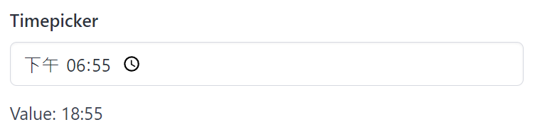
DateTimePicker
DateTimePicker create a datetimepicker and return its selected datetime.
API
func DateTimePicker(c *tgframe.Container, label string, conf ...*DateTimePickerConf) *time.Time
cis Parent container.labelis the label for datetimepicker.confis an optional configuration, at most one.- Return the selected datetime. nil if no datetime is selected.
// DateTimePickerConf is the configuration for the DateTimePicker component.
type DateTimePickerConf struct {
	tgframe.Base // ID

	// Default is the datetime the picker starts on, read to the minute. It is
	// only read until the app user first picks one.
	Default *time.Time

	// Disabled is true if the datetimepicker is disabled.
	Disabled bool
}

func (c *DateTimePickerConf) SetDefault(v time.Time) *DateTimePickerConf
Example
	datetimeValue := tgcomp.DateTimePicker(p.Main, "DateTimePicker")
	val := ""
	if datetimeValue != nil {
		val = datetimeValue.Format("2006-01-02 15:04")
	}

	tgcomp.Text(p.Main, "Value: "+val,
		&tgcomp.TextConf{ID: "datetimepicker_result"})
Starting on a datetime, until the app user picks another:
tgcomp.DateTimePicker(p.Main, "DateTimePicker",
	(&tgcomp.DateTimePickerConf{}).SetDefault(
		time.Date(2026, 9, 8, 13, 5, 0, 0, time.UTC)))
The wire carries minutes, so a Default with seconds on it is read to the
minute — the same value a pick of that minute gives.
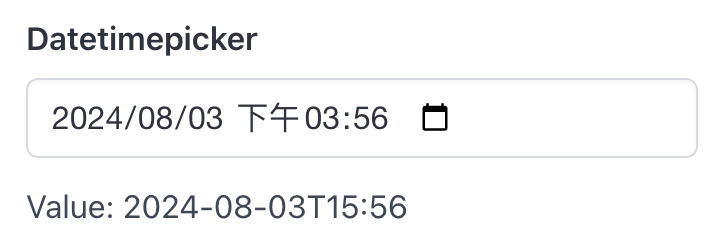
Number Input
Number create a number input and return its value, always within Min and
Max, and whether that value is the one the app user entered.
API
Interface
type Numeric interface {
	~int | ~int64 | ~float64
}

func Number[T Numeric](c *tgframe.Container, label string, conf ...*NumberConf[T]) (T, bool)
Parameters
cis Parent container.labelis the label of the number input.confis an optional configuration, at most one.
Number is one function for every numeric type it supports, so the type comes
from the conf or from an explicit instantiation:
count, _ := tgcomp.Number[int](p.Main, "Count")
ratio, _ := tgcomp.Number(p.Main, "Ratio", &tcinput.NumberConf[float64]{})
Neither of those sets a bound, so the second return is always true there and
_ is the honest way to write it. Read it wherever Min or Max is set —
see The second return below.
The ~ in the constraint lets a page keep its own named type all the way in,
so type Rating int is a Number[Rating].
NumberConf is generic, so tgcomp.NumberConf is an alias you can name but
the methods below live on tcinput.NumberConf.
Import it from github.com/voilelab/toolgui/toolgui/tgcomp/tcinput.
// NumberConf is the configuration for a number component.
type NumberConf[T Numeric] struct {
	tgframe.Base // ID

	// Default is what the input reads as before the app user types in it,
	// and what it reads as again once they empty it.
	Default T

	// Min is the minimum value of the number component.
	Min *T

	// Max is the maximum value of the number component.
	Max *T

	// Step is the step of the number component.
	Step *T

	// Color is the color of the number component.
	Color tcutil.Color

	// Placeholder is the placeholder of the number component.
	Placeholder string

	// Disabled is the disabled state of the number component.
	Disabled bool
}

func (c *NumberConf[T]) SetMin(v T) *NumberConf[T]
func (c *NumberConf[T]) SetMax(v T) *NumberConf[T]
func (c *NumberConf[T]) SetStep(v T) *NumberConf[T]
An integral T cannot step by 0, so an explicit zero step means 1. The value
comes back from the client as a JSON number, so an integral T truncates it.
There is no "nothing entered" state to report: an input nobody has typed in
reads as Default. A zero Default is also "no default" — the box starts empty
either way, and an empty box is zero, exactly as an empty
Textbox is "". Min, Max and Step stay pointers, because
there a zero is a bound and an absent one is not.
Emptying the box afterwards is an answer of zero, not a return to Default:
the same rule Textbox and the pickers follow, where clearing
reads as "" and as nil rather than putting the default back.
Min and Max are reported, then applied
The box does not enforce the range: it keeps whatever the app user typed,
marks itself invalid, shows a message beside itself and sends the value on as
it is. Number applies the range on arrival, so the value a page gets is
always within Min and Max.
That is the point of sending it. An out-of-range value used to be held back,
which left the server on the last one that happened to be inside the range —
so a button pressed while the box was red handed the page a number that was
no longer on screen, and pages set no Min/Max at all and clamped in Go by
hand instead. Now the value moves with what is typed: type 999 over a Max of
24 and the page reads 24, not whatever was there before.
The bounds are compared before an integral T truncates, on the number the
app user actually typed. A float no T can hold — a pasted 1e20 is no
int — has no number to report and no bound to be pulled to, so it reads as
Default.
An integral T still truncates a fractional value that is inside the range:
20.9 under a Max of 21 reads as 20. That is reported rather than
enforced too — see The second return.
The second return
Pulling the value into the range keeps it usable, but it says nothing about
where it came from: a Max of 24 reads as 24 whether the app user typed 24 or
typed 999. Storing the second is the bug this input used to have, and clamping
did not fix it — it only made the number stored a fresh 24 instead of a stale
one. The app user still sees a number they never entered come back.
The second return is what tells those apart:
limit, ok := tgcomp.Number(p.Main, "Limit", conf)
if !ok {
    tgcomp.Text(p.Main, "Enter a limit between 0 and 24.")
    return nil
}
save(limit)
It is false when what arrived was outside Min or Max, and when T does
not hold it as it is:
- a pasted
1e20is noint— there is no number to report, so the value reads asDefault; - a typed
20.9is nointeither — an integralTtruncates it to20, and nothing on the wire saysTis integral, so the box takes a decimal whateverTis. The value is the20, and the signal says it is not what was typed.
Neither is the app user's number, any more than a clamped 999 is. With no
bounds set and a T that holds whatever arrives exactly, it is always true:
an untouched box reading as Default and an emptied one reading as zero are
both answers, not refusals.
The value is still worth reading when it is false. It is the nearest one
T holds inside the range, which is what a page that only wants to display
something should show. The signal is extra information, not a replacement for the value:
handing back the raw 999 instead would put back the implementation-defined
conversion an integral T does with a number it cannot hold.
A form with several bounded inputs &&s their signals together itself; there
is no form-level validity to read.
Why a second return, and not something else
Three shapes were on the table. This is the one that is safe by default:
x := Number(...) stops compiling, so every call site has to look at the
signal once, rather than only the pages whose author already knew about the
problem. The cost is that Number is the only input with a comma-ok return —
an asymmetry, but a Go-idiomatic one, and one the bug is worth.
A sibling query function — NumberInRange(state, id) bool, in the shape of
ButtonClicked — was rejected for the opposite reason: it is opt-in. A page
that does not know it exists behaves exactly as it does today and stores the
clamped 24, so the default stays wrong. It would also have added another
component-layer function taking a *tgframe.State, which is the entry point
the component layer is trying to shed.
A handle — Number returning a value with Value() and Valid() on it —
carries the same signal and lines up with StatusHandle, but it is a heavy
shape for the simplest input there is, and it breaks existing call sites just
as hard as a second return does without buying anything more.
Example
	numberValue, ok := tgcomp.Number(p.Main, "Number",
		(&tcinput.NumberConf[float64]{
			Placeholder: "input the value here",
			Color:       tcutil.ColorSuccess,
			Default:     10,
		}).SetMin(10).SetMax(20).SetStep(2))

	// Type 123 and the box goes red while the value here reads 20: out of
	// range, what arrives is pulled to the bound rather than left on the
	// last one that was inside it.
	tgcomp.Text(p.Main, fmt.Sprint("Value: ", numberValue),
		&tgcomp.TextConf{ID: "number_result"})

	// 20 is a fine number to show, but nobody typed it, so it is not a
	// number to save. ok is what tells the two apart.
	if tgcomp.Button(p.Main, "Save number",
		&tgcomp.ButtonConf{ID: "save_number"}) {
		if ok {
			tgcomp.Text(p.Main, fmt.Sprint("Saved: ", numberValue),
				&tgcomp.TextConf{ID: "number_saved"})
		} else {
			tgcomp.Text(p.Main, "Not saved: enter a value between 10 and 20",
				&tgcomp.TextConf{ID: "number_saved"})
		}
	}
Slider
Slider create a slider over a numeric range and return its value.
API
Interface
type Numeric interface {
	~int | ~int64 | ~float64
}

func Slider[T Numeric](c *tgframe.Container, label string, conf ...*SliderConf[T]) T
Parameters
cis Parent container.labelis the label of the slider.confis an optional configuration, at most one.- Return the value the slider sits at.
Slider shares its constraint with Number, so the type
comes from the conf or from an explicit instantiation:
threshold := tgcomp.Slider[int](p.Main, "Threshold")
ratio := tgcomp.Slider(p.Main, "Ratio", &tcinput.SliderConf[float64]{})
A slider always sits somewhere in its range, so it always has a value to hand
back — no pointer, nothing to check: the value the app user left it at, else
Default, else Min. Default stays a pointer in the conf because an unset
one means Min, which need not be zero.
SliderConf is generic, so tgcomp.SliderConf is an alias you can name but
the methods below live on tcinput.SliderConf.
Import it from github.com/voilelab/toolgui/toolgui/tgcomp/tcinput.
// SliderConf is the configuration for a slider component.
type SliderConf[T Numeric] struct {
	tgframe.Base // ID

	// Default is the value the slider starts at. Defaults to Min.
	Default *T

	// Min is the low end of the range. Defaults to 0.
	Min *T

	// Max is the high end of the range. Defaults to 100.
	Max *T

	// Step is the distance between two positions. Defaults to 1 for an
	// integral T, and to a hundredth of the range for a floating point one.
	Step *T

	// Disabled is the disabled state of the slider component.
	Disabled bool
}

func (c *SliderConf[T]) SetDefault(v T) *SliderConf[T]
func (c *SliderConf[T]) SetMin(v T) *SliderConf[T]
func (c *SliderConf[T]) SetMax(v T) *SliderConf[T]
func (c *SliderConf[T]) SetStep(v T) *SliderConf[T]
A zero Step reads as unset, as it does on Number: a slider that cannot move
is not a value to pass on. A Step that does not divide the range evenly is
fine, and leaves both ends of the range where you put them.
A Min above Max, a negative Step, or a Default outside the range are
mistakes in the call rather than values to correct, and panic.
When the value is reported
The value is sent to Go when the handle is released, not while it is being dragged. A drag across the range is one rerun rather than one per step it crosses, which is what keeps a page with real work behind it usable.
The practical consequence is that anything downstream of a slider updates once the app user lets go, not as they move. A value that has to follow the handle live belongs in the browser, not in a rerun.
Example
	sliderValue := tgcomp.Slider(p.Main, "Slider",
		(&tcinput.SliderConf[int64]{}).SetMin(0).SetMax(100).SetStep(10).
			SetDefault(50))

	// A slider always sits somewhere, so there is always a value.
	tgcomp.Text(p.Main, fmt.Sprint("Value: ", sliderValue),
		&tgcomp.TextConf{ID: "slider_result"})
A slider derives its id from its label, so two with the same label collide. Naming either of them is the way out:
tgcomp.Slider[int](p.Main, "Weight")
tgcomp.Slider[int](p.Main, "Weight", &tcinput.SliderConf[int]{ID: "second_weight"})

Color Picker
ColorPicker create a color picker and return the picked color.
API
Interface
func ColorPicker(c *tgframe.Container, label string, conf ...*ColorPickerConf) string
Parameters
cis Parent container.labelis the label of the color picker.confis an optional configuration, at most one.- Return the picked color as a lowercase
#rrggbbstring. Before anything is picked, that is the conf'sDefault.
// ColorPickerConf is the configuration for a color picker.
type ColorPickerConf struct {
	tgframe.Base // ID

	// Default is the color the picker starts on, as "#rrggbb". Defaults to
	// black.
	Default string

	// Disabled is true if the color picker is disabled.
	Disabled bool
}
The return is always seven characters, always lowercase, and never empty, so it
can go straight into a style or a chart color. A Default that is not an
#rrggbb color is a mistake in the call rather than a value to correct, and
panics — "#fff" and "red" included.
The color is sent to Go when the pointer is released, not while it is being dragged over the picker.
Example
	color := tgcomp.ColorPicker(p.Main, "ColorPicker",
		&tgcomp.ColorPickerConf{Default: "#ff3860"})

	tgcomp.Text(p.Main, "Value: "+color,
		&tgcomp.TextConf{ID: "color_picker_result"})

Form
Form create a form component. The input components in this component will not auto trigger script execution. The user need to submit the form to trigger the script execution.
A form is submitted by its built-in submit button, or by a Button written
inside it: a click inside a form is sent together with the values held since
the last submit, so the run that sees the click is the one that reads the new
values. That is what HideSubmit is for — a search form can offer its own
"Search" button instead of one of those beside a hardwired "Submit".
API
Interface
func Form(c *tgframe.Container, conf ...*FormConf) *tgframe.Container
Parameters
cis Parent container.confis an optional configuration, at most one.
// FormConf is the configuration for the Form component.
type FormConf struct {
	tgframe.Base // ID

	// SubmitLabel is the text on the built-in submit button. Empty is
	// "Submit".
	SubmitLabel string

	// HideSubmit drops the built-in submit button. Submitting is then up to a
	// Button written inside the form; a form with neither has no way to be
	// sent.
	HideSubmit bool
}
Example
	var a, b float64
	var ops []int
	opItems := []string{"sum", "product"}
	tgcomp.Form(p.Main, &tgcomp.FormConf{ID: "form"}).With(func(c *tgframe.Container) {
		// No Min or Max, so every number the app user can type is one
		// this form accepts: the second return is always true here.
		a, _ = tgcomp.Number[float64](c, "a")
		b, _ = tgcomp.Number[float64](c, "b")
		ops = tgcomp.MultiSelect(c, "ops", opItems,
			&tgcomp.MultiSelectConf{Placeholder: "pick the operations"})
	})

	// Named rather than numbered, so adding an item to opItems cannot
	// silently turn into one of the operations already here.
	for _, op := range ops {
		switch opItems[op] {
		case "sum":
			tgcomp.Text(p.Main,
				fmt.Sprintf("int(a) + int(b) = %d", int(a)+int(b)))
		case "product":
			tgcomp.Text(p.Main,
				fmt.Sprintf("int(a) * int(b) = %d", int(a)*int(b)))
		}
	}
An untouched field reads as its Default, so the fields hold zero until the
app user fills them in and hits Submit — there is nothing to nil-check.
Submitting from a button inside the form
	var keyword string
	var searched bool

	// No submit button of its own: the Search button inside sends the
	// form, so the page offers one button rather than two.
	tgcomp.Form(p.Main, &tgcomp.FormConf{
		ID: "search_form", HideSubmit: true}).
		With(func(c *tgframe.Container) {
			keyword = tgcomp.Textbox(c, "keyword")
			searched = tgcomp.Button(c, "Search")

			// Only a Button sends the form. A download button reports its
			// press the same way, and handing someone a file is not
			// submitting.
			tgcomp.DownloadButton(c, "Save query", []byte("q"),
				&tgcomp.DownloadButtonConf{Filename: "query.txt"})
		})

	if searched {
		tgcomp.Text(p.Main, "Searched: "+keyword)
	} else {
		tgcomp.Text(p.Main, "Not searched yet")
	}
searched is true on the run the click was sent with, and keyword already
holds what was typed before it.
Any widget belongs in a form
A slider, a toggle or a checkbox inside a form holds its value like the rest of them, and hands it over on submit rather than on the drag or the click:
	var threshold int64
	var enabled bool
	var notify bool

	tgcomp.Form(p.Main, &tgcomp.FormConf{ID: "widget_form"}).
		With(func(c *tgframe.Container) {
			threshold = tgcomp.Slider(c, "threshold",
				(&tcinput.SliderConf[int64]{}).SetMax(100).SetStep(25))
			enabled = tgcomp.Toggle(c, "enabled")
			notify = tgcomp.Checkbox(c, "notify")
		})

	tgcomp.Text(p.Main,
		fmt.Sprintf("threshold = %d, enabled = %v, notify = %v",
			threshold, enabled, notify))
Naming the submit button
var city string
tgcomp.Form(p.Main, &tgcomp.FormConf{
ID: "label_form", SubmitLabel: "Apply"}).
With(func(c *tgframe.Container) {
city = tgcomp.Textbox(c, "city")
})
tgcomp.Text(p.Main, "Applied: "+city)
Layout Components
The layout components display control component layout and position.
import "github.com/voilelab/toolgui/toolgui/tgcomp"
These components are shown on the layout page of the demo app: run it in
your browser, or task run_demo and open
http://localhost:3000/layout.
Container
Container is the most basic layout component. Its definition is in tgframe. The Main "container" and Sidebar "container" are Containers.
Usage
To create a container under a container. Just call the function:
func (c *Container) AddContainer(id string) *Container
- ID should be unique.
Box
Box provide a simple container that show box style.
Usage
Box create a box container.
func Box(c *tgframe.Container, conf ...*BoxConf) *tgframe.Container
c: Parent container.conf: Optional configuration, at most one.
// BoxConf is the configuration for the Box component.
type BoxConf struct {
tgframe.Base // ID
}
The container a box hands out derives its id from the box's; give none and it carries none, and the components inside are still placed by position.
Example
box := tgcomp.Box(p.Main, &tgcomp.BoxConf{ID: "box"})
tgcomp.Text(box, "A box!")
box := tgcomp.Box(boxCompCol, &tgcomp.BoxConf{ID: "summary"})
Empty
Empty reserves a place in the page and hands back a slot to write it with. Writing the slot again takes the previous contents off the screen instead of adding to them, which is what lets a page function show progress and then replace it with the result.
Usage
func Empty(c *tgframe.Container, conf ...*EmptyConf) *EmptySlot
c: Parent container.conf: Optional configuration, at most one.
// EmptyConf is the configuration for the Empty component.
type EmptyConf struct {
tgframe.Base // ID
}
The container an empty hands out derives its id from the empty's; give none and it carries none, and the components inside are still placed by position.
The slot has two methods:
// With writes what f adds into the slot, over whatever it held.
func (s *EmptySlot) With(f func(c *tgframe.Container))
// Clear takes what the slot holds off the screen.
func (s *EmptySlot) Clear()
The container With hands over lives until the next With or Clear.
Writing into it after that puts components under a node the client no longer
has, so take it in the callback rather than keeping it.
Example
slot := tgcomp.Empty(p.Main, &tgcomp.EmptyConf{ID: "query_result"})
slot.With(func(c *tgframe.Container) {
tgcomp.Text(c, "No query yet.")
})
if tgcomp.Button(p.Main, "Run a slow query") {
slot.With(func(c *tgframe.Container) {
tgcomp.Text(c, "Querying…")
})
time.Sleep(3 * time.Second)
slot.With(func(c *tgframe.Container) {
tgcomp.Table(c,
[]string{"table", "rows"},
[][]string{{"users", "1289"}, {"orders", "4021"}})
})
}
Ids and state
A widget in a slot claims its id the same way it would anywhere else, and
gives it back when the slot is cleared. So the same widget may be written into
one slot as many times as the page likes without the run failing with
duplicated component id:
slot := tgcomp.Empty(p.Main)
for range names {
slot.With(func(c *tgframe.Container) {
tgcomp.Textbox(c, "Name")
})
}
A widget that is cleared and not written again is gone from the page, and its state goes with it: the value it held is dropped at the end of the run, rather than turning up in whatever lands on that id next run.
The slot also starts empty on every run, whatever the last run left in it.
Column
Column provides columns layout.
Usage
- Column create N columns, each as wide as its content needs.
- Column1 create 1 column.
- Column2 create 2 columns.
- Column3 create 3 columns.
- EqColumn create N columns with equal width.
- EqColumn1 create 1 column with equal width.
- EqColumn2 create 2 columns with equal width.
- EqColumn3 create 3 columns with equal width.
- EqColumn4 create 4 columns with equal width.
- EqColumn5 create 5 columns with equal width.
func Column(c *tgframe.Container, n uint, conf ...*ColumnConf) []*tgframe.Container
func Column1(c *tgframe.Container, conf ...*ColumnConf) *tgframe.Container
func Column2(c *tgframe.Container, conf ...*ColumnConf) (*tgframe.Container, *tgframe.Container)
func Column3(c *tgframe.Container, conf ...*ColumnConf) (*tgframe.Container, *tgframe.Container, *tgframe.Container)
func EqColumn(c *tgframe.Container, n uint, conf ...*ColumnConf) []*tgframe.Container
func EqColumn1(c *tgframe.Container, conf ...*ColumnConf) *tgframe.Container
func EqColumn2(c *tgframe.Container, conf ...*ColumnConf) (*tgframe.Container, *tgframe.Container)
func EqColumn3(c *tgframe.Container, conf ...*ColumnConf) (*tgframe.Container, *tgframe.Container, *tgframe.Container)
func EqColumn4(c *tgframe.Container, conf ...*ColumnConf) (*tgframe.Container, *tgframe.Container, *tgframe.Container, *tgframe.Container)
func EqColumn5(c *tgframe.Container, conf ...*ColumnConf) (*tgframe.Container, *tgframe.Container, *tgframe.Container, *tgframe.Container, *tgframe.Container)
c: Parent container.n: Number of column.conf: Optional configuration, at most one.
// ColumnConf is the configuration for the column components.
type ColumnConf struct {
tgframe.Base // ID
}
The containers a column hands out derive their ids from its ID; give none and they carry none, and the components inside are still placed by position.
Example
cols := tgcomp.Column(p.Main, 3, &tgcomp.ColumnConf{ID: "cols"})
for i, col := range cols {
tgcomp.Text(col, fmt.Sprintf("col-%d", i))
}
left, right := tgcomp.EqColumn2(p.Main, &tgcomp.ColumnConf{ID: "summary"})
Grid
Grid lays what is written into it out in cells of equal width, as many to a
row as fit, and wraps onto the next row when the width runs out. A row of
cards such as Metric no longer has to be cut into
groups of N and handed to EqColumn by hand.
Usage
func Grid(c *tgframe.Container, conf ...*GridConf) *tgframe.Container
c: Parent container.conf: Optional configuration, at most one.
// GridConf is the configuration for the Grid component.
type GridConf struct {
tgframe.Base // ID
// MinColWidth is the narrowest a cell may be, in px; it decides how many
// cells fit a row. 0 means GridDefaultMinColWidth (200).
MinColWidth uint
// Gap is the space between cells: GridGapNone, GridGapXS, GridGapSM,
// GridGapMD (default), GridGapLG or GridGapXL. Anything else panics.
Gap string
}
The container a grid hands out derives its id from the grid's; give none and it carries none, and the components inside are still placed by position.
Each component written into the grid is one cell. A short last row keeps the
width of the rows above, and on a screen narrower than MinColWidth a cell
takes the full width. A grid works the same inside a form,
an Empty slot or a dialog.
Example
metrics := []struct{ label, value, delta string }{
{"Revenue", "12.4M", "+12%"},
{"Users", "8,210", "+3%"},
{"Churn", "1.8%", "-0.4%"},
{"Orders", "1,024", "+9%"},
{"Refunds", "31", "-12%"},
}
// As many cells to a row as fit; the fifth wraps, and keeps the width of
// the four above.
g := tgcomp.Grid(p.Main, &tgcomp.GridConf{ID: "kpi", MinColWidth: 160})
for _, m := range metrics {
tgcomp.Metric(g, m.label, m.value, &tgcomp.MetricConf{Delta: m.delta})
}
Grid or Column?
EqColumn gives a fixed number of columns, each a container of
its own — use it to split a page into parts. A grid is for a list of similar
items whose count, or the screen they land on, decides how many fit a row.
Toolbar
Toolbar is a row of controls: what is written into it lines up horizontally,
each item as wide as it needs to be, rather than taking a row of the page
each. Sticky keeps that row at the top of the page while the rest of it
scrolls under.
Usage
func Toolbar(c *tgframe.Container, conf ...*ToolbarConf) *tgframe.Container
c: Parent container.conf: Optional configuration, at most one.
// ToolbarConf is the configuration for the Toolbar component.
type ToolbarConf struct {
tgframe.Base // ID
// Sticky keeps the row at the top of the page while the rest of it
// scrolls under, on an opaque background so nothing shows through.
Sticky bool
// Justify is ToolbarJustifyStart (default), ToolbarJustifyEnd or
// ToolbarJustifyBetween. Anything else panics.
Justify string
}
The container a toolbar hands out derives its id from the toolbar's; give none and it carries none, and the components inside are still placed by position.
Justify says where the row's spare width goes:
| Value | Items sit |
|---|---|
ToolbarJustifyStart | at the start of the row, the default |
ToolbarJustifyEnd | at the end of the row |
ToolbarJustifyBetween | spread out, first and last at the edges |
A row too wide for the viewport wraps rather than pushing the page sideways, so a toolbar is as safe on a phone as a column is.
Example
bar := tgcomp.Toolbar(p.Main, &tgcomp.ToolbarConf{ID: "toolbar"})
run := tgcomp.Button(bar, "Run", &tgcomp.ButtonConf{ID: "toolbar_run"})
tgcomp.Button(bar, "Stop", &tgcomp.ButtonConf{ID: "toolbar_stop"})
modes := []string{"fast", "safe"}
mode := tgcomp.Select(bar, "Mode", modes,
(&tgcomp.SelectConf{ID: "toolbar_mode"}).SetDefault(0))
tgcomp.Text(p.Main, fmt.Sprintf("Run: %v, mode: %s", run, modes[*mode]),
&tgcomp.TextConf{ID: "toolbar_result"})
Sticky
A sticky toolbar stays at the top of the viewport while the page scrolls under it, on the page's own background and with a line under it, so what passes beneath does not show through:
bar := tgcomp.Toolbar(p.Main, &tgcomp.ToolbarConf{
ID: "sticky_toolbar",
Sticky: true,
Justify: tgcomp.ToolbarJustifyBetween,
})
tgcomp.Subtitle(bar, "Report")
tgcomp.Button(bar, "Export", &tgcomp.ButtonConf{ID: "toolbar_export"})
// Enough rows to scroll, so the row above stays put while they pass
// under it.
for i := range 40 {
tgcomp.Text(p.Main, fmt.Sprintf("row-%d", i))
}
It sticks to whatever scrolls the page, which for an app in the shell is the document. A toolbar written inside something that scrolls on its own — a dialog body — sticks to the top of that instead, and below anything that container already keeps there: a dialog's own header is sticky, so the row stops under it rather than sliding beneath it.
d := tgcomp.Dialog(p.Main, "Rows", &tgcomp.DialogConf{ID: "toolbar_dialog"})
if tgcomp.Button(p.Main, "Open", &tgcomp.ButtonConf{ID: "toolbar_dialog_open"}) {
d.Open()
}
d.With(func(c *tgframe.Container) {
bar := tgcomp.Toolbar(c, &tgcomp.ToolbarConf{
ID: "dialog_toolbar",
Sticky: true,
})
tgcomp.Button(bar, "Export", &tgcomp.ButtonConf{ID: "toolbar_dialog_export"})
// A dialog scrolls its own body, so the row sticks to the top of
// that -- below the dialog's header rather than under it.
for i := range 30 {
tgcomp.Text(c, fmt.Sprintf("dialog-row-%d", i))
}
})
Toolbar or Column?
Column is for laying a page out in parts: each column is a
share of the width, and what goes in one is a section of the page. A toolbar
is for the controls above that page — it packs them together at their natural
widths, wraps them on a narrow screen and, with Sticky, keeps them reachable
however far down the page the reader is.
Expand
Expand provides expandable layout.
API
func Expand(c *tgframe.Container, title string, expanded bool, conf ...*ExpandConf) *tgframe.Container
cis the container to add the expandable component to.titleis the title of the expandable component.expandedis the initial expanded state of the expandable component.confis an optional configuration, at most one.
// ExpandConf is the configuration for the Expand component.
type ExpandConf struct {
tgframe.Base // ID
}
The client keeps whether an expander is open, so it claims an id derived from
its title. Two expanders with the same title collide; give one of them a
Conf.ID.
Example
expand := tgcomp.Expand(p.Main, "Expand", true)
tgcomp.Text(expand, "A expand!")
tgcomp.Expand(c, "Details", false, &tgcomp.ExpandConf{ID: "second_details"})
Rendering
The contents are built on the first open and then stay rendered, hidden while collapsed. An expander that was never opened costs nothing, and collapsing one that was opened keeps what it holds.
Popover
Popover puts a button on the page and hangs a floating panel behind it, so options that are not needed often stay out of the way without taking a row of their own.
API
func Popover(c *tgframe.Container, label string, conf ...*PopoverConf) *tgframe.Container
cis the container to add the popover to.labelis the label of the button that opens it.confis an optional configuration, at most one.
// PopoverConf is the configuration for the Popover component.
type PopoverConf struct {
tgframe.Base // ID
// Disabled is true if the trigger button is disabled.
Disabled bool
}
The client keeps whether a popover is open, so it claims an id derived from
its label. Two popovers with the same label collide, and the run reports
duplicated component id; give one of them a Conf.ID.
Example
pop := tgcomp.Popover(p.Main, "Advanced options")
tgcomp.Checkbox(pop, "Show hidden columns")
if tgcomp.Button(pop, "Reset options") {
tgcomp.Text(p.Main, "Options reset.",
&tgcomp.TextConf{ID: "popover_reset"})
}
pop := tgcomp.Popover(c, "Advanced options",
&tgcomp.PopoverConf{ID: "second_advanced", Disabled: true})
Rendering
The panel holds whatever was written into the returned container, whether the popover is open or not: nothing is built lazily, so a widget inside keeps what it holds while the popover is closed.
The open state lives on the client, which the server never sees and never
sets. A widget inside the panel can rerun the page — the popover stays open
across the rerun. Clicking outside it, or pressing Escape, closes it.
Escape goes to whichever overlay was opened last, so a popover opened inside
a dialog closes on the first press and leaves the dialog for the
second.
An open panel follows its button: it hides itself while the button is scrolled off the screen, and comes back when the button does.
Dialog
Dialog asks the app user something without leaving the page: a confirmation, a short form. Its body is only computed while it is open, so the query behind "delete these 3 rows?" does not run on every rerun.
Usage
func Dialog(c *tgframe.Container, title string, conf ...*DialogConf) *DialogContainer
c: Parent container.title: The heading of the dialog.conf: Optional configuration, at most one.
// DialogConf is the configuration for the Dialog component.
type DialogConf struct {
tgframe.Base // ID
// Width is DialogWidthSmall (default), DialogWidthMedium or
// DialogWidthLarge. Anything else panics.
Width string
// Dismissible lets the app user close the dialog with X, ESC or a click
// outside, default on. Set it with SetDismissible.
Dismissible *bool
}
Dismissible is a pointer, against the positive naming the other confs use
for their bools, because the default is on: a plain bool's zero value would
mean "not dismissible", which is the rarer of the two. Set it through the
helper rather than taking the address of a variable:
(&tgcomp.DialogConf{}).SetDismissible(false)
The dialog hands back a handle:
// Open opens the dialog, from anywhere in the run.
func (d *DialogContainer) Open()
// Close closes the dialog.
func (d *DialogContainer) Close()
// IsOpen reports whether the dialog is open, as of this point in the run.
func (d *DialogContainer) IsOpen() bool
// With writes the body, and calls f only while the dialog is open.
func (d *DialogContainer) With(f func(c *tgframe.Container))
Whether the dialog is open is kept by the page rather than the client, so a
dialog claims an id derived from its title. Two dialogs with the same title
collide; give one of them a Conf.ID.
Example
d := tgcomp.Dialog(p.Main, "Delete confirm")
if tgcomp.Button(p.Main, "Delete") {
d.Open()
}
d.With(func(c *tgframe.Container) {
tgcomp.Text(c, "Delete "+name+"?")
if tgcomp.Button(c, "Yes, delete") {
remove(name)
d.Close()
}
})
Handle the trigger first, then With
With is what draws the body, so whatever opens the dialog has to be handled
above it, as in the example. Open() still works below With — the dialog is
open on the client the moment it is called, wherever in the run that is,
because being open is a property of the dialog rather than "was the body
sent". But the body of that run is empty: With already went by while the
dialog was closed. It appears on the next run.
Close() is the mirror image. The body of the run it is called in has already
been sent, so the client is told to close separately and keeps what it holds
until the run ends. The next run does not write the body, and the client drops
it then. Nothing has to cut the run short.
Widget state while closed
Widgets inside the body keep their state while the dialog is closed, the same
as any component hidden behind an if: a closed dialog does not write them,
and a page only gives an id's state back when something takes it off the
screen. So a half-filled form is still half-filled when the dialog is reopened.
To throw that state away instead, write the body into an
Empty slot and clear it when the dialog closes: clearing a slot
gives back the ids it held, and the state under them goes with it.
Rendering
The dialog is a portal: it covers the window from wherever it is written, so
one declared in p.Sidebar still darkens the whole page rather than the side
column. A closed dialog renders as an empty portal and takes up no room.
// A dialog is a portal wherever it is written, so one declared in the
// sidebar covers the whole window rather than the side column.
sideDialog := tgcomp.Dialog(p.Sidebar, "From the sidebar",
(&tgcomp.DialogConf{Width: tgcomp.DialogWidthMedium}).
SetDismissible(false))
if tgcomp.Button(p.Sidebar, "Open the sidebar dialog") {
sideDialog.Open()
}
sideDialog.With(func(c *tgframe.Container) {
tgcomp.Text(c, "Declared in the sidebar, shown over the page.")
if tgcomp.Button(c, "Close the sidebar dialog") {
sideDialog.Close()
}
})
Two dialogs may be open at once, and the one opened later is drawn over the
one opened earlier, whichever order the page writes them in. ESC and a click
outside reach that topmost dialog only, so dismissing it leaves the one under
it open; a dialog with Dismissible off on top swallows them rather than
letting the dialog beneath take them.
A popover opened inside a dialog counts as being on top of it, so ESC closes the popover first and the dialog on the press after.
d := tgcomp.Dialog(p.Main, "Delete confirm")
why := tgcomp.Dialog(p.Main, "What deleting does")
d.With(func(c *tgframe.Container) {
if tgcomp.Button(c, "What does this do?") {
why.Open()
}
})
why.With(func(c *tgframe.Container) {
tgcomp.Text(c, "The rows are removed for good.")
})
why.Open() is called from d's body, which is above why.With, so the
second dialog's body is drawn in the same run it opens in.
Tab
Tab component is used to create a tabbed interface.
API
func Tab(c *tgframe.Container, tabs []string, conf ...*TabConf) []*tgframe.Container
func Tab2(c *tgframe.Container, tab1, tab2 string, conf ...*TabConf) (*tgframe.Container, *tgframe.Container)
func Tab3(c *tgframe.Container, tab1, tab2, tab3 string, conf ...*TabConf) (*tgframe.Container, *tgframe.Container, *tgframe.Container)
func Tab4(c *tgframe.Container, tab1, tab2, tab3, tab4 string, conf ...*TabConf) (*tgframe.Container, *tgframe.Container, *tgframe.Container, *tgframe.Container)
func Tab5(c *tgframe.Container, tab1, tab2, tab3, tab4, tab5 string, conf ...*TabConf) (*tgframe.Container, *tgframe.Container, *tgframe.Container, *tgframe.Container, *tgframe.Container)
cis the container to add the tab component to.tabsis the list of tab titles.tab1,tab2,tab3,tab4,tab5are the tab titles.confis an optional configuration, at most one.
// TabConf is the configuration for the tab components.
type TabConf struct {
tgframe.Base // ID
}
The client keeps which tab is open, so the component claims an id derived from
the tab titles. Two tab groups with the same titles collide; give one of them
a Conf.ID.
Example
tab1, tab2 := tgcomp.Tab2(p.Main, "tab1", "tab2")
tgcomp.Text(tab1, "A tab!")
tgcomp.Text(tab2, "B tab!")
one, two := tgcomp.Tab2(c, "one", "two", &tgcomp.TabConf{ID: "lower"})
Rendering
Every tab is rendered and the inactive ones are hidden, so a tab keeps what it
holds while you are on another one: an Iframe is not reloaded, a Chart is
not rebuilt, and what was typed into an input is still there when you come back.
Chat Components
The chat components build a conversational interface, such as a chat with a model.
import "github.com/voilelab/toolgui/toolgui/tgcomp"
These components are shown on the chat page of the demo app: run it in
your browser, or task run_demo and open
http://localhost:3000/chat.
Chat Message
ChatMessage draws one message of a chat, and returns the container its content goes in. Any component can go in it.
API
Interface
func ChatMessage(c *tgframe.Container, role string, conf ...*ChatMessageConf) *tgframe.Container
Parameters
c: Parent container.role: Who sent the message."user"and"human"are drawn as the user,"assistant"and"ai"as the assistant, each with an icon of its own. Any other role is drawn by its first letter.conf: Optional configuration, at most one.
// ChatMessageConf is the configuration for the ChatMessage component.
type ChatMessageConf struct {
tgframe.Base // ID
// Avatar is an emoji, or an image URL: http, https, data:image or a path
// starting with / or ./. Default is an icon for the user and the
// assistant, and the role's first letter for any other role.
Avatar string
}
Example
tgcomp.Markdown(tgcomp.ChatMessage(p.Main, "user"), "What can ChatMessage hold?")
reply := tgcomp.ChatMessage(p.Main, "assistant")
tgcomp.Markdown(reply, "Any component, for example a **metric**:")
tgcomp.Metric(reply, "Tokens", "1,024")
tgcomp.Text(tgcomp.ChatMessage(p.Main, "tool",
&tgcomp.ChatMessageConf{Avatar: "🔧"}), "search(\"toolgui\") -> 3 results")
A reply streamed with WriteStream:
if tgcomp.Button(p.Main, "Ask") {
tgcomp.Text(tgcomp.ChatMessage(p.Main, "user"), "Tell me about WriteStream.")
reply := tgcomp.ChatMessage(p.Main, "assistant")
if _, err := tgcomp.WriteStream(reply, fakeReply(p.Context)); err != nil {
return err
}
}
Chat Input
ChatInput draws a box to send a chat message. It returns the message on the run the send starts, and empties the box.
API
Interface
func ChatInput(c *tgframe.Container, placeholder string, conf ...*ChatInputConf) (string, bool)
Parameters
c: Parent container.placeholder: The hint shown in the empty box. It also names the input, so two inputs with the same placeholder collide; give one aConf.ID.conf: Optional configuration, at most one.
// ChatInputConf is the configuration for the ChatInput component.
type ChatInputConf struct {
tgframe.Base // ID
// MaxLength is the most characters a message may have. 0 is no limit.
MaxLength int
// Disabled keeps the app user from sending, e.g. while a reply streams.
Disabled bool
}
Return
The message and true on the run its send starts; "" and false on every
other run. The message is not kept: store it, as a chat keeps its history.
Enter sends, Shift+Enter breaks the line. An Enter that ends an IME composition only picks the characters.
Where it is drawn
Written in the page's main container, p.Main, it is pinned to the bottom of
the page wherever it is written. That lets a page read the message first and
draw the messages it adds after, as the example does. In any other container
it stays where it is written.
Example
type chatTurn struct {
Role string
Text string
}
history := p.State.Default("chat_history", []chatTurn{})
msg, sent := tgcomp.ChatInput(p.Main, "Say something")
for _, turn := range *history {
tgcomp.Markdown(tgcomp.ChatMessage(p.Main, turn.Role), turn.Text)
}
if sent {
// Kept before streaming: a new send cancels this run mid-stream,
// and the message is already gone from the input.
*history = append(*history, chatTurn{Role: "user", Text: msg})
tgcomp.Markdown(tgcomp.ChatMessage(p.Main, "user"), msg)
reply, err := tgcomp.WriteStream(
tgcomp.ChatMessage(p.Main, "assistant"), echo(p.Context, msg))
if err != nil {
return err
}
*history = append(*history, chatTurn{Role: "assistant", Text: reply})
}
echo stands in for a model, streamed with
WriteStream:
// echo stands in for a model: it answers with the message, a word at a time.
func echo(ctx context.Context, msg string) iter.Seq2[string, error] {
return func(yield func(string, error) bool) {
for _, word := range strings.SplitAfter("You said: "+msg, " ") {
select {
case <-ctx.Done():
return
case <-time.After(60 * time.Millisecond):
}
if !yield(word, nil) {
return
}
}
}
}
Misc Components
The misc components provide various UI components that are not classified under other categories.
import "github.com/voilelab/toolgui/toolgui/tgcomp"
These components are shown on the misc page of the demo app: run it in
your browser, or task run_demo and open
http://localhost:3000/misc.
Echo
Echo is a component that execute the code of lambda function and display the code of lambda function.
API
func Echo(c *tgframe.Container, code string, lambda func())
Parameters
c: Parent container.code: Code of current file. The user should use go embed syntax to embed the code.lambda: Lambda function to execute.
Example
tgcomp.Echo(p.Main, code, func() {
tgcomp.Text(p.Main, "hello echo")
})
Message
Message is a component that displays a message.
API
Interface
func Message(c *tgframe.Container, text string, conf ...*MessageConf)
func MessageInfo(c *tgframe.Container, text string, conf ...*MessageConf)
func MessageSuccess(c *tgframe.Container, text string, conf ...*MessageConf)
func MessageWarning(c *tgframe.Container, text string, conf ...*MessageConf)
func MessageDanger(c *tgframe.Container, text string, conf ...*MessageConf)
Parameters
c: Parent container.text: Text to display.conf: Optional configuration, at most one.
Message[Info|Success|Warning|Danger] set Color themselves and ignore what
the conf says; Message follows the conf.
type MessageConf struct {
tgframe.Base // ID
// Title is the title of the message. Optional.
Title string
// Color is the color of the message. Default is tcutil.ColorNull.
Color tcutil.Color
}
Example
tgcomp.Message(p.Main, "body of msg")
tgcomp.Message(p.Main, "body of msg2",
&tgcomp.MessageConf{
Title: "danger!",
Color: tcutil.ColorDanger,
})
tgcomp.MessageInfo(c, "Hello, World!")
tgcomp.Message(c, "Hello, World!", &tgcomp.MessageConf{
Title: "Info",
Color: tcutil.ColorInfo,
})
tgcomp.MessageDanger(c, "It broke", &tgcomp.MessageConf{Title: "danger!"})
Progress Bar
ProgressBar is a component that displays a progress bar.
API
Interface
func ProgressBar(c *tgframe.Container, value int, label string, conf ...*ProgressBarConf) *ProgressBarHandle
Parameters
c: Parent container.value: Value of the progress bar, between 0 and 100.label: Label of the progress bar.conf: Optional configuration, at most one.
// ProgressBarConf is the configuration for the ProgressBar component.
type ProgressBarConf struct {
tgframe.Base // ID
}
The returned handle moves the bar along while the page function runs:
func (p *ProgressBarHandle) SetValue(value int)
func (p *ProgressBarHandle) SetLabel(label string)
func (p *ProgressBarHandle) Remove()
ProgressBarHandle is exported, so the work that moves the bar need not be
the code that drew it: the handle can be kept in a struct field, passed to a
function, or named in an interface of your own. See what a component hands
back.
Remove also gives the bar's Conf.ID back, so the same id can be declared
again later in the run and the removed bar's state is not handed to whatever
lands on that id next.
Example
pct := p.State.Default("misc_progress", 30)
if tgcomp.Button(p.Main, "+10%") {
*pct += 10
if *pct > 100 {
*pct = 0
}
}
tgcomp.ProgressBar(p.Main, *pct,
fmt.Sprintf("progress_bar: %d%%", *pct),
&tgcomp.ProgressBarConf{ID: "misc_progress"})
The handle is for a bar that moves while the run is still going:
bar := tgcomp.ProgressBar(c, 0, "Progress")
for i := 0; i <= 100; i++ {
bar.SetValue(i)
time.Sleep(100 * time.Millisecond)
}
bar.SetLabel("Completed")
Spinner
Spinner shows that the page function is busy, and returns the function that takes it down again.
API
Interface
func Spinner(c *tgframe.Container, label string, conf ...*SpinnerConf) func()
Parameters
c: Parent container.label: Text shown beside the spinner.conf: Optional configuration, at most one.
// SpinnerConf is the configuration for the Spinner component.
type SpinnerConf struct {
tgframe.Base // ID
}
The spinner sits in an Empty slot, so taking it down leaves the page as if it had never been there. The returned function may be called more than once; only the first call does anything.
Taking it down is the only thing a spinner is asked to do afterwards, so it
hands back a bare func() rather than a handle. See what a component hands
back.
Example
if tgcomp.Button(p.Main, "Spin for three seconds") {
stop := tgcomp.Spinner(p.Main, "Working…")
time.Sleep(3 * time.Second)
stop()
tgcomp.Text(p.Main, "Done!")
}
Call it with defer and the spinner is taken down however the work ends, a
panic included:
defer tgcomp.Spinner(c, "Loading…")()
Toast
Toast shows a one-off notification that takes itself off the screen again.
if tgcomp.Button(c, "Save") {
save()
tgcomp.Toast(c, "Saved", &tgcomp.ToastConf{Icon: "✅"})
}
API
Interface
func Toast(c *tgframe.Container, text string, conf ...*ToastConf)
Parameters
c: Parent container.text: Text of the notification. Emoji shortcodes such as:tada:work.conf: Optional configuration, at most one.
// ToastConf is the configuration for the Toast component.
type ToastConf struct {
tgframe.Base // ID
// Icon is an emoji shown in front of the text.
Icon string
// Duration is how long the toast stays. Zero is the default.
Duration time.Duration
}
A negative Duration panics. There is no way to ask for a toast that never
goes away; a notification the user has to dismiss is a
Message.
Toast hands nothing back. It is a notification that has been sent, not something the page keeps: it cannot be updated or taken down again. See what a component hands back.
One toast per run
Every run that reaches the call fires the toast again. A second click of
the same button shows it a second time, and so does a rerun that nothing on
the page caused. This is the same rule Streamlit's st.toast follows, and it
is what makes a toast a notification rather than a Message that happens to
fade.
A run that never reaches the call, because an if above it was false or
because the page function failed first, fires nothing.
So put a Toast behind whatever it is reporting, not beside it:
// Fires once, when the button is clicked.
if tgcomp.Button(c, "Save") {
save()
tgcomp.Toast(c, "Saved", &tgcomp.ToastConf{Icon: "✅"})
}
// Fires on every run, including the ones the user did not start.
tgcomp.Toast(c, "Saved", &tgcomp.ToastConf{Icon: "✅"})
Once a toast is out it is out. A run that is interrupted partway through — the user clicked something else while the page function was still working — does not take back a toast it already sent.
On the page
A toast takes up no room. The node it leaves where the page function wrote it renders nothing, and the notification itself is drawn over the page, so nothing around the call moves when one fires.
Toasts stack in the order they were fired, newest nearest the corner, and five are shown at a time; more than that wait their turn. Hovering any of them, or moving the keyboard focus into one, holds them all on screen until the pointer leaves again.
Example
Two toasts from one run, one of them left up longer than the default:
if tgcomp.Button(p.Main, "Save") {
tgcomp.Toast(p.Main, "Saved to disk",
&tgcomp.ToastConf{Icon: "✅"})
tgcomp.Toast(p.Main, "Two rows changed",
&tgcomp.ToastConf{Icon: "📝", Duration: 10 * time.Second})
}
Status
Status reports a piece of work while the page function does it: a labelled expander that collects the lines written to it, and closes as a success or a failure.
API
Interface
func Status(c *tgframe.Container, label string, conf ...*StatusConf) *StatusHandle
Parameters
c: Parent container.label: What the work is. An icon in front of it says how it is going.conf: Optional configuration, at most one.
// StatusConf is the configuration for the Status component.
type StatusConf struct {
tgframe.Base // ID
// Expanded is whether the status starts open. It is closed by default:
// the label says how the work is going, and the lines are the detail.
Expanded bool
}
The returned handle is written while the page function runs:
// Write appends a line to the status.
func (s *StatusHandle) Write(text string)
// Update replaces the label, leaving the state and the lines alone.
func (s *StatusHandle) Update(label string)
// Complete closes the status as a success, taking a new label at most one.
func (s *StatusHandle) Complete(label ...string)
// Fail closes the status as a failure, taking a new label at most one.
func (s *StatusHandle) Fail(label ...string)
Complete and Fail take at most one closing label; two or more panics, the
way passing two confs to a component does.
A status that is never closed stays in its running state, which is what the page should show when the work did not get that far.
Fail was called Error — a name that reads like the error interface.
Error is kept as a deprecated alias. See what a component hands
back.
Example
if tgcomp.Button(p.Main, "Import three files") {
status := tgcomp.Status(p.Main, "Importing…",
&tgcomp.StatusConf{Expanded: true})
for _, name := range []string{"one.csv", "two.csv", "three.csv"} {
status.Write(name)
time.Sleep(time.Second)
}
status.Complete("Imported 3 files")
}
Fail ends it the other way, for work that did not get there:
for _, f := range files {
s.Write(f)
if err := importFile(f); err != nil {
s.Fail("Import failed: " + err.Error())
return err
}
}
How it is built
Status is an Expand inside an
Empty slot, redrawn on every change. That is why the
label may change without the expander closing: the expander keeps one id
through every redraw, which is the id StatusConf.ID sets, or the label the
status was created with.
Iframe (Experimental)
Iframe is used to show a html in a iframe.
Warning: This component is experimental 🧪 and may not work as expected.
The iframe is sandboxed on an opaque origin, so the html cannot reach the app's
page, its DOM, its cookies or its storage. It talks to the app only through
window.toolgui, and can only write to its own state.
API
func Iframe(c *tgframe.Container, html string, conf ...*IframeConf)
func IframeValue[T any](c *tgframe.Container, html string, conf ...*IframeConf) *T
cis the container to add the iframe to.htmlis the html to show in the iframe.confis an optional configuration, at most one.
IframeConf:
| Field | Description | Default |
|---|---|---|
ID | The user specific id, from the embedded tgframe.Base. | hashed id |
Script | Allow the iframe to run javascript. | false |
Width | CSS width of the iframe. | 100% |
Height | CSS height of the iframe, or auto. | 150px |
IframeValue returns the latest value the guest sent through
window.toolgui.update. It reads the value, it does not draw the iframe: give
it the same html and conf the Iframe call gets, so that both name the same
component. It returns nil until the guest has a value, which is not the same
as a value that happens to be the zero T. A guest that has not sent yet and
one that sent null both read as nil — null is how a guest says it has
nothing. It fails the run rather than return a silent zero when what the guest
sent does not fit T.
Examples
Simple
Show h1 element in the iframe.
tgcomp.Iframe(
p.Main,
"<b>Hello world gen by html</b>",
&tgcomp.IframeConf{ID: "iframe_with_simple"})
Script
Run a script inside the iframe to update its content.
htmlWithScript := `
<b id="test">Hello world not changed</b>
<script>
const element = document.getElementById('test');
element.innerText = 'Hello world gen by script';
</script>`
tgcomp.Iframe(
p.Main,
htmlWithScript,
&tgcomp.IframeConf{Script: true, ID: "iframe_with_script"})
Sizing
tgcomp.Iframe(p.Main, "<h1>Hello World</h1>", &tgcomp.IframeConf{
Script: true,
Width: "300px",
Height: "400px",
})
Interactive
window.toolgui is available inside every iframe that has Script enabled. It
talks to the app over postMessage, which is what lets the iframe stay on an
opaque origin.
window.toolgui.update(value)- send an arbitrary JSON value back to the server. It is stored in the state under the iframe's own id — the app fills the id in, so an iframe cannot write to another component's state.window.toolgui.upload(file)- upload aFile. Returns aPromise<{ok: boolean, error?: string}>.window.toolgui.onRender(fn)- runfn(props, theme)on every render, and once immediately if a render already arrived.window.toolgui.autoHeight()- report the document height to the app. Pair it withHeight: "auto".window.toolgui.props/.theme/.id- the latest values from the app. Undefined until the first render.
type clickedValue struct {
Clicked bool `json:"clicked"`
}
html := `<button id="btn">Click me to update</button>
<script>
const btn = document.getElementById('btn');
btn.addEventListener('click', (event) => {
window.toolgui.update({clicked: true});
});
</script>`
conf := &tgcomp.IframeConf{
Script: true,
Height: "60px",
ID: "iframe_with_interactive",
}
tgcomp.Iframe(p.Main, html, conf)
tgcomp.Text(p.Main, time.Now().Format("2006-01-02 15:04:05"))
// nil until the guest clicks for the first time.
clicked := false
if v := tgcomp.IframeValue[clickedValue](p.Main, html, conf); v != nil {
clicked = v.Clicked
}
tgcomp.Text(p.Main, fmt.Sprintf("Status: %v", clicked))
Reacting to reruns, and auto height
onRender fires on the first render and again whenever the props or the theme
change, so an iframe can update itself without being reloaded.
autoHeight reports the guest's own height as it changes; with Height: "auto"
the app resizes the iframe to match.
Two caveats. It measures the body, so a guest whose body is sized off the
viewport (height: 100%) will feed its own height back and should set a fixed
Height instead. And because the iframe is isolated it is a separate rendering
context, which the browser throttles while it is scrolled out of view: an
offscreen iframe stays at the default height and takes its real one as it
becomes visible.
tgcomp.Iframe(
p.Main,
`<div id="out">waiting for render</div>
<script>
const out = document.getElementById('out');
window.toolgui.onRender((props, theme) => {
out.innerText = 'theme=' + theme + ' id=' + props.id;
});
window.toolgui.autoHeight();
</script>`,
&tgcomp.IframeConf{
Script: true,
Height: "auto",
ID: "iframe_with_render",
})
Plugin (Experimental)
Plugin runs a script the app serves in a sandboxed frame, and hands it props from Go.
Warning: This component is experimental 🧪 and may not work as expected.
It is Iframe with the guest document turned inside out: instead
of a string of html in the page function, the guest is a script, a stylesheet
and whatever else the plugin is made of, shipped as files. The frame is the
same one — an opaque origin, no reach into the app's page, dom, cookies or
storage, and the window.toolgui bridge for everything it does need.
API
func (app *tgframe.App) AddPluginAssets(name string, fsys fs.FS) error
func tgframe.PluginAssetURL(name, file string) string
func Plugin(c *tgframe.Container, src string, conf ...*PluginConf)
func PluginValue[T any](c *tgframe.Container, src string, conf ...*PluginConf) *T
cis the container to add the plugin to.srcis the url of the plugin script.confis an optional configuration, at most one.
PluginValue reads the plugin's value, it does not draw the plugin: give it
the same src and conf the Plugin call gets. It returns nil until the
plugin has a value, which is not the same as a value that happens to be the
zero T. A plugin that has not sent yet and one that sent null both read as
nil — null is how a plugin says it has nothing. It fails the run rather than
return a silent zero when what the plugin sent does not fit T.
PluginConf:
| Field | Description | Default |
|---|---|---|
ID | Names the plugin's state, from the embedded tgframe.Base. | none |
Props | Props handed to the plugin. | nil |
Style | Url of a stylesheet to load in the frame. | none |
Width | CSS width of the frame. | 100% |
Height | CSS height of the frame, or auto. | 150px |
ID is the key PluginValue reads, and the id the frontend stamps on every
value the plugin sends. A plugin with no ID derives one from its src, so it
can still send values back; two plugins running the same script need an ID
each.
Shipping a plugin
AddPluginAssets serves a file set under /plugin/<name>/, and
PluginAssetURL names a file in it. The name is one url path segment, so it
cannot reach outside the prefix it is served under.
//go:embed plugins/colorpicker
var colorPickerAssets embed.FS
func main() {
app := tgframe.NewApp()
// ...
assets, err := fs.Sub(colorPickerAssets, "plugins/colorpicker")
if err != nil {
log.Fatal(err)
}
if err := app.AddPluginAssets("colorpicker", assets); err != nil {
log.Fatal(err)
}
tgexec.NewWebExecutor(app).StartService("127.0.0.1:3000")
}
The web and desktop executors both serve them, so a plugin works the same over http and in a desktop window. The wasm build is the exception: it ships as static files with no executor behind them, so nothing answers the plugin's url there.
Writing a plugin
The script runs inside the frame, after the bridge is installed and after the
document is parsed, so window.toolgui and document.body are both there.
(function () {
var root = document.createElement('div')
document.body.appendChild(root)
window.toolgui.onRender(function (props, theme) {
root.innerHTML = ''
// ... draw props ...
})
window.toolgui.autoHeight()
})()
onRender fires on the first render and again whenever the props or the theme
change. update sends a value back to the app, which lands in the state under
the plugin's own id and is read with PluginValue. autoHeight reports the
plugin's height, which is what Height: "auto" follows. They are the same
bridge the iframe page documents.
It is worth keeping the plugin's own state in Go rather than in the frame: a plugin that draws what its props say shows the same thing after a rerun or a reconnect.
Example
The demo's colour picker takes the colours and the current selection from Go, and sends back the one the user clicks.
The selection is what the plugin draws from, so it is read before the plugin is drawn.
type pickedColor struct {
Color string `json:"color"`
}
src := tgframe.PluginAssetURL("colorpicker", "colorpicker.js")
conf := &tgcomp.PluginConf{
ID: "color_picker",
Style: tgframe.PluginAssetURL("colorpicker", "colorpicker.css"),
Height: "auto",
}
// The plugin keeps no state of its own, so what is selected has to be
// read before it is drawn. Nothing is until it sends its first value.
selected := ""
if v := tgcomp.PluginValue[pickedColor](p.Main, src, conf); v != nil {
selected = v.Color
}
conf.Props = map[string]any{
"colors": PickerColors,
"selected": selected,
}
tgcomp.Plugin(p.Main, src, conf)
tgcomp.Text(p.Main, "Selected: "+selected)
(function () {
var root = document.createElement('div')
document.body.appendChild(root)
window.toolgui.onRender(function (props, theme) {
document.body.className = theme === 'dark' ? 'dark' : ''
root.innerHTML = ''
var colors = props.colors || []
for (var i = 0; i < colors.length; i++) {
root.appendChild(swatch(colors[i], colors[i] === props.selected))
}
})
function swatch(color, selected) {
var button = document.createElement('button')
button.className = selected ? 'swatch selected' : 'swatch'
button.style.background = color
button.addEventListener('click', function () {
window.toolgui.update({ color: color })
})
return button
}
window.toolgui.autoHeight()
})()
Limits
The frame is the tradeoff. A plugin gets none of the app's css or theme beyond
what onRender hands it, it cannot contain other toolgui components, and each
one is a document of its own.
The other limit is where the app runs: a plugin is loaded over a url, so it needs an executor serving one. That rules out the wasm build, which is a directory of static files.
HTML
HTML component is used to display html content.
API
func HTML(c *tgframe.Container, html string, conf ...*HTMLConf)
Parameters
c: Parent container.html: HTML content to display.conf: Optional configuration, at most one.
// HTMLConf is the configuration for the HTML component.
type HTMLConf struct {
tgframe.Base // ID
}
Example
tgcomp.HTML(p.Main,
"<b>Hello world gen by html component</b>")