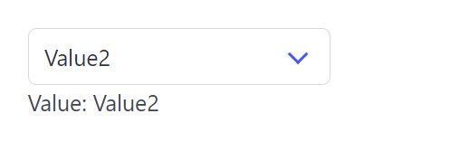
Select
Select create a select dropdown list and return its selected value.
API
func Select(c *tgframe.Container, label string, items []string, conf ...*SelectConf) *int
cis Parent container.labelis the label for select.itemsis the list of options.confis an optional configuration, at most one.- Return the index of the selected item, 0-indexed. nil if no item is selected.
// SelectConf is the configuration for the Select component.
type SelectConf struct {
	tgframe.Base // ID

	// Default is the item the select starts on, as an index into items,
	// 0-based like the return. It is only read until the app user first
	// touches the component, and one that points outside items is ignored.
	Default *int

	// Disabled is true if the select is disabled.
	Disabled bool
}

func (c *SelectConf) SetDefault(v int) *SelectConf
Default is 0-based like the return, so a Default of 0 starts on
items[0]. The state behind a select is 1-based — the frontend keeps its first
option for the placeholder — but that offset stays inside the component; see
State Storage for the one place it
shows.
Example
	selIdx := tgcomp.Select(p.Main, "Select", []string{"Value1", "Value2"})

	selItem := ""
	if selIdx != nil {
		selItem = fmt.Sprintf("Value%d", (*selIdx)+1)
	}

	tgcomp.Text(p.Main, "Value: "+selItem,
		&tgcomp.TextConf{ID: "select_result"})
Starting on the second item, until the app user picks another:
tgcomp.Select(p.Main, "Select", values,
	(&tgcomp.SelectConf{}).SetDefault(1))
A select derives its id from its label, so two with the same label collide. Naming either of them is the way out:
tgcomp.Select(p.Main, "Pick", items)
tgcomp.Select(p.Main, "Pick", items, &tgcomp.SelectConf{ID: "second_pick"})