Chart
Chart component draws a line, bar or area chart. A scatter chart is drawn from points rather than labels, and has its own page: Scatter Chart.
API
func Chart(c *tgframe.Container, labels []string, series []ChartSeries, conf ...*ChartConf)
func LineChart(c *tgframe.Container, labels []string, series []ChartSeries, conf ...*ChartConf)
func BarChart(c *tgframe.Container, labels []string, series []ChartSeries, conf ...*ChartConf)
func AreaChart(c *tgframe.Container, labels []string, series []ChartSeries, conf ...*ChartConf)
cis the parent container.labelsare the x axis categories.seriesare the series to draw. Every series needs one value per label; a series of any other length draws an error placeholder instead of the chart and fails the run, without stopping the rest of the page.confis an optional configuration, at most one.
LineChart, BarChart and AreaChart set Kind themselves and ignore what
the conf says; Chart follows the conf.
ChartSeries:
| Field | Description |
|---|---|
Name | Shown in the legend and the tooltip. |
Values | One value per label, in the same order. |
Points | The {X, Y} points of a scatter series, instead of Values. |
Color | Any CSS color, overriding the theme palette. |
ChartConf:
| Field | Description | Default |
|---|---|---|
ID | The user specific id, from the embedded tgframe.Base. | none |
Kind | ChartKindLine, ChartKindBar, ChartKindArea or ChartKindScatter. | ChartKindLine |
Stacked | Stack the series instead of drawing them side by side. | false |
Height | CSS height of the chart. | 300px |
XLabel | Title of the x axis, hidden when empty. | none |
YLabel | Title of the y axis, hidden when empty. | none |
YLogScale | Draw the y axis on a log scale. See Log scale. | false |
XLogScale | Draw the x axis on a log scale, scatter only. See Log scale. | false |
A chart is placed by position like everything else, so it does not need an id to be updated in place across runs. Give it one when a test or a stylesheet has to name it, or when the page draws two charts you want to tell apart.
Examples
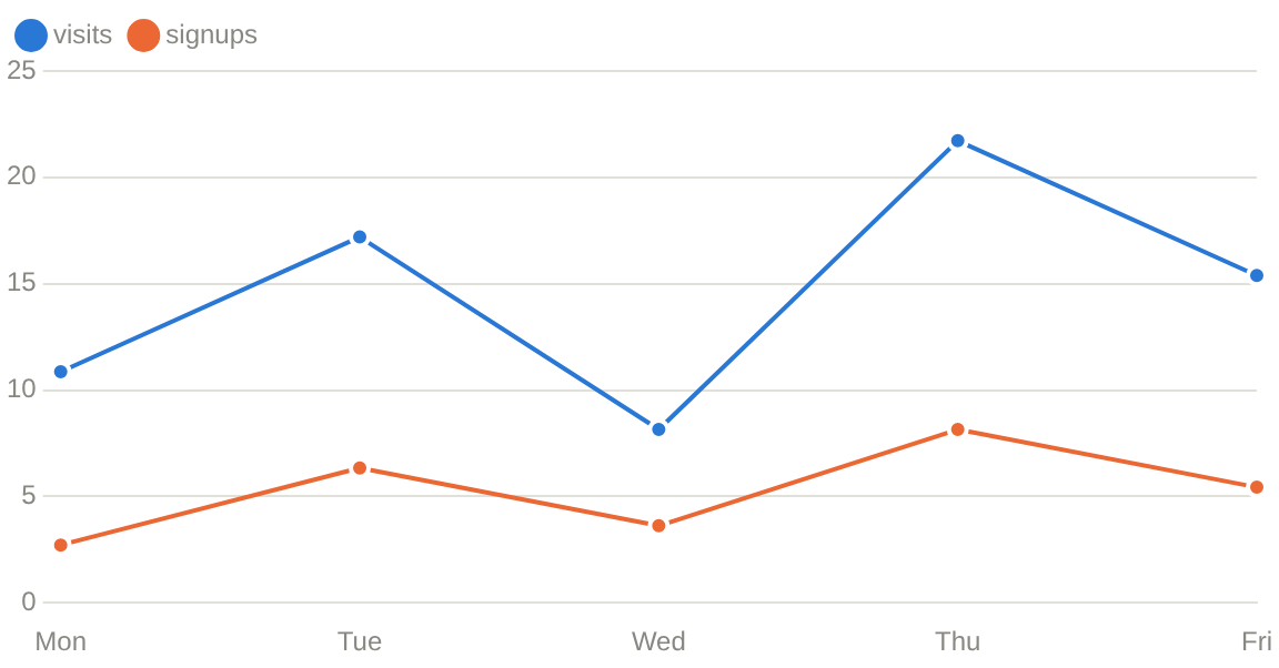
Line
	tgcomp.LineChart(p.Main,
		[]string{"Mon", "Tue", "Wed", "Thu", "Fri"},
		[]tgcomp.ChartSeries{
			{Name: "visits", Values: []float64{12, 19, 9, 24, 17}},
			{Name: "signups", Values: []float64{3, 7, 4, 9, 6}},
		},
		&tgcomp.ChartConf{ID: "demo_line"})
Bar
	tgcomp.BarChart(p.Main,
		[]string{"Go", "Rust", "Python"},
		[]tgcomp.ChartSeries{
			{Name: "stars", Values: []float64{31, 24, 47}},
		},
		&tgcomp.ChartConf{ID: "demo_bar"})
Stacked area
	tgcomp.AreaChart(p.Main,
		[]string{"Q1", "Q2", "Q3", "Q4"},
		[]tgcomp.ChartSeries{
			{Name: "cloud", Values: []float64{4, 6, 5, 9}},
			{Name: "desktop", Values: []float64{2, 3, 4, 4}},
		},
		&tgcomp.ChartConf{
			ID:      "demo_area",
			Stacked: true,
			YLabel:  "revenue",
		})
Log scale
	tgcomp.LineChart(p.Main,
		[]string{"v1", "v2", "v3", "v4", "v5"},
		[]tgcomp.ChartSeries{
			{Name: "downloads", Values: []float64{3, 40, 520, 6800, 91000}},
		},
		&tgcomp.ChartConf{
			ID:        "demo_log",
			YLogScale: true,
			YLabel:    "downloads",
		})
Log scale
YLogScale draws the y axis on a log scale, so data spanning several orders
of magnitude does not crowd the small values onto the baseline. XLogScale
does the same for the x axis of a Scatter Chart, the only
kind whose x axis carries values.
A log axis has no 0, so these draw an error placeholder instead of the chart and fail the run:
XLogScaleon a line, bar or area chart: their x axis is categories.YLogScaletogether withStacked: stacked segments add up linearly.- Any value ≤ 0 on a log axis.
Bars and area fills, which start from 0 on a linear axis, start from the bottom of a log axis instead, one decade below the smallest value.
Notes
- Values are
float64, labels are strings. A time axis is formatted into labels by the page function; there is no time scale. - Colors follow the theme. Series get their color from a palette that is
stepped for the light and the dark theme, in a fixed order. The palette has
eight slots and is never cycled, so a chart with more than eight series has
to set
ChartSeries.Coloron the rest. - Every point travels over the websocket on every run of the page function. A few thousand points per chart is the practical ceiling; downsample before drawing more than that.